Author Archives: Braden Kelley

About Braden Kelley

Braden Kelley is a Human-Centered Experience, Innovation and Transformation practice lead at HCL Technologies, a popular innovation speaker, and creator of the FutureHacking™ and Human-Centered Change™ methodologies. He is the author of Stoking Your Innovation Bonfire from John Wiley & Sons and Charting Change (Second Edition) from Palgrave Macmillan. Braden is a US Navy veteran and earned his MBA from top-rated London Business School. Follow him on Linkedin, Twitter, Facebook, or Instagram.

New CX Leader? Why an Independent Audit Belongs in Your First 90 Days

New CX Leader? Why an Independent Audit Belongs in Your First 90 Days

by Braden Kelley and Art Inteligencia

Walking into a new customer experience role — CX lead, CMO, VP of Customer Success — comes with an unspoken clock. You have a window, usually measured in months rather than years, where you’re expected to understand what you inherited and start showing you can improve it. Most new leaders spend that window doing exactly the wrong thing first.

The trap of trusting what you’re told

Every new leader inherits a story about the customer experience, told by the people who built it. It’s rarely dishonest — it’s just inevitably shaped by whoever’s closest to each part of the business, and by what the previous regime chose to measure and report upward. Spending your first quarter absorbing that story, then acting on it, means your first major decisions are built on someone else’s blind spots, not your own judgment.

Why independence matters more here than almost anywhere else

An internal review, run by your own team in your first months, has a structural problem: the people doing the reviewing often have a stake in what it finds, whether or not anyone intends that. A team that built the current onboarding flow isn’t the ideal group to independently evaluate whether it’s working. An independent audit doesn’t carry that conflict — it walks the journey and evaluates the data with no incentive to protect any particular decision that came before you.

It gives you a real baseline, not a borrowed one

Six months from now, when you’re reporting on what’s improved, you’ll want a credible “before” picture that isn’t just a set of dashboard screenshots someone else built. An audit run at the start of your tenure — covering validated personas, a current journey map, an honest read of the existing data, firsthand walkthroughs of the real experience, and a look at how you compare to competitors — becomes the fixed point everything else gets measured against. Without it, your progress reporting six or twelve months in rests on metrics your predecessor chose, defined, and possibly optimized for their own narrative.

It tells you where to spend your political capital first

New leaders get a limited amount of organizational goodwill to spend on change, and spending it on the wrong priority is one of the most common ways a promising tenure stalls early. A structured audit gives you a prioritized, evidence-based view of where the real gaps are — not the loudest complaint in the building, not the pet project someone’s been pushing for years, but where the customer data and the firsthand journey walk actually point. That’s a far stronger position to walk into your first big budget conversation from than “my gut says we should fix X.”

It’s a credibility move, not just a diagnostic one

There’s also a simple organizational-politics benefit that’s easy to underrate: commissioning an outside, objective audit early signals that you’re not there to defend the status quo or protect any particular team’s prior decisions. That reads very differently to a skeptical organization than announcing changes based on your own first impressions, however well-founded those impressions might be.

Where to start

If you’re inside your first few months in a CX role and want to see where an independent read of your team’s own current state stands, the Customer Experience Audit Checklist walks through the same five activities a full audit runs. And if you want a defensible number to bring into your first budget conversation, the CX ROI Calculator is a fast way to get one. When you’re ready for the real diagnostic, a Customer Experience Audit run in your first 90 days gives you the independent baseline every decision after that can stand on.

Customer Experience Audit Checklist

Download the Customer Experience Audit Checklist as a PDF
Image Credits: Pexels

Content Authenticity Statement: The topic area, key elements to focus on, etc. were decisions made by Braden Kelley, with a little help from Claude to clean up the article.

Subscribe to Human-Centered Change & Innovation WeeklySign up here to get Human-Centered Change & Innovation Weekly delivered to your inbox every week.

Customer Experience Audit for B2B SaaS

What Makes This Journey Different

Customer Experience Audit for B2B SaaS

by Braden Kelley and Art Inteligencia

Most customer experience frameworks are written with a single decision-maker in mind — one person, one moment of dissatisfaction, one chance to leave. B2B SaaS almost never works that way, and an audit approach borrowed from consumer retail will miss most of what actually matters in a software buying and renewal relationship.

The journey has more than one customer in it

A single SaaS account often includes a buyer who approved the budget, an admin who configured the product, and a set of end users who never spoke to sales at all and may not even know your company name. Each of these roles experiences a completely different journey, forms a completely different opinion, and has completely different influence over renewal. An audit that only interviews the buyer — the person easiest to reach — misses the end users whose day-to-day frustration is often what actually drives churn, quietly, long before a renewal conversation happens.

Onboarding failures don’t show up until months later

In consumer contexts, a bad first experience usually shows up immediately — a return, a one-star review, a quick churn. In B2B SaaS, a confusing onboarding often doesn’t kill the relationship on day one. It just means the product never gets adopted the way it was sold to be used, usage stays shallow, and the account quietly becomes a non-renewal a year later for reasons that trace directly back to week one. Walking the onboarding journey firsthand — not reviewing the onboarding flowchart, but actually going through it as a new user would — is where this kind of audit consistently finds the most expensive gaps.

Support tickets are a lagging indicator, not a leading one

By the time a SaaS customer files a support ticket, they’ve usually already tried to solve the problem themselves, asked a colleague, checked the help docs, and given up more than once. The ticket is the tip of a much larger iceberg of friction that a support-ticket dashboard alone will never show you. This is exactly why data evaluation in an audit has to be paired with firsthand journey walking — the tickets tell you what people were frustrated enough to report; the journey walk tells you everything they weren’t.

Expansion revenue depends on trust building quietly in the background

Upsell and cross-sell in SaaS rarely happen through a single sales conversation — they happen because a champion inside the account has quietly built confidence in the product over months of ordinary use. Every piece of friction in that ordinary use is a small tax on that trust, invisible individually, but cumulative. An audit that maps the full post-sale journey — not just the support-facing parts — is usually where the connection between “small usability annoyance” and “expansion revenue we didn’t get” becomes visible for the first time.

Competitive benchmarking means something different here

In B2B SaaS, your real competitive benchmark often isn’t your closest direct competitor — it’s the best onboarding flow or support experience your buyer has encountered anywhere in their software stack. B2B buyers import their expectations from whatever consumer-grade product experience they use daily, which means “good enough” is a moving target set well outside your own category.

Where to start

If any of this sounds like it’s describing gaps you suspect exist but haven’t confirmed, the Customer Experience Revenue Leakage Self-Assessment is a good first step to see where your own program stands across the five core audit activities. From there, a Customer Experience Audit scoped specifically to a multi-stakeholder SaaS journey — buyer, admin, and end user — finds what a single-persona review structurally can’t.

Download the Customer Experience Audit Checklist as a PDF
Image Credits: Pexels

Content Authenticity Statement: The topic area, key elements to focus on, etc. were decisions made by Braden Kelley, with a little help from Claude to clean up the article.

Subscribe to Human-Centered Change & Innovation WeeklySign up here to get Human-Centered Change & Innovation Weekly delivered to your inbox every week.

The Revenue Hiding In Plain Sight

The Revenue Hiding In Plain Sight

by Braden Kelley and Art Inteligencia

Why your gut already knows something’s wrong, and how to finally prove it.

You’ve seen it before. The numbers look okay on paper, but something just doesn’t feel right. Churn is creeping up. Conversions aren’t where they should be. Your support team is busier than ever. Yet, when you dig into the dashboards, nothing is jumping out and screaming for your attention.

So, like so many leaders do, you wait. You hope it’s a blip. You tell yourself the team will course correct. But deep down, you already know what’s really going on… Your customers are quietly voting with their feet.

Here’s the hard truth: The biggest threats to your revenue aren’t always obvious. They’re hiding in the frustrating onboarding flow your team has grown numb to. They’re buried in the clunky renewal process that only your customers seem to notice. They’re tucked away in the dozen micro-moments of friction you’ve accepted as “just the way things are.”

If You Can’t See It, You Can’t Fix It

For years, we’ve obsessed over measuring sentiment. NPS, CSAT, and star ratings all have their place. But as an experience designer, I can tell you this: sentiment doesn’t always open up a spreadsheet. Revenue does.

The problem is, most organizations don’t have a way to connect those frustrating customer moments to the bottom line. The result? CX initiatives get deprioritized, underfunded, or worse… they become shelfware because leaders can’t see the business case to act.

That’s exactly why I created the CX Revenue Leak Self-Assessment.

Five Minutes To Clarity

This isn’t just another survey. It’s a reality check for growth-minded leaders. In just five minutes, you’ll answer seven pointed questions about churn, conversions, support costs, renewals, customer sentiment, visibility, and your team’s ability to act. What you get in return is immediate clarity.

You’ll walk away with a Leak Score that tells you if you’re in a low, medium, or high-risk category, a laser-focused tip you can act on today, and a clear path forward. No email gate to get your results. No fluff. Just the truth about where your revenue is at risk.

So, if that nagging feeling hasn’t gone away, don’t ignore it. Take the CX Revenue Leak Self-Assessment right now and finally put a number to what your gut has been trying to tell you.

From “How Bad Is It?” To “How Much Can We Recover?”

Once you know where the leak is coming from, the next logical question is always, “how much is this actually costing us?” That’s where our CX ROI Calculator comes in. It’s the perfect companion to your results, helping you model a realistic, defensible range of recoverable revenue in seconds. It’s not the focus, but it’s the tool that will get your CFO nodding their head.

When You Need More Than a Quick Fix

Sometimes, a tip and a number are enough to get the ball rolling. Other times, you need to go deeper. You need to uncover the root cause of that leak, prioritize what to do first, and build a roadmap your team will actually adopt. Not one that collects dust.

That’s the heart of our independent Customer Experience Audit. It’s built on a simple belief: human-centered change only works when it’s paired with a business case that’s undeniable. That’s why we don’t just hand you a report, we deliver a 3-week action plan with effort vs. impact and estimated revenue lift for each of your top priorities.

The Cost of Waiting Is Greater Than You Think

Every day you wait to address that friction is another day of lost revenue you won’t get back. The good news? You don’t have to boil the ocean to make progress. You just need to start by shining a light on your biggest leak.

So, do what great leaders do. Get curious. Get clarity. Then, get moving.

Start Your 5-Minute Assessment Now

Your customers are already telling you something. It’s time to hear what their actions are saying about your revenue.

Image Credits: Microsoft AI

Content Authenticity Statement: The topic area, key elements to focus on, etc. were decisions made by Braden Kelley, with a little help from Microsoft AI to clean up the article.

Subscribe to Human-Centered Change & Innovation WeeklySign up here to get Human-Centered Change & Innovation Weekly delivered to your inbox every week.

7 Signs Your Company Needs a Customer Experience Audit

7 Signs Your Company Needs a Customer Experience Audit

by Braden Kelley and Art Inteligencia

Most companies don’t wake up one day and decide they need a customer experience (CX) audit. They notice something’s off — a number that won’t move, a complaint that keeps recurring in slightly different words — and spend months treating the symptom before anyone names the actual problem. If any of the following sound familiar, that’s usually the moment to stop treating symptoms.

1. Your satisfaction scores have plateaued, not declined

A declining NPS is easy to act on — something clearly broke, and you go find it. A plateaued score is harder, because nothing is obviously wrong, and yet nothing is getting better either, no matter what you try. That’s usually a sign the problem isn’t in the parts of the experience your survey is capturing. It’s in the parts nobody’s measuring.

2. Customer complaints keep circling the same theme without ever naming the same issue

Different words, different tickets, different customers — but if you squint, they’re all describing the same friction from slightly different angles. That pattern usually means the actual root cause is a step upstream of where the complaints are landing, and no one’s traced it back far enough to find it.

3. Your team has strong opinions about “what customers want” — and no recent research to back it up

Every organization develops internal folklore about its customers over time, and folklore calcifies fast. If the last time anyone formally validated your personas was more than a year or two ago, there’s a real chance the assumptions steering your roadmap and your customer’s actual expectations have quietly drifted apart.

4. Frontline teams routinely “work around” the same problem instead of escalating it

When support or sales staff have built informal scripts or manual fixes for a recurring issue, that’s a sign the organization has adapted to a problem instead of solving it. It also means leadership likely has no visibility into how often it’s happening, because a workaround is specifically designed not to generate a ticket.

5. You’re investing in acquisition, and retention isn’t keeping pace

New customer growth that isn’t showing up in overall revenue growth is one of the clearest tells that the experience, not the funnel, is where the leak is. It’s a math problem before it’s ever discussed as an experience problem — and by the time it’s obviously an experience problem, it’s usually cost you a lot more than an audit would have.

6. A competitor keeps coming up in customer conversations for reasons that aren’t about price

When customers mention a competitor unprompted, and the comparison isn’t about cost, it’s almost always about experience — how easy something is, how fast a question gets answered, how the relationship feels. That’s a benchmarking gap, and it’s one of the harder ones to see from inside your own organization.

7. Nobody in leadership has personally walked the customer journey in the last year

This is the simplest sign and the one most often overlooked. If the people making decisions about the customer experience are working entirely from dashboards and secondhand reports, rather than having recently gone through the journey themselves, there’s a structural gap between what leadership believes is happening and what’s actually happening.

What to do if two or more of these sound familiar

One of these signs, on its own, might just be normal organizational noise. Two or three together is a pattern worth taking seriously. If you want a more structured way to check where the real gaps are, the Customer Experience Audit Checklist walks through the same five areas a professional audit examines, so you can see for yourself before committing to anything larger.

If you’re already fairly confident there’s a real problem and want to know roughly what it’s costing you, the CX ROI Calculator is the fastest way to put a number on it — and from there, a Customer Experience Audit is how you find out exactly where to fix it first.

Download the Customer Experience Audit Checklist as a PDF

Image Credits: Pexels

Content Authenticity Statement: The topic area, key elements to focus on, etc. were decisions made by Braden Kelley, with a little help from Claude to clean up the article.

Subscribe to Human-Centered Change & Innovation WeeklySign up here to get Human-Centered Change & Innovation Weekly delivered to your inbox every week.

How Long Does a Customer Experience Audit Take?

A Realistic Timeline

How Long Does a Customer Experience Audit Take?

by Braden Kelley and Art Inteligencia

The honest answer to “how long will this take” is almost always more useful than a vague reassurance that it “won’t take too long.” Vagueness here is what makes people hesitate — not the actual time commitment, which is usually more manageable than they expect once they can see it laid out phase by phase.

Why duration varies more than people assume

A Customer Experience Audit runs through five integrated activities, and each one has its own natural pace. The total timeline isn’t one number so much as it’s the sum of how much depth each activity needs for your specific journey — which is why a single-persona, single-channel audit might wrap in a few weeks, while a multi-segment, omnichannel engagement with full competitive benchmarking runs considerably longer. Here’s roughly what each phase involves.

Phase 1: Audience research and persona validation

This phase moves relatively quickly when personas already exist and mostly need validation against current reality, rather than being built from nothing. It slows down considerably when there’s no existing research to validate against — in that case, this phase does double duty as both discovery and validation, which naturally extends it.

Phase 2: Journey mapping and touchpoint analysis

This phase’s pace tracks directly with touchpoint count and channel count. Mapping a single-channel journey with a handful of touchpoints is straightforward. Mapping an omnichannel journey — where a customer might start on a website, continue on a phone call, and finish in person — takes meaningfully longer, because each channel handoff needs its own attention, not just each channel in isolation.

Phase 3: Existing data evaluation

This can run partly in parallel with the phases around it, which is one of the easiest ways to compress a timeline without cutting corners. The pace here depends less on data volume and more on data organization — data spread across disconnected systems that were never designed to talk to each other takes real time to reconcile, even when there isn’t much of it.

Phase 4: Walking the journey firsthand

This is usually the phase people underestimate, because it’s genuine fieldwork rather than analysis — retail visits, live service calls, full sales cycles observed end to end, sometimes across both B2B and B2C contexts in the same engagement. It’s also, consistently, where an audit turns up its most valuable and most surprising findings, which makes it a poor candidate for compressing even when the calendar is tight.

Phase 5: Competitive benchmarking

This phase can run largely independent of the others and is one of the more schedule-flexible components — it’s also the one most commonly trimmed or skipped entirely when timeline pressure is real, since it looks outward at competitors rather than inward at your own journey.

What actually extends a timeline

In practice, three things push a timeline out further than people expect: internal scheduling delays (getting the right stakeholders and frontline staff available for interviews and shadowing), data that’s harder to access or reconcile than anticipated, and scope that expands mid-engagement as new touchpoints or segments turn out to matter more than originally assumed. None of these are about the audit process itself moving slowly — they’re about the realities of coordinating across an organization, and they’re worth planning around rather than being surprised by.

What compresses a timeline

Running the data evaluation phase in parallel with early journey mapping, having stakeholder availability locked in before the engagement starts rather than scheduled reactively, and scoping deliberately — one primary journey and persona rather than every segment at once — are the three most reliable ways to bring a timeline in faster without sacrificing the depth that makes the findings useful.

Getting a real number for your situation

Because the actual timeline depends on your specific journey — how many personas, how many touchpoints, whether benchmarking is in scope — a general range is only ever a starting point for the conversation, not a substitute for it. If you’re building a case internally and need a realistic figure to bring to your own leadership, the audit page has the full detail on how an engagement runs, and I’m glad to talk through a specific timeline for your situation directly — the same way I would the disruption and cost questions that usually come up alongside it.

Download the Customer Experience Audit Checklist as a PDF
Image Credits: Gemini

Content Authenticity Statement: The topic area, key elements to focus on, etc. were decisions made by Braden Kelley, with a little help from Claude to clean up the article.

Subscribe to Human-Centered Change & Innovation WeeklySign up here to get Human-Centered Change & Innovation Weekly delivered to your inbox every week.
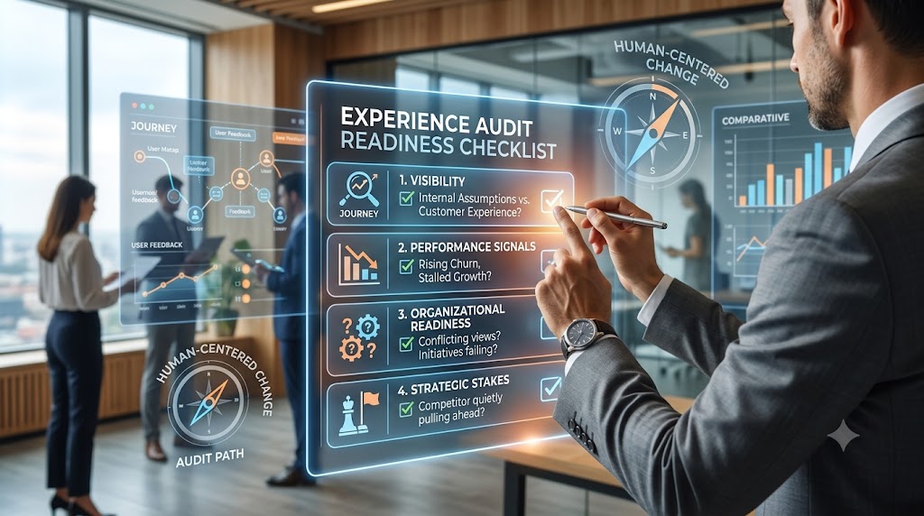
Customer Experience Audit Checklist

What a Professional Auditor Actually Looks For

Customer Experience Audit Checklist

by Braden Kelley and Art Inteligencia

People often picture a customer experience audit as something closer to inspiration than inspection — a few interviews, some good ideas, a workshop. It isn’t. A real audit runs a specific, repeatable checklist across five activities, and knowing what’s actually on that checklist is useful even if you’re not commissioning a full audit yet — it tells you exactly where your own internal review is likely leaving gaps.

1. Audience research and persona validation

  • Have you named your distinct audience segments explicitly, rather than treating “the customer” as one undifferentiated group?
  • Are your existing personas based on validated research, or on assumptions that were accurate once and never rechecked?
  • Do you know which needs, expectations, and pain points are consistent across segments, and which ones genuinely differ?
  • Has anyone recently asked customers directly what they expect, rather than inferring it from internal debate?

Most organizations have personas. Far fewer have validated them against current reality in the last two years — and a persona built on outdated assumptions can misdirect an entire audit before it starts.

2. Journey mapping and touchpoint analysis

  • Is there a current journey map for each validated persona, or one generic map applied to everyone?
  • Are all relevant channels represented, not just the primary one your team happens to work in?
  • Does the map capture emotional highs and lows at each touchpoint, or only the functional steps?
  • Have improvement opportunities been identified at the touchpoint level, rather than as vague, journey-wide observations?

A journey map that only lists steps, without the emotional experience at each one, tells you what happens without telling you what it’s like — and “what it’s like” is usually where the real problem lives.

3. Existing data evaluation

  • Are your KPIs, NPS, CSAT, and sentiment data being analyzed together, or read in isolation by different teams?
  • Have you looked for patterns across data sources that no single dashboard would surface on its own?
  • Is there a gap between what your data says and what your frontline teams say — and if so, has anyone reconciled it?
  • What insight is your current reporting structurally unable to produce, no matter how closely you look at it?

This step exists because most organizations already have more data than they’ve actually used. The checklist item isn’t “collect more data” — it’s “extract what’s already sitting there unexamined.”

4. Walking the journey firsthand

  • Has anyone on your team experienced the journey as a customer would — not reviewed it on paper, but actually gone through it?
  • Does that include the channels that are hardest to observe from a desk — a retail visit, a live service call, a full sales cycle?
  • For B2B experiences specifically, has the buying-committee journey been walked, not just the end-user journey?
  • What did that firsthand pass turn up that no dashboard or survey had previously flagged?

This is consistently where an audit finds its most valuable insights, and it’s also the step most internal reviews skip entirely, because it requires time in the field rather than time in a meeting.

5. Competitive benchmarking

  • Do you know how your experience compares to your closest competitors at the touchpoints that matter most, not just anecdotally?
  • Have you looked at best-in-class examples outside your own industry, where customer expectations are quietly being reset?
  • Is “good enough” being judged against your own history, or against where your customers’ expectations actually sit today?

Benchmarking is the item most often skipped to save time — understandably, since it’s the one activity that looks outward instead of inward. It’s also the one that answers the question your leadership will eventually ask: not “are we good,” but “are we good enough relative to the alternative.”

Using this checklist honestly

If you walk through these five sections and find real gaps — persona research from three years ago, a journey map from before a major process change, data that’s never been cross-analyzed, no one who’s actually walked the journey firsthand, no benchmarking at all — that’s not a failure. It’s an accurate picture of where a professional audit would start, and it’s useful information either way.

If the gaps are small, a lighter internal review might close them. If the gaps run through several of these five, it’s usually a sign that a proper Customer Experience Audit is worth the investment rather than another attempt to patch it internally — and if you want a sense of what closing those gaps could be worth before you commit, the CX ROI Calculator is the fastest way to find out.

Download the Customer Experience Audit Checklist as a PDF

Image Credits: Gemini

Content Authenticity Statement: The topic area, key elements to focus on, etc. were decisions made by Braden Kelley, with a little help from Claude to clean up the article.

Subscribe to Human-Centered Change & Innovation WeeklySign up here to get Human-Centered Change & Innovation Weekly delivered to your inbox every week.

How to Build a Local Value Score Without Starting a Partisan Firefight

How to Build a Local Value Score Without Starting a Partisan Firefight

by Braden Kelley and Art Inteligencia

In the first piece in this series, we lit the spark: absolute spending debates rarely move the needle, while peer-relative value, what similar communities achieve per dollar, can. This article opens the instrument. Not the full DIY toolkit yet. The method. The experience architecture. The discipline that turns civic anger into civic learning.

From spark to instrument

Innovation without an instrument is just a mood. Human-centered change without a shared unit of sense-making becomes another round of tribal theater. If you felt the first article land – What If You Could Prove the Government is Ripping Us Off? – the next question is practical:

How do we score a place fairly enough that good-faith people on the left, right, and exhausted middle can argue about the same dashboard?

That is an experience-design problem before it is a political problem. People cannot improve what they cannot sense. So we need an interface for civic value that ordinary neighbors can understand in under two minutes, and that a finance director can challenge without inventing motives.

Call the instrument a Relative Value Score (RVS): a transparent, peer-normalized view of outcomes per cost-adjusted dollar, with a clear path to “why the gap.” The revolutionary move is not inventing a grade that flatters your side. It is building a comparison citizens trust enough to use in budget season.

What a Relative Value Score actually measures

A Relative Value Score is not “how big is the budget?” Bigger places spend more. Harder case mixes cost more. Expensive labor markets pay more. Treating raw spend as proof of compassion, or of waste, is how we keep fighting about identity instead of delivery.

Conceptually:

RVS ≈ how close you are to the best peer in your cohort on value delivered per dollar—across a small set of outcome domains, cost-adjusted, with published weights and sources.

Think of it like comparing restaurants of the same type and price band on food quality per dollar, not comparing a food truck to a banquet hall and declaring a winner by total receipts. Futurology loves flashy national indexes. Experience design prefers local instruments that feel fair in the neighborhood where life is actually lived.

Three design rules keep the score human-centered:

  • Outcomes over optics. Prefer measurable delivery (response times, learning growth, pavement condition, permit latency, unit cost of capital) over press-release volume.
  • Cost-adjusted dollars. Adjust for regional price and wage differences so “expensive place” is not automatically “bad place.”
  • Relative, not absolute holiness. Normalize within the peer cohort. The best peer becomes the teacher. Everyone else gets a gap to close—or explain.

Improper payments, fraud risk, and opaque grantee chains still matter. They belong on a related but separate track (more below). Mixing “inefficient” with “corrupt” in one opaque number is how movements lose the room on the first contested claim.

Peers first: the fairness engine

Most “benchmarking” fails before the math starts—because the peer set is a vibes playlist. Comparing a dense coastal city to a rural county, or a high-poverty district to an affluent one using unadjusted test levels, is not accountability. It is ammunition.

Peer cohorts are the fairness engine. Build them first. Argue about them in public. Version them. That is change leadership: put the contested assumptions where people can see them.

Practical cohort dimensions by layer:

  • Cities: population band, density, metro/rural context, regional price/wage index.
  • Counties: population, urban share, mandate set (courts, jails, public health, roads, elections).
  • States: population scale, economic mix, federal transfer share—used carefully; states are multi-product machines.
  • School districts: enrollment, % students in special education / English learners / free-or-reduced lunch (or equivalent need measures), urbanicity, regional educator wages. Prefer learning growth / value-add over raw proficiency levels whenever possible.
  • Water and special districts: service population, infrastructure age/type, treatment complexity, geography—unit cost of delivered service beats “total budget” every time.

A good peer set is small enough to be intelligible and large enough that one outlier cannot redefine “normal.” Publish who is in the cohort and why. Invite the entity to propose alternate peers with evidence. Right-to-reply is not weakness. It is how trust compounds.

Domains, weights, and the “why the gap” story

Do not boil the ocean. Innovation teams ship thin slices. For a first local scorecard, pick 8–12 metrics max across a few domains—not 200 indicators nobody reads.

Example domain shapes (customize by entity type):

  • Service delivery: outcomes or service quality per dollar or per FTE (clearance, response, throughput, condition).
  • Administrative load: central office / admin share versus program or instructional spend.
  • Labor intensity: compensation density (payroll, overtime, benefits where available) versus outputs.
  • Contracting & capital: competitive bid share, concentration, unit cost and schedule slippage on comparable projects.
  • Transparency: timely CAFRs/budgets, machine-readable checkbooks, FOIA latency—inputs to trust, not vanity.

Weights should be public, few, and revisable. Publish a default weighting, and let citizens toggle sensitivity modes (“weight learning growth higher,” “weight admin share higher”) so critics can fork the story without assassinating the messenger. That is open innovation applied to civic sense-making.

The score is the headline. The product is the “why the gap” decomposition: which 2–3 drivers explain most of the distance from the best peer, each with sources and confidence. Without that story, a score is just a ranking for dunking. With it, a score becomes a change agenda.

Two tracks: performance vs. integrity

Human-centered accountability refuses false equivalence. A district can be expensive relative to peers and still honest. An agency can look “lean” on paper and still run integrity red flags. Smash those into one “corruption score” and you have built a weapon, not an instrument.

Keep two panels on the same dashboard:

  • Performance track (RVS): peer-relative outcomes per cost-adjusted dollar. This is the main civic interface.
  • Integrity overlay: audit findings, delayed reporting, sole-source patterns, related-party flags, outcome-light grantee chains—shown with higher evidentiary bars, source documents, and room to reply. Treat AI here as a highlighter for human review, never as a judge pronouncing guilt.

This separation is how a multipartisan movement survives contact with reality. Precision is the revolutionary ethic. Smear is the cheap substitute.

A weekend walkthrough for one jurisdiction

You do not need the full toolkit to practice the method. You need a first mile. Here is a human-sized walkthrough you can start this weekend—before the downloadable suite and guidebooks ship.

  • 1. Name the entity in one sentence. “Our K–12 district,” “our city general fund,” “our water district”—passion plus a border beats rage at “the system.”
  • 2. Pull Tier-A documents. Latest adopted budget, CAFR or annual financial report, salary schedule or checkbook export, and any published outcomes dashboards. Note what is missing.
  • 3. Draft a peer shortlist. Five to fifteen similars using the cohort dimensions above. Write one paragraph defending the set.
  • 4. Choose eight metrics you can source. Prefer unit costs and outcomes over vibes. If a metric cannot be sourced, park it—do not invent it.
  • 5. Build a crude gap view. For each metric, who is best in your peer set? Where are you? What is the story in two drivers?
  • 6. Separate integrity notes. If you see red flags, log them with links and confidence—not as the score itself.
  • 7. Write three budget-season questions. Short enough for a three-minute public comment. Specific enough that staff must answer on the record.

That walkthrough is reconnaissance, not a finished product. Finished products need versioned methods, entity right-to-reply, and consistent cohort rules. That is exactly what the forthcoming DIY tools and role-based guidebooks are for—so local teams are not reinventing discipline in the dark.

What comes next—and how to stay in formation

Method without movement is a PDF nobody uses. Movement without method is a mob with a megaphone. We are building both: open instruments for peer-relative value, and a network of roles—data gatherers, benchmarking intelligence creators, website hosts, promoters, meeting advocates, media partners—who can stand up local scoreboards when the kits are ready.

In the next pieces in this series, we will walk a single jurisdiction end-to-end as a chapter-lead story, then open the downloadable suite: data gathering, careful AI-assisted processing under human guardrails, and public benchmarking sites neighbors can actually use.

Between method and toolkit, stay on the bus.

If this article sharpened your sense of how fair comparison should work, subscribe to Human-Centered Change & Innovation Weekly. That list is how you get first notice when the guidebooks and DIY tools move from spark to usable firepower—practical next steps for the jurisdiction and role you choose.

Prefer the full signup page? Open the newsletter signup page.

Forward this to the person who already knows the peer set in their head—and to the person who keeps saying the comparison “isn’t fair” without ever defining fair. Fairness is designable. That is the work.

Absolute spend is a slogan. Peer-relative value is an instrument. Instruments are how human-centered futures get built.

Frequently Asked Questions

What is a Relative Value Score (RVS)?

A Relative Value Score is a peer-normalized measure of outcomes per cost-adjusted dollar for a city, county, state, school district, or special district. It shows how close an entity is to the best performer among similar peers across a small set of transparent metrics—not whether its total budget is large or small in absolute terms.

How do you choose fair peers for comparison?

Fair peers share similar constraints: size and density for cities; mandate mix for counties; enrollment and student-need mix plus regional wages for school districts; service population and infrastructure profile for water and special districts. Publish the cohort rules, keep the set large enough to be meaningful, and allow entities to propose alternate peers with evidence. Unadjusted “leaderboards” that ignore poverty or cost of living are not fair benchmarks.

Should fraud and performance be one score?

No. Keep a performance track (peer-relative value) separate from an integrity overlay (audits, delayed reporting, sole-source patterns, opaque grantee chains) that requires stronger evidence and human review. Combining them into one “corruption score” destroys credibility and unfairly smears underperforming but honest agencies.

Image Credits: Pexels

Content Authenticity Statement: The topic area, key elements to focus on, etc. were decisions made by Braden Kelley, with a little help from Cursor to clean up the article.

Subscribe to Human-Centered Change & Innovation WeeklySign up here to get Human-Centered Change & Innovation Weekly delivered to your inbox every week and to be alerted when the guidebooks and DIY tools to implement this discipline locally are available.

What Does a Customer Experience Audit Cost?

What Does a Customer Experience Audit Cost?

by Braden Kelley and Art Inteligencia

This is usually the last question someone asks before they’re ready to move forward, which means it deserves a direct answer rather than the consultant’s reflex of “it depends.” It does depend — but on a small, specific set of factors, and I’d rather walk you through exactly what they are than make you guess.

The honest answer: it scales with scope, not with company size

The biggest misconception I run into is that audit cost tracks with company revenue or headcount. It doesn’t, directly. It tracks with the shape of the journey being audited: how many distinct touchpoints are in scope, how many channels the experience spans (in-person, phone, web, app, in some combination), and how many stakeholder groups need to be interviewed to understand the journey from more than one angle. A single-channel, single-audience journey for a mid-size company can cost less than a sprawling omnichannel journey for a smaller one, if the omnichannel journey is genuinely more complex to walk.

The five activities that drive cost

  1. Audience research and persona validation. Every audit starts by identifying your distinct audience segments and validating their journeys against current reality — surfacing the needs, expectations, and pain points that internal assumptions have obscured. One clearly-defined audience is a much faster starting point than four segments that each need their own research and validation pass, and this is usually the first scope decision worth making deliberately.
  2. Journey mapping and touchpoint analysis. From there, we create or update persona-based journey maps — identifying key touchpoints, pain points, emotional highs and lows, and improvement opportunities across every relevant channel. A journey with four or five touchpoints in a single channel maps far faster than one spanning fifteen touchpoints across phone, web, app, and in-person combined.
  3. Existing data evaluation. Your current KPIs, NPS scores, CSAT data, and sentiment analysis get analyzed for the patterns, gaps, and untapped insights that current reporting isn’t surfacing. How much historical data you already have — and how much of it is usable versus scattered across disconnected systems — changes how much work this step takes before it produces anything actionable.
  4. Walking the journey. This is where key touchpoints get evaluated firsthand — retail locations, digital channels, service calls, sales cycles, in B2B and B2C contexts alike — and it’s typically where an audit finds its most surprising and valuable insights. It’s also usually the most time-intensive of the five activities, because it’s genuine fieldwork rather than analysis of what already exists, and cost scales directly with how many touchpoints and channels get walked in person versus reviewed through documentation alone.
  5. Competitive benchmarking. Benchmarking your experience performance against select competitors and best-in-class examples shows not just where you stand, but how far you are from where you need to be. This one is genuinely optional depending on your goals — skipping it keeps the engagement focused purely on your own gaps, while including it adds real value when you specifically need to know how you compare to the alternatives your customers are weighing.

Timeline compresses or expands the cost of all five at once: doing them in two weeks instead of six doesn’t reduce the work, it concentrates it, usually by putting more people on it in parallel. If you have flexibility on timeline, it’s often the easiest lever to pull to manage overall cost.

The number that actually matters more than the price

Cost in isolation is the wrong comparison. The comparison that matters is cost against what the friction is currently costing you in retained revenue, referral loss, and cost to serve — because that’s the number an audit is designed to protect. If you haven’t run that comparison yet, the CX ROI Calculator will give you a real figure in a few minutes, and it’s the right first step before a cost conversation, not after it. A number that’s larger than the audit’s cost is the fastest way to know the conversation is worth having at all.

Getting an actual number

Because cost depends on the scope decisions above, and those decisions are specific to your journey and your goals, the accurate way to get a real figure is a short scoping conversation rather than a published price list that would be wrong for most people who read it. If you’re at the point of wanting that conversation, the audit page has the details on how an engagement runs, and I’m glad to talk through scope and a realistic estimate directly.

Customer Experience Audit Learn More

Image Credits: Gemini

Content Authenticity Statement: The topic area, key elements to focus on, etc. were decisions made by Braden Kelley, with a little help from Claude to clean up the article.

Subscribe to Human-Centered Change & Innovation WeeklySign up here to get Human-Centered Change & Innovation Weekly delivered to your inbox every week.

What If You Could Prove the Government is Ripping Us Off?

What If You Could Prove the Government is Ripping Us Off?

by Braden Kelley and Art Inteligencia

We are living through a crisis of civic experience. People can feel that they’re being ripped off by their elected and administrative officials, but yet they lack a fair way to prove it. The future will not be built by louder arguments alone. It will be built by better comparisons: value delivered per dollar, relative to peers who look like us. That is the spark for a human-centered citizen movement. First, let’s look at the scale of the problem already documented in the public record.

The bill without a receipt

Most of us do not experience government as a spreadsheet. We experience it as a journey: the permit that takes months, the school board meeting that buries tradeoffs in jargon, the water bill that climbs while the story never quite lands. That journey is the real product. And if experience design has taught us anything, it is this: when the interface of truth is broken, people do not get smarter by trying harder, they get cynical.

Cynicism is not a character flaw. It is a rational response to incomplete design.

We are asked to fund systems whose performance is rarely presented in the only language that makes human comparison fair: what does a place like mine get for money like mine?

Imagine, just for a moment, learning that a school district with a nearly identical enrollment mix educates children with far less administrative drag and better learning growth per instructional dollar. Or that a peer city issues permits, paves roads, or clears cases at a cost structure that cannot be waved away with “we’re special.” That is not a conspiracy theory. That is a design question. Design questions can be answered, if we stop accepting fog as a management strategy.

Before we build the instruments of peer comparison, we have to stop understating what already leaks, bloats, and under-delivers in plain sight. Innovation begins with facing reality, not romanticizing it.

The scale hiding in plain sight

If this were only a few bad actors and a few delayed audits, a nice annual report and a press release would be enough. The public record says otherwise. What we are looking at is a systems problem: structural error and theft measured in hundreds of billions; spending that sprints past simple population-and-inflation baselines; and institutions whose staffing mix drifts toward administration while the work citizens think they are buying becomes relatively thinner.

Let’s start at the federal level, not because your city council or school board is less important, but because the national numbers are large enough that denial starts looking like a lifestyle choice.

The U.S. Government Accountability Office (GAO) estimated that direct annual financial losses to the federal government from fraud fall between roughly $233 billion and $521 billion a year, based on fiscal years 2018–2022 risk environments (GAO-24-105833 highlights; full report: PDF). That is not a rounding error. That is a second economy of loss living inside the first.

Then there are improper payments – the broader leak that includes overpayments, underpayments, documentation failures, and more. Agencies reported about $236 billion in improper payments in fiscal year 2023 (GAO FY2023 overview) and still about $162 billion in fiscal year 2024 after some pandemic programs wound down (GAO FY2024 press release; GAO-25-107753 PDF). Cumulative improper-payment estimates since fiscal year 2003 approach about $2.8 trillion (see GAO-25-107753). Earlier in the same stretch: roughly $281 billion in FY2021 (GAO) and $247 billion in FY2022 (GAO).

Let’s be clear, as any honest change leader must be: improper payments are not all intentional fraud. But they are the proof that our control experience is broken. If you cannot reliably send the right money to the right place, you do not have a “communications” problem. You have a design problem.

Bar chart of federal improper payment estimates for FY2021 through FY2024, declining from roughly $281 billion to $162 billion but remaining very large.

Federal agency-reported improper payment estimates remain measured in hundreds of billions even after the pandemic peak. Sources:
GAO FY2021 (~$281B);
GAO FY2022 (~$247B);
GAO FY2023 (~$236B);
GAO FY2024 (~$162B).
Scale of loss is one window. Scale of spend is another. Total federal net outlays rose from roughly $3.5 trillion in fiscal year 2014 to roughly $6.7 trillion in fiscal year 2024 – nearly a doubling in a decade in nominal dollars, with the pandemic rewriting the shape of the curve. Those figures come from the U.S. Office of Management and Budget historical outlay series published via the Federal Reserve Bank of St. Louis as FRED series FYONET, with the broader tables at OMB Historical Tables.

More spending can mean more service, more obligations, an older population, emergencies. Futurology without humility is just sci-fi cosplay. But here is the innovation insight most public debates miss: absolute “we spent more” tells citizens almost nothing about unit cost, quality, or leakage. When the size of the system grows, the need for peer-relative instruments grows with it. Otherwise we are asking people to navigate a denser fog with the same broken map.

Bar chart showing U.S. federal net outlays rising from about $3.5 trillion in FY2014 to about $6.7 trillion in FY2024.

U.S. federal net outlays, selected fiscal years (nominal dollars). Source:
OMB Federal Net Outlays (FYONET) via FRED.
See also OMB Historical Tables.
Now bring it closer to home – for many of us, literally. Washington State’s Near General Fund–Outlook (NGF-O) operating budget grew from about $31.2 billion in the 2011–13 biennium to about $80.2 billion for 2025–27, roughly a 157% increase in nominal dollars, as laid out by the Washington Policy Center using the state’s NGF-O series. The 2023–25 NGF-O package, after the 2024 supplemental, was about $71.9 billion (Legislative Budget Notes PDF). The same analysis notes that if spending since the mid-2010s had tracked only population and inflation, today’s scale would be tens of billions lower. Growth is real. “We only kept up with costs” is a different claim. Official statewide spending trails also live at fiscal.wa.gov.

This is not a Washington-only story. It is a pattern story: when the bar chart climbs and the experience of value does not climb with it, citizens notice – even if they cannot yet prove the gap against peers.

Bar chart of Washington state Near General Fund–Outlook biennial operating budgets rising from $31.2 billion in 2011–13 to about $80.2 billion in 2025–27.

Washington NGF-O biennial operating budget scale (nominal). Sources:
Washington Policy Center NGF-O growth summary
(2011–13 ≈ $31.2B; 2025–27 ≈ $80.2B; ~157%);
2023–25 NGF-O ≈ $71.9B (Legislative Budget Notes PDF);
mid-decade ~$38B scale as described in the same WPC overview of the decade-long climb.
Then there is administrative gravity, especially in higher education, where parents still believe they are buying teaching first. The Delta Cost Project at the American Institutes for Research documented something experience designers would call a quiet interface change: as managerial and professional administrative ranks grew, the average number of faculty and staff per administrator fell by roughly 40 percent at many four-year institutions between 1990 and 2012, landing near 2.5 or fewer faculty and staff per administrator (Desrochers & Kirshstein, Labor Intensive or Labor Expensive?, 2014 (PDF); AIR press summary). Professional non-faculty roles often grew faster than full-time instructional capacity, even as campuses leaned harder on part-time instructors. The underlying institutional data ecosystem lives in IPEDS and the Delta Cost Project database.

Is every new position waste? Of course not. Human organizations need coordination. The revolutionary question is not “abolish administration.” It is: do we have a transparent, peer-relative view of what administration costs relative to learning and outcomes — or are we just hoping for the best?

Bar chart showing faculty and staff positions per administrator declining from roughly 3.3 around 1990 to about 2.3 around 2012.

Illustrative faculty-and-staff-per-administrator levels reflecting Delta Cost Project / AIR findings of roughly a 40% decline from 1990 to 2012 at many four-year campuses, averaging about 2.5 or fewer faculty and staff per administrator.
Source: Desrochers & Kirshstein (2014) PDF.
And then there is the softer, stickier problem: corruption perceptions and nonprofit “grift” that thrives in long outcome chains. In occupational-fraud cases studied by the Association of Certified Fraud Examiners (ACFE), government organizations and for-profit firms land around a median loss of about $150,000 per case, while nonprofits still show up in about one in ten cases, with smaller median losses (about $76,000) that can still wreck a thin-margin mission (Occupational Fraud 2024: A Report to the Nations (PDF)).

Here is the human-centered insight: when public dollars pass through contractors and tax-exempt intermediaries, the distance between the taxpayer’s intention and the citizen’s experience often grows. High overhead, related parties, vague deliverables, and glossy stories without unit costs are not always illegal – but they can be a failure of value design. Law can punish fraud. Only better metrics can expose underperformance that still has good branding.

Trust tracks this story. Transparency International’s Corruption Perceptions Index has scored the United States in the mid-60s out of 100 in recent years, with multi-year deterioration flagged by Transparency International U.S. (see their CPI 2025 statement (PDF)). When perceptions fall, governance gets more expensive — because every negotiation becomes theater, and every reform takes more energy to land.

So stack it up without theatrics: hundreds of billions a year in federal fraud-loss risk and improper-payment leakage; state operating budgets that can more than double across a decade and a half; staffing mixes that load coordination relative to the work many people believe they are buying; pass-through chains that hide unit economics. That is enough reason to innovate how citizens see value. It is not a license to smear every public employee. Revolutionary change worth having is precise, not performative.

Sources for the scale claims above

Why shouting about “too much spending” never ends the argument

American public argument too often collapses into two dead ends. One side treats every dollar as proof of compassion. The other treats every dollar as proof of waste. Both can be partially right, and still leave neighbors holding a slogan instead of a shared fact.

Absolute spend is a weak instrument for learning. Larger places spend more. Harder case mixes cost more. Expensive labor markets pay more without automatically proving mismanagement. When numbers ignore context, people fight about identity instead of performance. That is not governance. That is sportswashing for budgets.

Experience design offers a simpler truth: people cannot improve what they cannot sense. If the “interface” of civic truth is either opaque PDFs or cable-news moral theater, the lived journey of taxpayers becomes cynicism – then disengagement – then the quiet permission structure where bloat, under-delivery, and yes, fraud, get more time than they deserve.

The future of healthier institutions will not be won by volume alone. It will be won by better comparisons ordinary people can use without a PhD in public finance. That is human-centered change in one sentence: redesign the sense-making layer, and better action becomes possible.

A better unit of civic truth: value relative to peers

Futurology has a bad habit: it over-promises technology and under-specifies culture. Here is the cultural upgrade that matters first.

Score places the way adults already rank experiences in the rest of life, relative to alternatives that should be similar.

Peer-relative value asks a sharper question than “how much did we spend?” It asks: among entities of roughly the same size and constraints, who delivers more real outcomes per dollar – and who is the best performer we should be learning from?

That shift changes the emotional temperature of accountability. It is harder to dismiss a neighbor when the comparison is another city that looks like yours, another county with a similar mandate set, another school district with a similar student population, another water district with similar infrastructure age. The conversation stops being “are you for or against government?” and starts being “why are we so different from our best peers?”

Relative performance does not erase values. It clarifies delivery. Compassion with weak unit economics is still compassion, and also an unfinished design problem. Efficiency without outcomes is just thrift cosplay. Citizens deserve both: what was intended, and what was delivered, at a cost that survives peer daylight.

This is innovation in the classic sense: not novelty for its own sake, but a better way of creating and measuring value — at the civic layer, where most of life is still lived.

Where fraud, grift, and bloat actually hide

Serious fraud is not always cinematic. More often it is procedural: sole-source patterns that never face real competition; nonprofit pass-throughs that struggle to show outcomes while still collecting public purpose; administrative layers that expand faster than service quality; capital projects whose unit costs and schedule slips never get benchmarked against places that built something comparable; delay as a shield because documents arrive too late to matter.

This is where passion becomes useful, and where discipline becomes non-negotiable. Performance gaps and integrity red flags are not the same thing. Treating every underperforming budget line as a crime story destroys trust the first time a good-faith agency is smeared. Treating every audit as “politics” is how poor design gets tenure.

A mature citizen practice separates the tracks, think of them as three instrument panels on the same dashboard:

  • Performance: outcomes and service quality relative to cost among peers.
  • Structure: administration share, contracting concentration, salary density versus output.
  • Integrity: delayed reporting, audit findings, related-party patterns, outcome-light grantee chains—presented with sources, confidence, and room to reply.

That separation is not gentleness toward corruption. It is how legitimate pressure remains standing when the pushback arrives. Revolutions that last are the ones that can still tell the truth under scrutiny.

The future of accountability is local (and buildable)

National drama can make local work feel small. It is not. Your life is administered by boards, districts, counties, cities, and agencies that set real prices for real services within a few miles of your door. Those are also the levels where a committed group of citizens can still change the information environment in a single budget cycle.

What is newly possible, and this is the innovation hinge, is not “AI as magic.” Magic is for marketing decks. Real innovation is AI as scale applied to the boring, necessary labor of extraction, classification, plain-language briefing, and pattern spotting — always subordinated to transparent methods and primary records. The opportunity is a suite of do-it-yourself tools that a passionate local team can download, stand up, and own: gather public data, process it with clear human oversight, and publish peer benchmarks for the jurisdiction they care about.

Think of it as open experience architecture for citizenship: not a single national score imposed from above, but many local instruments speaking the same comparative language. Cities. Counties. States. School districts. Water boards and special districts. Same idea. Local ownership. Peer daylight.

Movements fail when they ask everyone to wait for a capital-city hero. They gain power when they give capable people a way to begin where they already have skin in the game—and when the path from “I care” to “I can host a public scoreboard” is designed, documented, and downloadable. That is human-centered change: remove friction between intention and action.

From spark to local firepower: what you can actually do

Enthusiasm without a next step is just another scroll. So here is the honest promise of this movement: we are building the instruments — and you choose the jurisdiction, the intensity, and the role that fits your life.

Start with a target you can describe in one sentence. Your school district. Your city budget. Your county contracting. Your state’s administrative stack. Your water or sewer or flood-control district, the special-purpose governments that spend real money while almost nobody is watching. Passion plus a defined entity beats vague anger about “the system” every time.

Then choose a depth of start that matches your week, not your fantasy of free time:

  • Weekend scout: Pull the latest budget, CAFR, or checkbook export. List the top five cost centers. Note what is missing — outcomes, headcount by function, sole-source awards. That alone is civic reconnaissance.
  • Meeting witness: Show up once a month with three peer-comparison questions written in advance. Serious questions change how staff prepare—and how journalists listen.
  • Budget-season cadence: Build a small team and a calendar tied to when appropriations still can move. That is when numbers still have opponents who can feel them.
  • Local scoreboard: When the toolkit ships, stand up a public site — data intake, AI-assisted processing under human guardrails, and peer-relative benchmarks neighbors can share without translating bureaucracy dialect.

You do not need to do everything. You need a first mile. The guidebooks we will publish will walk those miles: how to FOIA without burning out, how to structure a peer cohort fairly, how to avoid turning a performance gap into a defamation trap, how to brief a board in three minutes, how to partner with a local reporter as an ally rather than an ambush.

Lighting a fire does not mean burning institutions down. It means raising the temperature of truth until fog can no longer survive as a management strategy—and giving thousands of local teams the same matchbook.

Pick a role that fits how you show up

From the outside, movements look monolithic. From the inside, they are division of labor — just like every innovation team that ever shipped anything that mattered. You do not have to become a full-stack auditor, web host, and public speaker on the same Tuesday night. Find the work that matches your temperament. Then find one person whose temperament complements yours.

Data gatherers and custodians. You enjoy documents more than microphones. You pull budgets, salary schedules, bid awards, board packets, 990s tied to public grants. You file public-records requests, keep the source folder honest, and leave a trail so nothing depends on a single hero’s laptop. Without clean intake, every downstream score is theater.

Benchmarking intelligence creators. You want the “so what.” You define peer sets carefully, normalize costs, choose outcome metrics that survive scrutiny, and write method notes so a critic can challenge the math without inventing motives. You turn spreadsheets into stories: unit cost of pavement, administrative share of a district, permit latency per FTE, learning growth per instructional dollar — always versus true peers. When the AI processing stack is ready, this role runs it with human judgment still on the wheel.

Website hosts and local product owners. You are willing to stand something up for your community: a place where neighbors can see the score, the sources, the trends, and an invitation to correct errors. You care about reliability and clarity – not turning a civic tool into a partisan meme machine. The downloadable suite is for you: templates, deployment path, content structure—so passion is not blocked by “I don’t know how to ship a site.”

Promoters, translators, and evangelists. You are the bridge. You do not have to invent the model. You make sure it reaches PTAs, rotary clubs, neighborhood groups, faith communities, taxpayer groups, student journalists, and people who will never open a CAFR unprompted. You translate peer-relative value into plain language, share uncomfortable comparisons without contempt, and keep the movement multipartisan enough that the score—not the team jersey—remains the headline.

Meeting advocates and budget-season operators. You take the brief to the microphone. Three questions. One peer chart. A written record. You show up when the appropriation can still move. The action packs we will release are for this role: scripts, FOIA companions, and “why the gap” one-pagers for boards and councils.

Local media partners and explanation designers. You help facts travel. A retired editor, a podcast host, a newsletter writer, a visual explainer—anyone who can turn a transparent ranking into public attention that demands reply rather than rumor. Credible pressure almost always needs a second institution’s megaphone.

Tutors of the top decile. When a peer is crushing your entity on value, someone should study them without ego—procurement habits, staffing ratios, open-data practices, facility utilization, grantee outcomes. Celebrating excellence is not a side quest. It is how reform becomes copyable instead of merely shaming. That is continuous improvement in civic form.

If you have ever left a public meeting thinking, “Someone should document this properly,” there is a role with your name on it. If you can explain a hard idea at a kitchen table, there is a role. If you can keep a folder organized, there is a role. The only non-role is permanent spectator—assuming someone else will finish the counting.

From newsletter spark to the bonfire of tools

The first act of a movement is not a software download. It is a shared refusal: we will no longer treat uncompared spending as a finished explanation of life. We will learn to ask for peer-relative value. We will demand receipts ordinary people can follow. We will treat the best performers as teachers, not enemies.

The second act is capability. That is the work now underway: do-it-yourself tooling for data gathering, careful AI-assisted processing, and public benchmarking intelligence — plus a series of role-based guidebooks so data gatherers, intelligence creators, website hosts, promoters, and budget-season operators are not inventing discipline from scratch in the dark.

Between spark and bonfire, there is a simple way to stay in formation: join the people who want the heads-up when the kits go live, when the next methods article drops, and when the first local teams start publishing peer scores others can fork and improve.

If this article lit something in you, subscribe to Human-Centered Change & Innovation Weekly. Use that signup as your seat on the bus for this movement. When the downloadable tools and guidebooks are ready — beyond the idea, into usable firepower — that is how you will know first, with practical next steps you can take in the jurisdiction you choose.

Prefer the full signup page? Open the newsletter signup page.

Tell a friend who sits through the same meetings and mutters the same unfinished sentence. Forward this to the person who always says, “If someone would just pull the numbers…” Forward it to the person who already pulls numbers but has nowhere trusted to publish them. Movements scale by invitation more than by manifesto.

For now, sit with the question every zip code deserves:

What if your community pays more and gets less than its true peers — and the only reason it continues is that nobody has finished the counting?

If that question lands, you are already part of the movement. Choose a jurisdiction. Choose a role. Get on the list. We will build the matchbooks — toolkits, methods, and guidebooks — so when you are ready to strike, the fire has somewhere local, human, and bright to go.

Frequently Asked Questions

What is “peer-relative value,” and why is it better than arguing about total spending?

Peer-relative value compares what similar governments achieve per dollar — schools with similar student needs, cities of similar size and density, utilities with similar infrastructure ages — rather than treating raw budget size as proof of success or failure. It makes accountability fairer because it adjusts for context, and sharper because it points to real best performers citizens can learn from. In experience-design terms: it gives people a better interface for understanding value.

Does this approach accuse every high-spending community of fraud?

No. Serious, human-centered accountability separates performance gaps (weaker outcomes or higher unit costs than peers) from integrity red flags (audit issues, opaque grantee chains, noncompetitive contracting patterns) that require stronger evidence. Relative benchmarking creates pressure for better results; it is not a substitute for investigation, law, or due process—and it should never be used as a license to smear people who serve in good faith.

How can I get involved before the tools are fully available?

Choose one jurisdiction you care about, start basic public-record reconnaissance, and pick a role that fits how you show up — data gathering, benchmarking intelligence, website hosting, promotion, meeting advocacy, or media partnership. Subscribe to Human-Centered Change & Innovation Weekly at bradenkelley.com/contact-me/newsletter-signup/ so you are first in line when downloadable toolkits and role-based guidebooks are ready to help stand up local peer-benchmarking sites.

Image Credits: Gemini

Content Authenticity Statement: The topic area, key elements to focus on, etc. were decisions made by Braden Kelley, with a little help from Cursor to clean up the article.

Subscribe to Human-Centered Change & Innovation WeeklySign up here to get Human-Centered Change & Innovation Weekly delivered to your inbox every week.

AI Will Create a More Human Future, Not a Less Human One

An AI Soft Landing Scenario

AI Soft Landing Scenario
by Braden Kelley and Art Inteligencia


What If the Future Gets More Human?

We spend a remarkable amount of time rehearsing the wrong ending.

In one popular story, artificial intelligence hollows out work, flattens craft, and leaves people performing the emotional leftovers of automation. That is a hard landing: humans demoted by systems that do more of everything, including the parts of work that used to make us feel useful.

There is another future available to us, what I call an AI soft landing. In that future, organizations and societies deliberately design AI to absorb fragmentation, acceleration, and low-judgment transaction. What returns to humans is not emptiness. What returns is depth: larger blocks of time for insight, empathy, decision making, direction setting, problem definition, creativity, and collaboration. The future becomes more human, not less, because human attention is finally reserved for human work.

This is not a naive techno-optimism. Soft landings are designed. Hard landings arrive when efficiency is the only value on the dashboard.

The Hidden Enemy Was Never “Work.” It Was Fragmentation.

Most knowledge work did not become less meaningful because people stopped caring. It became less meaningful because attention was diced into tickets, pings, updates, status rituals, and micro-approvals. We mistook motion for progress and responsiveness for value.

Task switching is expensive. Every context shift asks the brain to unload one problem and reload another. Multiply that by a day of chats, forms, triage, and administrative glue work, and you get a workforce that is always “on” and rarely deep. Strategic thinking does not fail only for lack of talent. It fails for lack of contiguous time.

AI’s first gift, if we use it well, is not genius on demand. It is fewer interrupted minutes. When drafting, scheduling, summarizing, searching, classifying, routing, and first-pass analysis get accelerated or handled, the calendar can stop looking like confetti. Bigger time blocks reappear. And bigger blocks are the raw material of original insight.

AI Future of Work

What Humans Should Own in a Soft Landing

A soft landing is not humans “using AI better.” It is a clear division of cognitive labor, one that protects the uniquely human contribution instead of competing with the machine on volume.

In a more human future, people spend more of their capacity on:

  • Insight development — connecting weak signals into meaning, not merely producing more output
  • Empathy — understanding stakes, dignity, and lived context that no dashboard fully captures
  • Decision making — choosing under uncertainty with values, tradeoffs, and accountability
  • Direction setting — naming where we are going and why it is worth the journey
  • Problem definition — asking better questions before rushing to automated answers
  • Creativity — combining perspectives in ways that are novel, useful, and humanly resonant
  • Collaboration — building trust, resolving conflict, and making progress together

Notice what is missing from that list: being the fastest typist in the room. Soft landing excellence is not measured in tokens per minute. It is measured in clarity per hour — and in whether people leave interactions more capable, more trusted, and more oriented than before.

From Transactional Lives to Strategic Ones

When small tasks expand to fill the day, even senior roles become transactional. Leaders spend their best hours approving instead of directing, reacting instead of sensing, facilitating meetings about work rather than doing the work of judgment.

AI can reverse that inversion, but only if organizations stop using every efficiency gain to stuff more micro-tasks into the same damaged attention budget. Saving ten minutes and immediately filling them with ten more interruptions is not transformation. It is denser exhaustion.

The soft landing asks a different operating question: What human capability do we want more of, now that machines can carry more of the glue?

If the answer is “more throughput at any cost,” you will automate people into thinner slices of busyness. If the answer is “more strategic quality, better problem framing, deeper customer and employee understanding,” AI becomes a scaffold for human depth. Less task switching. More deliberate thinking. Fewer performative updates. More real collaboration around decisions that matter.

AI Human Endeavors

How Leaders Design a Soft Landing (Instead of Hoping for One)

Human-centered change makes soft landings practical. A few design moves matter more than tool catalogs:

  1. Automate the glue, not the judgment. Route AI toward fragmentation: search, draft, summarize, schedule, classify, prepare. Keep humans responsible for choices with ethical, relational, or strategic consequence.
  2. Protect deep-work blocks as policy, not privilege. If AI creates capacity, calendar culture must not immediately reclaim it for more meetings.
  3. Redefine roles around human endeavors. Job descriptions should emphasize insight, empathy, problem definition, and direction — not inbox velocity as a proxy for value.
  4. Measure success in human outcomes. Track decision quality, customer trust, employee agency, and innovation usefulness — not only cost per interaction.
  5. Teach the craft of better questions. In an AI-rich world, problem definition becomes a core leadership skill. Bad prompts and bad frames still produce confident nonsense.
  6. Build collaboration for synthesis, not status. Use reclaimed time for cross-functional sense-making, not another dashboard review theater.

This is experience design for the future of work: design the system so people can be fully human on purpose.

The Choice Ahead

Futurology is not prediction cosplay. It is responsibility with a longer horizon.

We can use AI to compress people into ever-faster transaction machines. Or we can use it to return something modern work has been quietly stealing: the ability to think, feel, decide, and create with integrity.

The soft landing is the second path, a future where machines handle more of the small so humans can do more of the meaningful. Where strategy is less of a slide ritual and more of a practiced habit. Where customer and employee experience improve not only because algorithms personalize, but because people finally have the attention required for empathy and judgment.

A more human future will not arrive by accident. It will be designed by leaders who refuse to confuse automation with progress, and who insist that the best use of artificial intelligence is the expansion of human capacity where it still matters most.

Frequently Asked Questions

What is an AI soft landing?

An AI soft landing is a future in which artificial intelligence absorbs fragmented, transactional tasks so humans can spend more time on deeper endeavors — insight, empathy, decision making, direction setting, problem definition, creativity, and collaboration — making work more human rather than less.

How does AI reduce task switching at work?

AI can handle or accelerate small tasks such as drafting, summarizing, searching, scheduling, classifying, and routing. When organizations protect the time this frees, instead of immediately filling it with more interruptions, people gain larger blocks for strategic thinking and higher-quality collaboration.

What should leaders do to make the future more human with AI?

Leaders should automate glue work rather than human judgment, protect deep-work capacity as policy, redesign roles around human endeavors, measure human outcomes as well as efficiency, invest in better problem definition, and use reclaimed time for real collaboration and decision quality — not denser busyness.

Image Credits: Cursor

Content Authenticity Statement: The topic area, key elements to focus on, etc. were decisions made by Braden Kelley, with a little help from Cursor to clean up the article.

Subscribe to Human-Centered Change & Innovation WeeklySign up here to get Human-Centered Change & Innovation Weekly delivered to your inbox every week.