Category Archives: Design

Make Life Easier for Your Customers

Make Life Easier for Your Customers

GUEST POST from Mike Shipulski

Companies that have products want to improve them year-on-year. This year’s must be better than last year’s. For selfish reasons, we like to improve cost, speed and quality. Cost reduction drops profit directly to the bottom line. Increased speed reduces overhead (less labor per unit) and increases floor space productivity (more through the factory). Improved quality reduces costs. And for our customers, we like to improve their productivity by helping them do more value-added work with fewer resources. More with less! But there’s a problem – every year it gets more difficult to improve on last year, especially with our narrowly-defined view of what customers value.

And some companies talk about creating the next generation business model, though no one’s quite sure of what the business model actually is and what makes for a better one.

To break out of our narrow view of “better” and to avoid endless arguments over business models, I suggest an approach based on a simple mantra – Make It Easy.

Make it easy for the customer to _____________.

And take a broad view of what customers actually do. Here are some ideas:

Make it easy to find you. If they can’t find you, they can’t buy from you.

Make it easy to understand what you do and why you do it. Give them a reason to buy.

Make it easy to choose the right solution. No one likes buying the wrong thing.

Make it easy to pay. If they need a loan, why not find one for them?

Make it easy to receive. Think undamaged, recyclable packaging, easy to get off the truck.

Make it easy to install. Don’t think user manuals, think self-installation.

Make it easy to verify it’s ready to go. No screens, no menus. One green light.

Make it easy to deliver the value-added benefit. We over-focus here and can benefit by thinking more broadly. Make it easy to set up, easy to verify the setup, easy to know how to use it, easy change over to the next job.

Make it easy to know the utilization. The product knows when it’s being used, why not give it the authority to automatically tell people how much free time it has?

Make it easy to maintain. When the fastest machine in the world is down for the count, it becomes tied for the slowest machine in the world. Make it easy to know what needs be replaced and when, make it easy to know how to replace it, make it easy to order the replacement parts, make it easy to verify the work was done correctly, make it easy to notify that the work was done correctly, and make it easy to reset the timers.

Make it easy to troubleshoot. Even the best maintenance programs don’t eliminate all the problems. Think auto-diagnosis. Then, like with maintenance, all the follow-on work should be easy.

Make it easy to improve. As the product is used, it learns. It recognizes who is using it, remembers how they like it to behave, then assumes the desired persona.

Though this list is not exhaustive, it provides some food for thought. Yes, most of the list is not traditionally considered value-added activities. But, customers DO value improvements in these areas because these are the jobs they must do. If your competition is focused narrowly on productivity, why not differentiate by making it easy in a more broader sense? When you do, they’ll buy more.

And don’t argue about your business model. Instead, choose important jobs to be done and make them easier for the customer. In that way, how you prioritize your work defines your business model. Think of the business model as a result.

And for a deeper dive on how to make it easy, here’s one of my favorite posts. The takeaway – Don’t push people toward an objective. Instead, eliminate what’s in the way.

Image credit: Pexels

Subscribe to Human-Centered Change & Innovation WeeklySign up here to join 17,000+ leaders getting Human-Centered Change & Innovation Weekly delivered to their inbox every week.

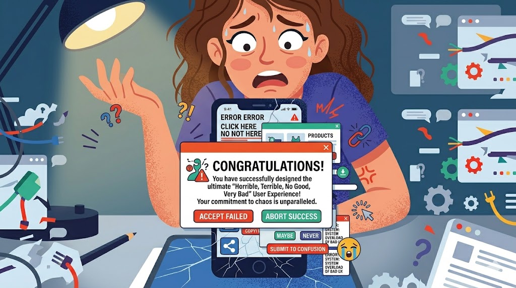
How to Design a Horrible, Terrible, No Good, Very Bad User Experience

How to Design a Horrible, Terrible, No Good, Very Bad User Experience

GUEST POST from Geoffrey A. Moore


Some of you may know that early in my career I taught English at the college level. The freshman writing requirement was always a challenge as textbook publishers struggled valiantly to find some reading material that would actually help students write better. One of their best efforts was an essay titled “How to Write an F Paper.” It turns out we learn better from failure than from success—who knew?

With that thought in mind, and taking liberties with the title of one of my favorite children’s books, I want to review an actual user experience delivered to me by the manufacturer of a luxury automobile. The vehicle itself performs admirably, so kudos to the product engineers. It is the customer experience team that needs to be taken to the woodshed.

Here’s how the experience starts. I get in my car, start it, and back out of my garage, benefiting as always from the rear camera system. The system stays on when I shift into drive until I get onto the road and have gone perhaps fifty yards. At that point, the multimedia display presents the following:

An update is ready for installation on your multimedia system. The following conditions must be agreed to before installation.
(READ NOW) (LATER)

Well, I am driving the car, so I don’t think READ NOW is a very good option. I hit LATER, the screen returns to normal, and I get on with my day. To tell the truth, I forget about the whole experience until the next day when, after backing out of my garage and getting onto the road, I get a replay of the same message. Astoundingly, I am driving my car again, so again I push LATER.

Now, as my spouse will testify, sometimes I am a slow learner, so it is not until the better part of a week has passed that I realize the only time I am going to get this message is the first time I start the car in the morning and have driven around fifty yards. At this point, I decide to pull over and push READ. Here is what I got in reply:

Software update for your infotainment system — In order to read the terms and conditions, please park the vehicle safely, switch off the ignition and apply the parking brake.

Well, as it turns out, the reason I got in my car and drove that first fifty yards is that I actually have someplace I need to get to on time, so the idea of switching off the ignition does not appeal. I go back, push the LATER button (feeling a bit like Neo in the Matrix at this point), sub-vocalize a few choice words for the vendor, and carry on with my day.

I won’t testify as to how many days after I had the same introductory message appear and pushed LATER because you guessed it, I actually had somewhere to go and wanted to arrive there on time. But, one day I had the opportunity to be parking somewhere for a good while, so that day I did not push either button until I got to the lot. (“You can fool some of the people all the time, and all of the people some of the time, but you cannot fool all the people all the time.”) Once parked, I did switch off my ignition and applied the parking brake, and was rewarded with the following messages.

Software update for your installation system

Notes
The installation process requires several minutes and cannot be canceled or closed. Individual functions and buttons in the vehicle are not available for use during the installation or their use is limited. The multimedia display does not support display messages.

In the unlikely event of a technical error during installation, functional restrictions of the multimedia system and the above-mentioned functions may persist and make it necessary to consult a workshop.

This is what happens when you let the legal team review the customer communications text. Fresh from their latest efforts with the Safe Harbor statement from the prior quarter’s earnings call, they are fiercely protecting their enterprise from any and every liability risk. Heartwarming as these words were, they actually felt they were not protection enough because they were followed by:

Warnings

During installation of this update, the multimedia system is not available. In particular, this includes systems such as the navigation system, phone, reversing camera, 360 camera, Active Parking Assist, Remote Parking Assist, PARKTRONIC, and the switch for DYNAMIC SELECT.

There is an increased risk of accident.

Installing the update while operating the vehicle may distract you from the traffic situation.

There is an increased risk of accident.

Carry out the installation

And yes, that last line is a call to action, clearly meant to benefit from the wave of inspiration created by the earlier sentences. My only surprise was that it did not append the phrase “at your own risk.”

Now, to be fair, I did carry out the installation, and it took about seven minutes or so, and it was fine. So again, the product engineers know what they are doing. But where in the name of all that is holy is the customer experience engineering? Who in their right mind would ever want their customers—and remember this is a luxury vehicle with some pretty high-end customers—to go through such an experience? And most importantly, what are the takeaways that will keep us from going down the same path?

Here are three that come to mind:

  1. Design the experience. Work backward from the end in mind, making sure each element is contributing to the desired outcome.
  2. Test the experience. Make this a real-world test, not a lab test. Recruit vehicle owners to participate. Capture their feedback.
  3. Eliminate friction. All hygiene processes entail some amount of friction. In such situations, your job is not to delight your customers here but rather to avoid annoying them. Do so by respecting their time.

In this case, what if the car company had sent me an email first? That could have included all their liability stuff. It also could coach me on when and how to best install the update. Once I replied I had read the stuff, then they could have sent a much simpler message over the multimedia system, or maybe just triggered the download on my behalf when my car was safely in my garage. The point is, there was clearly a better way, and just as clearly, nobody at the car company cared enough to advocate for it.

That’s what I think. What do you think?

Image Credit: Pexels, Geoffrey Moore

Subscribe to Human-Centered Change & Innovation WeeklySign up here to join 17,000+ leaders getting Human-Centered Change & Innovation Weekly delivered to their inbox every week.

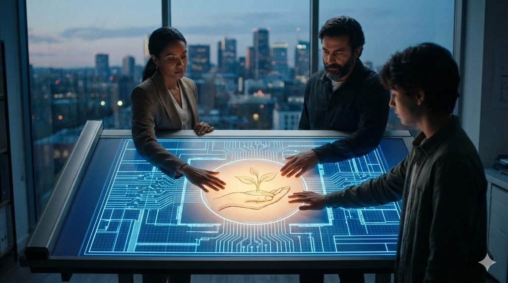
Why Zero UI Will Redefine Experience Design

The Invisible Interface

LAST UPDATED: May 2, 2026 at 9:13 AM

Why Zero UI Will Redefine Experience Design

GUEST POST from Art Inteligencia


I. Introduction: The End of the Glass Slab

The Screen Fatigue Phenomenon: We have reached a point of peak saturation with traditional displays. Our lives are currently mediated by glowing rectangles, leading to a fragmented human experience where the tool often overshadows the task.

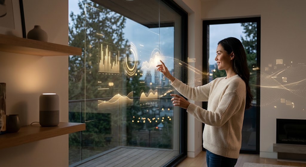
Defining Zero UI: This is not the absence of an interface, but the disappearance of the user interface as we know it. It represents a move away from rigid, button-heavy menus toward more organic inputs like voice, haptics, computer vision, and ambient intelligence.

The Core Thesis: Technology is at its most powerful when it is invisible. By removing the friction between human intent and technological execution, we allow people to return their focus to the experience itself, rather than the device required to facilitate it.

II. The Sensory Stack: How Zero UI Works

Voice & Natural Language: We are witnessing a transition from the “Command-Line Interface” era of voice (where specific keywords were required) to fluid, contextual conversations. The goal is a system that understands nuance, sarcasm, and intent, mirroring human-to-human interaction.

Biometrics & Gesture Control: In a Zero UI world, the body becomes the input device. Through computer vision and skeletal tracking, technology can interpret a wave of a hand or a shift in gaze, allowing for spatial computing that feels like an extension of natural movement.

Proactive vs. Reactive Design: Traditional UI waits for a user to click; Zero UI anticipates. By leveraging machine learning and sensor data, systems can predict needs—adjusting the lighting when you enter a room or preparing a summary of a meeting before you even ask for it.

Haptics & Sensory Feedback: Communication doesn’t always need to be audible or visual. Subtle vibrations (haptics) or environmental changes (thermal or olfactory cues) can provide “glanceable” information without demanding the user’s full cognitive attention.

III. From UX to HX (Human Experience)

Designing for Context: In the era of Zero UI, the focus shifts from “clicks” to “intent.” Experience design no longer lives within the boundaries of a screen; it must account for a user’s physical location, environmental noise levels, and even social setting. We aren’t just designing a path to a button; we are designing a response to a human moment.

Reducing Cognitive Load: The “Invisible Assistant” model moves us away from app management and toward outcome management. By utilizing ambient intelligence, technology handles the “how” so humans can focus on the “why.” This creates a “Calm UI” effect, where digital interactions support our life goals without demanding constant visual attention.

The Ethics of Invisibility: As interfaces disappear, the “Black Box” problem grows. Designers must prioritize radical transparency—ensuring users understand when and how they are being sensed. Trust becomes the primary currency; without clear consent and “off-switches” for predictive features, invisible interfaces risk becoming intrusive rather than helpful.

From Screens to Systems: We are moving toward “Sentient Interfaces” that detect hesitation or frustration through behavioral cues. Transitioning to HX (Human Experience) means building ecosystems that are emotionally aware, neuro-inclusive, and capable of failing gracefully when the AI misinterprets human intent.

IV. Leading Innovators: The Architects of Invisibility

The transition to Zero UI is being led by a diverse ecosystem of startups and legacy tech giants. As of 2026, the following organizations are moving beyond the screen to define the future of human-centered interaction:

Company / Startup Core Focus Why They Matter Now
Neuralink Brain-Computer Interface (BCI) Entering high-volume production in 2026, Neuralink is moving BCI from clinical trials to the ultimate seamless interface: thought-based control.
Ultraleap Mid-air Haptics & Tracking By projecting ultrasound waves onto the skin, they provide tactile feedback in mid-air, crucial for non-visual “touch” in automotive and XR environments.
SoundHound AI Agentic Voice Commerce Their latest “Amelia 7” platform allows users to manage complex real-world transactions—like dinner reservations and parking—entirely through natural conversation.
Memories.ai Contextual Wearables (LUCI) Following the pivot of early wearables like the Humane Ai Pin, Memories.ai is building the “Android of AI wearables,” providing a system-level reference for ambient intelligence.
Synchron Endovascular BCI A key competitor to Neuralink, Synchron focuses on minimally invasive brain interfaces that allow users to control digital devices via the blood vessels, emphasizing safety and accessibility.

Strategic Implementation: For brands, the challenge is no longer just “building an app.” It is about integrating into these emerging ecosystems. Whether it is through voice agents or haptic-enabled environments, the goal for designers is to ensure their brand’s presence is felt and heard, even when it cannot be seen.

V. The Futurologist’s Perspective: What’s Next?

The Transition to “Liquid Services”: In 2026, we are moving away from the “static app” model. Instead, we are entering the era of liquid services—capabilities that flow seamlessly across devices. Your interaction might start as a voice command in the kitchen, continue as a haptic pulse on your wrist while walking, and conclude as a spatial projection in your vehicle. The interface is no longer a destination; it is a persistent, supportive presence.

Hyper-Personalization and Ambient Intelligence: One-size-fits-all design is dead. Leveraging what I call “Fortified Intelligence,” future systems will adapt in real-time to the individual’s neurodiversity, physical abilities, and current emotional state. Environments will become “sentient,” adjusting lighting, acoustics, and information density based on the user’s “Digital Persona” without a single manual adjustment.

The Challenge for Designers: Behavioral Architecture: The role of the designer is shifting from visual storytelling to behavioral and sensory architecture. We are no longer just drawing screens; we are defining the “rules of engagement” between humans and machines. This requires a Whole-Brain approach—part scientist to manage the data and part artist to inspire human connection. Success in this new landscape is measured by “Speed to Resilience” rather than just speed to market.

Reclaiming the Human Moment: Paradoxically, the more advanced our technology becomes, the more we value “human friction.” As Zero UI automates the logistical “drudge work” of life, experience design for the future will emphasize the things AI cannot replicate: intentional inefficiency, the warmth of human presence, and the physical tangibility of the world around us. We are designing technology to get it out of the way, so we can finally be human again.

VI. Conclusion: Reclaiming the Human Moment

Beyond Efficiency: As I often say, true innovation isn’t just about making things faster or cheaper—it’s about making things more human. Zero UI is the final step in removing the technical debt of the 21st century. By dissolving the “glass slab” that separates us from our tasks, we aren’t just improving efficiency; we are restoring presence. When the technology disappears, we are finally free to focus on the work that matters and the people who inspire us.

A Call for Design Integrity: As we look toward the 2030s, the “Wild West” era of digital interfaces is closing. We are entering an era of Structural Integrity in experience design. Designers and innovation leaders must move beyond “Process Theater”—workshops that generate ideas without outcomes—and start building the resilient, invisible infrastructure that supports a flourishing society. We must have the courage to design a future that doesn’t require us to retreat into the friction of the past.

Final Thought: The most disruptive interface is the one that doesn’t exist because it works so well you’ve forgotten it’s there. The goal of the Invisible Interface is not to automate the human out of the loop, but to close the loop on friction, leaving only the experience behind. Let’s design an infrastructure that doesn’t just survive the future, but defines it.

Are you ready to move from UX to HX?

If you’re looking to get to the future first, increase your speed of innovation, or create a culture of continuous transformation, connect with Braden Kelley for a keynote or a FutureHacking™ workshop to teach you to be your own futurist.

Frequently Asked Questions

What is the difference between Zero UI and traditional UI?

Traditional UI (User Interface) relies on visual elements like screens, buttons, and menus to facilitate interaction. Zero UI moves away from these “glass slabs,” instead utilizing natural human behaviors—such as voice, gestures, haptics, and ambient intelligence—to interact with technology without a physical screen as the primary mediator.

How does Zero UI improve the Human Experience (HX)?

By reducing cognitive load and removing the friction of navigating complex menus, Zero UI allows technology to become a proactive assistant rather than a reactive tool. This shift toward “Human Experience” prioritizes context and intent, allowing users to stay present in their physical environment while still benefiting from digital capabilities.

Is Zero UI secure and private?

As interfaces become invisible, transparency becomes the most critical design element. Leading innovators are focusing on “Privacy by Design,” ensuring that ambient sensing and voice processing are handled with clear consent and robust encryption, often processing data locally (on-edge) rather than in the cloud to maintain user trust.

Disclaimer: This article speculates on the potential future applications of cutting-edge scientific research. While based on current scientific understanding, the practical realization of these concepts may vary in timeline and feasibility and are subject to ongoing research and development.

Image credits: Gemini

Subscribe to Human-Centered Change & Innovation WeeklySign up here to get Human-Centered Change & Innovation Weekly delivered to your inbox every week.

A Tiny Bit of Uninterrupted Work Goes a Long Way

A Tiny Bit of Uninterrupted Work Goes a Long Way

GUEST POST from Mike Shipulski

If your day doesn’t start with a list of things you want to get done, there’s little chance you’ll get them done. What if you spent thirty minutes to define what you want to get done and then spent an hour getting them done? In ninety minutes you’ll have made a significant dent in the most important work. It doesn’t sound like a big deal, but it’s bigger than big. Question: How often do you work for thirty minutes without interruptions?

Switching costs are high, but we don’t behave that way. Once interrupted, what if it takes ten minutes to get back into the groove? What if it takes fifteen minutes? What if you’re interrupted every ten or fifteen minutes? Question: What if the minimum time block to do real thinking is thirty minutes of uninterrupted time?

Let’s assume for your average week you carve out sixty minutes of uninterrupted time each day to do meaningful work, then, doing as I propose – spending thirty minutes planning and sixty minutes doing something meaningful every day – increases your meaningful work by 50%. Not bad. And if for your average week you currently spend thirty contiguous minutes each day doing deep work, the proposed ninety-minute arrangement increases your meaningful work by 200%. A big deal. And if you only work for thirty minutes three out of five days, the ninety-minute arrangement increases your meaningful work by 400%. A night and day difference.

Question: How many times per week do you spend thirty minutes of uninterrupted time working on the most important things? How would things change if every day you spent thirty minutes planning and sixty minutes doing the most important work?

Great idea, but with today’s business culture there’s no way to block out ninety minutes of uninterrupted time. To that I say, before going to work, plan for thirty minutes at home. And set up a sixty-minute recurring meeting with yourself first thing every morning and do sixty minutes of uninterrupted work. And if you can’t sit at your desk without being interrupted, hold the sixty-minute meeting with yourself in a location where you won’t be interrupted. And, to make up for the thirty minutes you spent planning at home, leave thirty minutes early.

No way. Can’t do it. Won’t work.

It will work. Here’s why. Over the course of a month, you’ll have done at least 50% more real work than everyone else. And, because your work time is uninterrupted, the quality of your work will be better than everyone else’s. And, because you spend time planning, you will work on the most important things. More deep work, higher quality working conditions, and regular planning. You can’t beat that, even if it’s only sixty to ninety minutes per day.

The math works because in our normal working mode, we don’t spend much time working in an uninterrupted way. Do the math for yourself. Sum the number of minutes per week you spend working at least thirty minutes at time. And whatever the number, figure out a way to increase the minutes by 50%. A small number of minutes will make a big difference.

Image credit: Pexels

Subscribe to Human-Centered Change & Innovation WeeklySign up here to join 17,000+ leaders getting Human-Centered Change & Innovation Weekly delivered to their inbox every week.

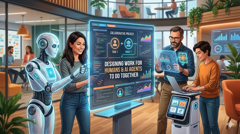
Designing Work for Humans and AI Agents to Do Together

LAST UPDATED: April 29, 2026 at 6:28 PM

Designing Work for Humans and AI Agents to Do Together

by Braden Kelley and Art Inteligencia


The Work Design Gap

We are not struggling to build artificial intelligence. We are struggling to design work for it.

Across industries, organizations are layering AI onto workflows that were never meant for collaboration. The result is predictable: inefficiency, mistrust, and unrealized value.

The real divide is not human versus AI. It is between work that is intentionally designed for collaboration and work that is not.

Why Traditional Tools Fail Us

Most of our management tools were built for a different era.

  • Process maps assume predictability
  • Org charts assume static roles
  • RACI models assume clear ownership

But human and AI collaboration is dynamic, contextual, and continuously learning. These tools help us optimize yesterday’s work, not design tomorrow’s.

What we need is a new visual language for collaboration.

Introducing the Human–AI Collaboration Canvas

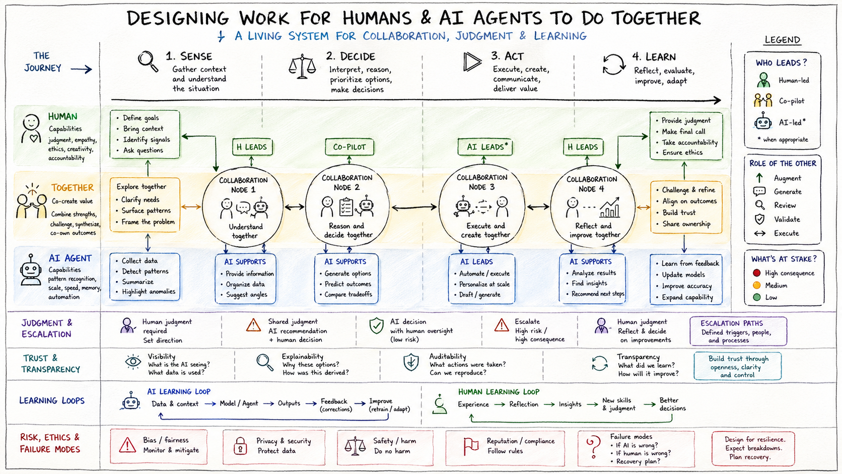
The infographic below is not just a diagram. It is a thinking tool.

Its purpose is to make invisible interactions visible, clarify roles without over-constraining them, and embed judgment, trust, and learning into how work gets done.

This is a shift from process design to system design for collaboration.

Designing Work for Humans and AI Infographic

The Three-Lane Model: A More Honest Representation of Work

The canvas is built around three interconnected lanes:

The Human Lane

Where judgment, empathy, ethics, and accountability live. Humans frame the problem, not just solve it.

The AI Agent Lane

Where scale, speed, pattern recognition, and automation operate. AI expands what is possible.

The “Together” Lane

This is where value is actually created. Co-creation, co-decision, and co-learning happen here.

If you are not explicitly designing the middle lane, you are leaving value on the table.

The Work Journey: Sense → Decide → Act → Learn

Instead of rigid workflows, the canvas maps work as an adaptive cycle:

  • Sense: Understand context and gather signals
  • Decide: Blend human reasoning with AI recommendations
  • Act: Execute with scale and oversight
  • Learn: Reflect, adapt, and improve

Learning is not the end of the process. It feeds everything.

Collaboration Nodes: Where the Magic (or Failure) Happens

At key points in the journey are collaboration nodes—the moments where humans and AI interact.

Each node forces three critical questions:

  • Who leads?
  • What is the role of the other?
  • What is at stake?

Most AI failures are not technical failures. They are interaction design failures.

Making Judgment Visible

One of the biggest risks in AI adoption is invisible decision-making.

The canvas highlights:

  • Where human judgment is required
  • Where AI recommendations are sufficient
  • Where escalation is necessary

Automation without explicit judgment design is just risk at scale.

Designing for Trust, Not Just Performance

Capability alone is not enough. Systems must be trusted to be used effectively.

This requires:

  • Transparency
  • Explainability
  • Auditability

The real question is not “Can the AI do this?” but “Will humans trust and use this appropriately?”

Learning Loops: The System That Gets Smarter

The canvas includes two reinforcing learning loops:

  • AI Learning Loop: Data → Model → Output → Feedback → Improvement
  • Human Learning Loop: Experience → Reflection → Insight → Better decisions

The real competitive advantage is not AI itself. It is how quickly your combined system learns.

Risk, Ethics, and Failure by Design

No system is perfect. The best systems are designed with failure in mind.

The canvas highlights:

  • Bias and fairness
  • Privacy and security
  • Safety and compliance

It also asks essential questions:

  • What happens if the AI is wrong?
  • What happens if the human is wrong?
  • How do we recover?

Resilience comes from designing for breakdowns, not ignoring them.

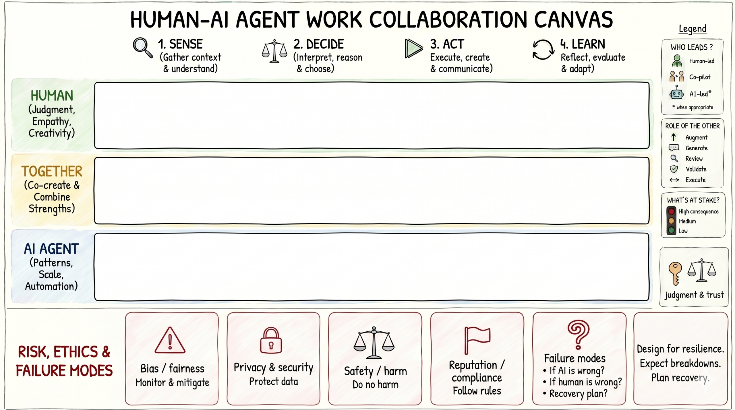
Human-AI Agent Work Collaboration Canvas

How to Use This Canvas

This is a practical tool, not a theoretical one.

  • Use it in workshops to map collaboration
  • Audit existing workflows
  • Design new human–AI systems from scratch

A simple place to start:

  1. Map one critical workflow
  2. Identify collaboration nodes
  3. Redesign the “together” lane first

Designing for a More Human Future

AI does not reduce the need for humans. It raises the bar for how we design work.

The goal is not efficiency alone. The goal is better decisions, better experiences, and better outcomes.

The organizations that win will not be the ones with the most AI. They will be the ones who best design how humans and AI work together.

EDITOR’S NOTE: You should read this article too to learn more about atomizing work for man and machine to do together.

Content Authenticity Statement: The topic area, key elements to focus on, etc. were decisions made by Braden Kelley, with a little help from ChatGPT and Google Gemini to clean up the article, add images and create infographics.

Image credits: Google Gemini, ChatGPT

Subscribe to Human-Centered Change & Innovation WeeklySign up here to get Human-Centered Change & Innovation Weekly delivered to your inbox every week.

Aesthetics – Part Two

Aesthetics - Part Two

GUEST POST from Geoffrey A. Moore


From The Cambridge Dictionary of Philosophy entry on Aesthetics

Philosophy of art has also dealt with the nature of taste, beauty, imagination, creativity, representation, expression, and expressiveness; style; whether artworks convey knowledge or truth; the nature of narrative and metaphor; the importance of genre; the ontological status of artworks; and the character of our emotional responses to art.

This is in essence a laundry list of the things I find compelling about esthetics, and in this essay, I plan to dig into each one of them.

Taste

Here’s how the Oxford English Dictionary defines taste relative to esthetics:

OED: 8. The sense of what is appropriate, harmonious, or beautiful; esp. discernment and appreciation of the beautiful in nature or art; spec. the faculty of perceiving and enjoying what is excellent in art, literature, and the like.

Note the struggle here to insert an analytical capability into a pre-linguistic experience. Sense is pre-linguistic, discernment and appreciation are post-linguistic, and faculty is an attempt to unify the two as an analytical skill. In my view, esthetic experience is a two-step process, where sense governs step 1, and discernment governs step 2. This is directly analogous to Coleridge’s primary and secondary imagination, the former coming up with innovations, the latter imposing shape and form upon them. Provided we maintain a disciplined separation between the two steps, we can indeed call this a faculty.

This begs a bigger question, however. How does the pre-linguistic capability of sense recognize what is appropriate, harmonious, or beautiful in the first place? What is the connection between the external and the internal?

Beauty

This is as close as we are going to get to the external pole of esthetic experience, the thing that causes the impact on the internal pole, our conscious self.

OED: 1. Such combined perfection of form and charm of coloring as affords keen pleasure to the sense of sight.

OED: 2. That quality or combination of qualities which affords keen pleasure to other senses (e.g. that of hearing), or which charms the intellectual or moral faculties, through inherent grace, or fitness to a desired end.

Look how out of its depth the OED is here! It is forced to use the word charm twice to invoke little more than inexplicable magic. It is not that I disagree with the word, but what the hell does it mean? OK, let’s ask the OED again:

OED: 3. Any quality, attribute, trait, feature, etc., which exerts a fascinating or attractive influence, exciting love, or admiration.

OK, I agree that beauty has charm, but that does not explain its force, it only labels it. Why is beauty charming? What is it that is fascinating or attractive, exciting our love or admiration?

At the material level, with visual arts, the consensus is that it is due to a combination of color and form that strikes us as harmonious, another word that I agree with but that also seems mystical. But here I think we can make a connection with the experience of mindfulness by asserting that the harmony involved in both experiences is the same. That would suggest that beauty is a spiritually refreshing experience, that it homeostatically returns us to a state of well-being. One virtue of this notion is that it makes it easy to bridge to other arts, like music, where form and color are not the active ingredients, but venturing out and returning to a state of well-being is still in play.

To be fair, for some at least, well-being itself may also be a mystical term, foreshadowing the possibility of an infinite regress of definitions as the analytical intellect struggles to engage with ineffable experiences, but I am willing to stop here and say, from a Darwinian perspective, it makes sense to me that homeostasis is real and relatively prevalent, that it is core to well-being, and that evolution would select for experiences that reinforce it as conferring competitive advantage in human affairs.

Imagination and Creativity

Both these topics extend far beyond the domain of esthetics and the philosophy of art and, if pursued at length, will lead us far off-topic. Within the domain of esthetics, both terms communicate admiration for the ingenuity of the artists who have in some way surprised us with their work. Surprise itself is an integral part of esthetic experience which we will address subsequently.

What we want to investigate here is the presence of the artist in the esthetic experience. In one sense, the artist is not present. We experience the artwork in their absence. But as we engage with multiple works from the same artist, we develop a sense of their style, their values, their topics of interest, and the like. We say things like, “I love Dylan,” or “I can’t stand Proust,” and both statements serve to summarize our esthetic experiences of their work. Where this goes awry, in my view, is when we drag the artist out onto center stage, creating a cult of personality—not a bad thing in itself necessarily, but outside the bounds of esthetics.

Representation, Expression, and Expressiveness

This collection of three terms manifests a tug of war between the Enlightenment and Romanticism about where to anchor the esthetic experience. The Enlightenment focuses on representation as the interaction between the art object, the experiencing subject, and the world at large, positioning art as a subject-object experience that upon absorption reshapes our subject-world experience. In this context, the role of esthetics is to critique the art in relation to the world—how well does the art represent the world to us, and how much has it changed our perception of things? The artist is not directly part of this equation.

By contrast, in the Romantic esthetic, the artist does take center stage. Art is positioned as a subject-object-subject experience, the artifact bridging between the artist and us rather than us and the world. Expression refers to what the artist puts into the artifact, and expressiveness refers to how much of that comes out of the experiencer’s end. For Romantics, this is at the heart of the esthetic experience. For followers of the Enlightenment, it is more of a distraction. They are looking for a solo experience that centers them with respect to the world at large, not a dialectic experience that destabilizes that relationship.

Style

Style is a secondary attribute of esthetics in that one can have style without esthetics, as with a cartoon, as well as esthetics without style, as with a natural landscape. That said, for the Romantics, with their focus on artistic expression, style does indeed “maketh the experience.” It serves as a bridge into the artist’s vision of the world, a way of seeing and being that can be transformative for the experiencer. For the Enlightenment, on the other hand, style is more of a societal asset. It has classic roots in proportion and harmony, attributes that are taken to transcend individual experience, understood instead as autonomously real. Both of these traditions make style more central to art than it was taken to be in the Early Modern period. At that time poetry was said to “teach and delight,” with commentators calling out style—the Elizabethans would have said rhetoric—as one of the chief sources of delight. Indeed, there were handbooks galore about how one could decorate one’s writing and speech with beautiful figures. This represents an early stage of playful euphoria when vernacular languages were displacing Latin across the entire spectrum of European culture.

Today, while all three of these views are still in play, contemporary criticism is often more interested in a fourth—style as a medium for communicating subtext, a mechanism for teasing nuances out of the more overt dimensions of the artwork. Juxtaposition of seemingly unrelated elements reframes our experience of what otherwise would be familiar and taken for granted. The work engages the experiencers’ analytical facilities in the midst of the fantasy experience, a distancing effect that makes them both participant and observer at the same time, accentuating their perception of irony, a cornerstone of the modern esthetic.

Do artworks convey knowledge or truth?

Although this question is intended to help us learn more about art, it introduces two very elusive concepts of its own, namely knowledge and truth, so we need to tread carefully. Nonetheless, the question is a valid one, and we owe it an answer.

To the degree that knowledge and truth are understood to consist of language-enabled statements, the answer is no, artworks do not convey either one. This is the Enlightenment’s position, one that caused it to turn to the concept of taste instead. By contrast, to the degree that knowledge and truth are conceived to transcend language-enabled understanding, meaning that they can reside beyond the scope and ken of reason, then the answer is yes. This is Romanticism’s claim, one that called it to substitute art for religion as a portal to spiritual experience.

Both these positions, however, are unsatisfactory. To be fair, the Enlightenment self-corrected itself in part by directing attention to the sublime, something that since antiquity had always been conceived as transcending reason. But at the end of the day, that did not open any new path to incorporating esthetic experience into one’s overall understanding of the world. The barrier of taste stood firmly in the way. The Romantics, by contrast, embraced transcendence wholeheartedly. Its problem was that it could not access it reliably. That is, neither nature nor art is able to consistently evoke the spiritual refreshment that Romantics value so highly. One is left in a state of anticipation, broken by occasional inspirational moments, but how and when they come at some times and not at others is a mystery. Indeed, the whole claim is a mystery, one that is hard to reconcile with any claims to knowledge or truth.

Contemporary culture, specifically the post-modern wing, dodges these issues by calling into question the reality of both knowledge and truth. Pragmatically, this is just a mistake. The reason we have words for both knowledge and truth is that they represent forces at work in the world that are relevant to our strategies for living. The fact that they are hard to come to grips with does not warrant dismissing them altogether. With that in mind, let us return to our original question: do artworks convey knowledge or truth?

Set aside the incidental communication of information that might accompany an esthetic experience, and focus instead on the experience itself. An external force has, with your permission, taken possession of your faculties and is manipulating your mind to its own ends. This force can be extraordinarily effective at creating belief. Whether that belief represents knowledge or truth cannot be determined from within the experience. Once the experience is over, we can analyze our memory of it, and in that context determine if it warrants being called “justified true belief,” which is philosophy’s gold standard for defining knowledge.

The nature of narrative and metaphor

Narrative and metaphor are two of humanity’s superpowers. Narrative is our most ubiquitous problem-solving tool. Each step in a story implies a cause-and-effect relationship that then can be tested by analytics for credibility. That’s the core function of criticism. Similarly, metaphor is one of our most ubiquitous innovation tools. Each instance proposes a strategic correlation between apparently dissimilar domains, whereby the tactics that have proven successful in the first domain are implicitly applied to address unsolved problems in the second. Again, this too must be tested, either by analytics or experiment.

In this context, what are the esthetic dimensions of narrative and metaphor? What makes for a good story or a good metaphor? I would vote for an experienced tension between expectations and fulfillment which both surprises and enlightens. In narrative, think of Sir Gawain and the Green Knight. What we expect is going to happen in that final encounter and what actually does happen is both surprising and enlightening. Similarly, with respect to metaphor, think of Ezra Pound’s “In a Station of the Metro”:

The apparition of these faces in the crowd:

Petals on a wet, black bough.

In this most industrial of situations, we are surprised and enlightened to find a kind of beauty we thought belonged only in nature.

The importance of genre

To the degree that surprise and enlightenment are core to esthetic experience, genre somewhat surprisingly takes center stage. It sets audience expectations through its established conventions. If it is a comedy, we know that our protagonists will be OK in the end; if it is a tragedy, they will not. To the degree that a given work of art fulfills our expectations, we are pleased but not enlightened. Indeed, if there are no deviations at all—what is often called the domain of stock response—we are likely to get bored and maybe even offended. At the other end of the spectrum, if the work refuses to provide any signals as to genre, we typically ignore it as we have not been invited to participate. However, when a work of art creates expectations and then deviates from them as it unfolds, we can experience a variety of reactions—intrigue, annoyance, doubt, curiosity, and others. The point is, it has engaged us. We are having an esthetic experience whether we like it or not.

Genre creates the bulk of its expectations around beginnings and endings, the former inviting us to open up our minds to engage with and be manipulated by an external force, the latter to bring that experience to a close and initiate any reflections we may have about it. The extent to which art invades our privacy is extraordinary, and so it is natural that we have developed defenses against it. Genres offer an implied contract with respect to what is within bounds and what is off limits. This allows us to prepare ourselves for what is to come, including the option of excluding it altogether (I do not watch horror movies, for example).

Norman Holland gave us a great acronym for understanding this relationship: DFT, which stands for Defense, Fantasy, and Transformation. My contribution is to add an E to it, making it DEFT, where E stands for Expectation. The esthetic experience, in other words, unfolds through four stages, as follows:

  1. Defense. Because art is inherently intrusive—indeed, manipulative—we all have psychological defenses against letting it in. The function of movie trailers, book covers, and online reviews is to get us to take down our defensive barrier and let this particular artwork in. We should keep in mind that this is a relatively rare occurrence. Most shows we do not watch. Most books we do not read. Most museums we do not attend.
  2. Expectation. The way art gets past our defenses is by using genre signals to create an expectation of getting an experience we would like. We know we are being “sold,” but we also are looking for experiences of some sort, and so we are potentially willing to “buy.”
  3. Fantasy. This is the pay-off, the essence of the esthetic experience. The term applies most directly to fiction where we internally imagine scenes based on nothing more than words we are reading. But visual and performative arts also enlist our imaginations, personalizing our experiences such that no two are identical, not even when we are the experiencer both times. These experiences are so intimate and engaging that we have developed an entire discipline to help us interpret them. It is called criticism.
  4. Transformation. Transformation is the business of criticism. We seek to extract from the residue of our fantasy experience ideas that we can incorporate into our strategy for living. We do this both through reflection and conversation, but regardless of the mode, the only evidence we have is our memories of the fantasy experience, and every one of those memories is unique, not only in place (whose memory) but also in time of recall (because memories change every time they are reexperienced). Nonetheless, we persist because these memories are now part of who we are, and if we fail to understand them, we fail to understand ourselves.

Genre participates directly in each of the four steps above, helping bypass our defenses (hey, it’s just an action movie), creating expectations (and it’s from the Marvel universe), teeing us up for fantasy (the viewing experience in which we let the movie take over our mind), and triggering a transformation conversation when it is over (I think Iron Man may need some counseling, or maybe I do).

The ontological status of artworks

Art consists of artifacts whose primary purpose is to deliver an experience as opposed to accomplishing a task. Typically, they do so by engaging the imagination of the participant in a fantasy shaped through either a sensory stimulus (painting, sculpture, dance, music, and the like) or a language act (stories, poetry, novels, and the like) or a combination of the two (plays, films, opera, and the like). We assign these artifacts a special status because we evaluate them not only on their craft but also on the quality of the experiences they evoke. Assessing that quality, its impact, and the contribution that craft makes to it is the purpose of esthetics.

The realm of esthetics extends well beyond the fine arts. In contemporary culture, for example, cuisine has taken center stage, for even as it performs a utilitarian task, it also creates emotional experiences of considerable force, particularly when tied to family, ethnic, or personal traditions. Proust’s Madeleine is a famous psychological example, but today the focus is more on cultural ties, where esthetics helps promote cross-cultural connections that can reinforce social cohesion. Similar esthetic circles form around cars and personal attire, really any field of life where identity binds itself to experiences that go beyond utility. The dialog is typically a mixture of the practical and the esthetic, the two fusing into a kind of expertise that goes viral on digital media, which brings us to our last topic.

The character of our emotional responses to art

One way to characterize our responses to art is in relation to our emerging knowledge of how our brains actually work. Our consciousness resides in the neocortex, that part of the brain we see from the outside that looks something like a cauliflower. The neurons in the neocortex are optimized to perform two functions:

  1. Engage with the things and events that are happening around us and initiate appropriate responses to them, and
  2. Imagine how such things and events might be different, and what such differences might lead to in terms of alternative responses.

It turns out that the very same neurons that perform function 1 also perform function 2, which makes for some interesting implications:

  • Each function trains the other one. That is, experience in the world feeds the imagination with material to work on, and imagined experiences expand the repertoire of alternatives our engagement function can draw upon.
  • Because the exact same neurons are used in both cases, the functions are mutually exclusive, meaning you can’t engage with the world when you are imagining, and you can’t imagine things when you are engaging with the world.

These implications cast important light on two elements of our response to art. The first is that we are drawn to it naturally. That is, evolution favors constructive use of imagination, and imagination is enhanced by engaging with art. Esthetics in this context investigates the specifics of the attraction itself, what elements in the art motivate us to attend to it, and the impact the experience has on our ability to engage with the world thereafter.

The second point, that we cannot both imagine and engage at the same time, speaks to the question of whether there is a specific attitude one must take in order to appreciate art. The answer is, yes, but it is totally involuntary. The notion that one must train oneself to adopt the appropriate attitude is yet another example of the analytical intellect overstepping its bounds. Analysis is fundamental to Transformation, but it has no role in Fantasy.

Our emotional responses to art touch all four phases of the esthetic experience. That is, our Defense against art we don’t like is driven by an emotional rejection we often are unable to explain. In contrast, our Expectation that some art will please us is driven by desires we are only too willing to explain. Regardless of our expectations, our Fantasy experience is highly varied with respect to emotion, which often correlates with how much or how little we value the art in question. Finally, our Transformation experience seeks to assess the impact of whatever emotion we did experience when recollected in tranquility.

That’s what I think. What do you think?

Click here to Read Part 1 if you missed it

Image Credit: Pexels

Subscribe to Human-Centered Change & Innovation WeeklySign up here to join 17,000+ leaders getting Human-Centered Change & Innovation Weekly delivered to their inbox every week.

Aesthetics – Part One

Aesthetics - Part One

GUEST POST from Geoffrey A. Moore

The Infinite Staircase offers readers a metaphysics and an ethics shaped by the 21st century’s understanding of how the world came to be. It has little to say, however about esthetics, and that is too large a part of human experience to neglect. With that in mind, I am going to address the topic in two short essays.

The first essay, the one you have in hand, is an interaction with The Cambridge Dictionary of Philosophy’s entry on the topic. I found myself constantly quarreling with it, and I wanted to sort out why, hence this piece. What I see now is that I was clearing a space to dig deeper into the issues I truly care about. That’s what the second essay is intended to do.

Of course, this begs the question, do you even need to read this essay? I mean, just because I have to clear my throat before I speak doesn’t mean you have to listen to it. That said, if you are academically oriented, or have ever taken courses in philosophy, I suggest you do read this if only to clarify your own point of view. If, on the other hand, you are simply interested in the nature of the esthetic experience itself, feel free to ignore this piece, but do keep an eye out for the next essay.

Essay #1: A Dialog with Cambridge

NOTE: The format of the dialog is to present the Cambridge material in blockquote format and my responses to it in normal text.

Aesthetics: the branch of philosophy that examines the nature of art and the character of our experience of art and of the natural environment.

The purpose of esthetics, as of any academic discipline, is to investigate a body of forces in order to better understand its nature and determine how best to incorporate it into our strategies for living. In the case of esthetics, the forces under study create psychological experiences, and it is these experiences that provide the data upon which the discipline is based.

Because the concept of experience is central to the understanding of esthetics, we need to get clear about its meaning. In particular, we need to distinguish between two common understandings of the term, one of which is central, the other of which is tangential to our purposes.

Here are the two definitions, taken from the Oxford English Dictionary:

  1. The actual observation of facts or events considered as a source of knowledge.
  2. The fact of being consciously the subject of a state or condition, or of being consciously affected by an event.

Definition 2 is the one that is central to our purpose. We are interested in the impact of an object on a subject, what it is like to be “consciously affected,” something that depends very much on the properties of both the subject and the object. We investigate this experience first by examining the residue of its impact on the subject and then by seeking attributes in the object that account for it.

This is where Definition 1 comes in. It is a tactic we use in pursuing a better understanding of what is happening under Definition 2. But we need to be careful here as we cannot objectively observe the facts in question—they are inherently subjective and can only be contemplated internally or reported externally. That means there can be no purely objective basis for esthetics. We must keep both subject and object in view at all times, focusing specifically on what is happening when we are being internally affected by an externally occasioned event.

It emerged as a separate field of philosophical inquiry during the eighteenth century in England and on the Continent. Recognition of aesthetics as a separate branch of philosophy coincided with the development of theories of art that grouped together painting, poetry, sculpture, music, and dance (and often landscape gardening) as the same kind of thing, les beaux arts, or the fine arts.

The fine arts are indeed all within the scope of esthetics. As a group, however, they are highly refined. Their force tends to be more ethereal than many people can experience, particularly modern audiences that are more global and less privileged than the eighteenth century thinkers who created the concept initially. As a result, we should not position the fine arts as the centerpoint of our category but rather at one end of a more inclusive spectrum, albeit one we have as yet to define.

Baumgarten coined the term ‘aesthetics’ in his Reflections on Poetry (1735) as the name for one of the two branches of the study of knowledge, i.e. for the study of sensory experience coupled with feeling, which he argued provided a different type of knowledge from the distinct, abstract ideas studied by “logic.” He derived it from the ancient Greek aisthanomai (to perceive), and “the aesthetic” has always been intimately connected with sensory experience and the kinds of feelings it arouses.

“Sensory experience coupled with feeling” is as good a starting point as any for capturing the full spectrum of aesthetic experience. It is still too general, as there are many such experiences that are not aesthetic, but it gives us a point of departure. The challenge is that when we try to convert any such experience into knowledge, of necessity we must express ourselves in language, and this can be confusing because the experience itself is pre-linguistic.

That is, to use the framework of The Infinite Staircase, sensory experience coupled with feeling takes place on the stairs of desire, consciousness, values, and culture—all prior to the stairs of language, narrative, analytics, and theory. When we use these higher stairs to explain what is happening on the lower ones, we are prone to imposing their structure in ways that ride roughshod over the subtleties of the actual experience. This is reflected throughout the list of questions that follow.

Questions specific to the field of esthetics are: Is there a special attitude, the aesthetic attitude, which we should take toward works of art and the natural environment, and what is it like?

The answer is no. This is an example of analytics seeking to reposition experiences that arise from below by proposing that they descend from above. That is, the refined analytical intellect is positioning itself at the center of an experience during which it was not even present. This is a big mistake, one that implies aesthetic experiences are reserved for the few who possess refined sensibilities when in fact they are universal.

Is there a distinctive type of experience, an aesthetic experience, and what is it?

The answer is yes, and in the lexicon of philosophy, it falls into the category of qualia. The entry on qualia from Wikipedia provides a useful introduction, defining it as subjective conscious experiences, examples of which include the perceived sensation of pain of a headache, the taste of wine, and the redness of an evening sky. As qualitative characteristics of sensation, qualia stand in contrast to propositional attitudes, where the focus is on beliefs about experience rather than what it is directly like to be experiencing.

Now, to be fair, pain does not qualify as an aesthetic experience, but the taste of wine and the color of red certainly do. The key point is that all the examples stand in contrast to propositional attitudes, the domain of analytics, which can be about aesthetic experience but not integral to it.

Is there a special object of attention that we can call the aesthetic object?

Yes, there is. It is whatever body of forces that are creating the impact on the subject, be that the wine, the evening sky, a painting, a story, or a piece of wood. But the object alone cannot be said to be inherently aesthetic. Only after it has evoked a sensory experience coupled with feeling can it be so termed, and then only with respect to subjects in whom that experience has been evoked.

Finally, is there a distinctive value, aesthetic value, comparable with moral, epistemic, and religious values?

Yes, there is. To put things in perspective

  • Moral value consists of behavior that is beneficial to others and consistent with social norms.
  • Epistemic value consists of justified true beliefs that lead to effective action in the world.
  • Religious value consists of spiritual experiences and commitments that provide sacred and undeniable guidelines for life in the world.

In such a context, aesthetic value consists of pleasurable, contemplative, non-utilitarian, resonating experiences that we characterize as beautiful, refreshing, and inspiring.

Some questions overlap with those in the philosophy of art, such as those concerning the nature of beauty, and whether there is a faculty of taste that is exercised in judging the aesthetic character and value of natural objects or works of art.

The nature of beauty is indeed an elusive topic, one where we need to be humble, but with respect to the faculty of taste, we can be more assertive. In the eighteenth century, judgments of taste were appropriated by a social class that privileged refinement and intellect over sensibility and joy. In the nineteenth century, the Romantic movement aggressively worked to overthrow and reverse this polarity, and in the twentieth, cultural relativism worked to deny the validity of any aesthetic judgments that extended beyond the personal preferences of the person making them within the norms of the culture they are inhabiting. All three positions contain an element of truth, and none by itself does a good job of accounting for the overall nature of beauty. The good news is that they are not incompatible with one another, so a synthesis of all three can potentially provide a stable foundation for esthetic theory.

Aesthetics also encompasses the philosophy of art. The most central issue in the philosophy of art has been how to define ‘art’. Not all cultures have, or have had, a concept of art that coincides with the one that emerged in Western Europe during the seventeenth and eighteenth centuries. What justifies our applying our concept to the things people in these other cultures have produced?

It is justifiable to apply our concepts to our experience of things other cultures have produced and how they stack up against our cultural norms. We just should not apply them to their experiences or the status of the things in their culture. The temptation to do so derives from seeking to locate the aesthetic force solely in the object. That is not a tenable claim.

There are also many pictures (including paintings), songs, buildings, and bits of writing that are not art. What distinguishes those pictures, musical works, etc., that are art from those that are not?

They do not evoke the pleasurable, contemplative, non-utilitarian, resonating experiences we call beautiful, refreshing, and inspiring.

Various answers have been proposed that identify the distinguishing features of art in terms of form, expressiveness, intentions of the maker, and social roles or uses of the object.

None of these topics is off limits, but each one can take us down a rabbit hole if we try to use it as definitive of what constitutes art. That begs the question of how we would define art, but we will leave that to the second essay.

Since the eighteenth century, there have been debates about what kinds of things count as “art.” Some have argued that architecture and ceramics are not art because their functions are primarily utilitarian, and novels were for a long time not listed among the “fine arts” because they are not embodied in a sensuous medium. Debates continue to arise over new media and what may be new art forms, such as film, video, photography, performance art, found art, furniture, posters, earthworks, and computer and electronic art. Sculptures these days may be made out of dirt, feces, or various discarded and mass-produced objects, rather than marble or bronze. There is often an explicit rejection of craft and technique by twentieth-century artists, and the subject matter has expanded to include the banal and everyday, and not merely mythological, historical, and religious subjects as in years past. All of these developments raise questions about the relevance of the category of “fine” or “high” art.

When discussing esthetics in general, over-rotating to fine or high art is simply a mistake. It is a valid subcategory, but not to the exclusion of other sensory experiences coupled with esthetic feelings. Once again, we see the analytical intellect overstepping its bounds, seeking to impose itself as an arbiter of aesthetic value when its proper role is to be an interpreter of aesthetic experience.

Another set of issues in philosophy of art concerns how artworks are to be interpreted, appreciated, and understood. Some views emphasize that artworks are products of individual efforts, so that a work should be understood in light of the producer’s knowledge, skill, and intentions. Others see the meaning of a work as established by social conventions and practices of the artist’s own time, but which may not be known or understood by the producer. Still, others see meaning as established by the practices of the users, even if they were not in effect when the work was produced. Are there objective criteria or standards for evaluating individual artworks?

All these views are legitimate in their own right, provided we surface the context in which the judgment is made. What is not legitimate is to overrule a rival approach, asserting one’s own as the only valid one. Overall, the goal is to get as much insight as possible into the body of forces at work in an esthetic experience, any way we can.

There has been much disagreement over whether value judgments have universal validity, or whether there can be no disputing about taste if value judgments are relative to the tastes and interests of each individual (or to some group of individuals who share the same tastes and interests). A judgment such as “This is good” certainly seems to make a claim about the work itself, though such a claim is often based on the sort of feeling, understanding, or experience a person has obtained from the work. A work’s aesthetic or artistic value is generally distinguished from simply liking it. But is it possible to establish what sort(s) of knowledge or experience(s) any given work should provide to any suitably prepared perceiver, and what would it be to be suitably prepared?

With respect to this question, we should acknowledge that university degree programs in the humanities do purport to teach this kind of knowledge and thereby suitably prepare the perceiver to appreciate the works being studied. As a practical exercise, this is invaluable. Where things can go astray is when the judgment “this is good” floats free of its moorings in culture-specific subject-object relationships and imposes itself as objective fact.

It is a matter of contention whether a work’s aesthetic and artistic values are independent of its moral, political, or epistemic stance or impact.

They are independent. Clearly works of art can have moral, political, or epistemic dimensions, but these are outboard of the aesthetic dimension. When criticism seeks to interpret art through these kinds of filters, be they Marxist, feminist, deconstructionist, or the like, we have left the realm of the humanities behind and ceded authority instead to the social sciences.

Philosophy of art has also dealt with the nature of taste, beauty, imagination, creativity, representation, expression, and expressiveness; style; whether artworks convey knowledge or truth; the nature of narrative and metaphor; the importance of genre; the ontological status of artworks; and the character of our emotional responses to art.

The paragraph above represents a laundry list of what for me are all the interesting topics. It warrants an entire essay of its own. That will be the subject of the essay to follow.

Work in the field has always been influenced by philosophical theories of language or meaning, and theories of knowledge and perception, and continues to be heavily influenced by psychological and cultural theory, including versions of semiotics, psychoanalysis, cognitive psychology, feminism, and Marxism.

Here we see more ceding of authority to the social sciences. It is not that they have nothing to add. It is that they are appropriating the aesthetic experience to promote another agenda. That agenda may indeed be worthwhile, but it cannot substitute for aesthetic analysis.

Some theorists in the late twentieth century have denied that the aesthetic and the “fine arts” can legitimately be separated out and understood as separate, autonomous human phenomena; they argue instead that these conceptual categories themselves manifest and reinforce certain kinds of cultural attitudes and power relationships. These theorists urge that aesthetics can and should be eliminated as a separate field of study, and that “the aesthetic” should not be conceived as a special kind of value. They favor instead a critique of the roles that images (not only painting, but film, photography, and advertising), sounds, narrative, and three-dimensional constructions have in expressing and shaping human attitudes and experiences.

And this is the ultimate ceding of authority to the social sciences, to which I am viscerally opposed.

That’s what I think. What do you think?

Part Two coming soon!

Image Credit: Pexels

Subscribe to Human-Centered Change & Innovation WeeklySign up here to join 17,000+ leaders getting Human-Centered Change & Innovation Weekly delivered to their inbox every week.

7 Differences Between Interface Design and Experience Design

7 Differences Between Interface Design and Experience Design

by Braden Kelley and Chateau G Pato


What Is the Difference Between Interface Design and Experience Design? (Short Answer)

Seven differences between interface design and experience design: (1) what each designs, (2) the success question, (3) the boundary of the system, (4) how seams and handoffs are treated, (5) how stakes, emotion, and recovery are handled, (6) whether the operating model is in scope, and (7) what “done” and evidence look like. Interface design shapes the surface. Experience design shapes whether a human can finish the job with dignity — before, during, and after the screen. Soft landings fund both. Hard landings ship interface polish and call it UX.

How Should Leaders Define Interface Design vs Experience Design?

Interface design is the craft of controls, layouts, flows, and interaction patterns on a surface — screen, kiosk, voice UI, form — so people can act with clarity and low friction at that surface. Experience design is the craft of the end-to-end lived journey: jobs-to-be-done, emotions, seams, waiting, policy, human help, recovery, and operating-model fit — so people succeed across time and channels, not only inside one UI.

Organizations often hire “UX,” ship polished screens, and call the job done. Interface craft matters. It is not the whole experience. For trust beyond usability heuristics, see 11 Principles for Designing Trust (Not Just Usability). For how service systems manufacture misery even when channels look efficient, see 8 Service Design Mistakes That Create Efficient Misery.

Difference Interface Design Experience Design
Designs Surfaces, controls, interaction patterns End-to-end lived journey
Success question Can they use this UI? Can they finish the job with dignity?
Boundary Edge of the screen/session Before/after, other channels, humans, policy
Seams Often “out of scope” Core design material
Stakes / recovery Error states and microcopy Make-right, trust, powered recovery
Operating model Rarely in the Figma file Incentives, ownership, old path
“Done” / evidence Usability heuristics, task completion Behavior, effort, outcome, return

If the screen is green and the job still fails, you designed an interface — not an experience.

1. What Does Interface Design Design vs Experience Design?

Difference: The object of the craft.

Interface design: Layouts, components, navigation, and interaction patterns on a channel surface.

Experience design: The whole path a human lives — entry, struggle, wait, handoff, outcome, and memory.

Example: A clean checkout UI (interface) vs the journey from “I need this” through delivery anxiety, status silence, and return dignity (experience).

Tell you’re only doing interface work: Shipping a redesign of screens while the journey map still has no owner.

2. How Does the Success Question Differ?

Difference: The primary question the work answers.

Interface design: Can they complete tasks on this surface with low friction?

Experience design: Did they get the job done — functionally and emotionally — as they define success?

Example: High task-completion on “submit claim” (interface) vs claim actually paid without retelling and shame (experience).

Tell: Usability scores celebrated while recontact and quiet exits rise. Usability sits closer to the interface; experience includes trust and outcome dignity — not only whether the button was findable.

3. Where Does the System Boundary End?

Difference: What counts as “in scope.”

Interface design: Ends at the viewport, the app, or the form.

Experience design: Includes what happens before entry, after exit, in email/SMS/phone/store, and with other humans.

Example: A beautiful self-service portal (interface) vs unpaid homework assembling documents before anyone ever logs in (experience).

Tell: “That’s not UX — that’s operations” used to eject the hard parts. For friction that shows up before your map looks tidy, see 12 Friction Points Customers Feel Before Your Journey Map.

4. How Are Seams and Handoffs Treated?

Difference: How broken borders are treated.

Interface design: Handoffs to other teams and systems often become edge cases or dead ends.

Experience design: Seams are where journeys live — designed, owned, and instrumented.

Example: Smooth bot chat (interface) vs bot → agent retelling tax with lost context (experience failure).

Tell: Each channel looks good alone; the customer pays at the border. Those border failures are also where moments that matter more than NPS either earn trust or spend it.

5. How Do Stakes, Emotion, and Recovery Differ?

Difference: How failure and feeling are designed.

Interface design: Validation errors, empty states, microcopy, maybe a “contact us” link.

Experience design: Stakes matched to friction; recovery as a product; dignity when it breaks.

Example: Friendly 404 and undo on a form (interface) vs powered refund or rebook with a human who can finish (experience).

Tell: Apology UI without recovery power.

6. Is the Operating Model In Scope?

Difference: Whether work, policy, and power are design materials.

Interface design: Often assumes the process and incentives are fixed; UI wraps them.

Experience design: Redesigns jobs, decision rights, fine print, and old paths when they block human success.

Example: A sleek approval screen (interface) vs an exception that still needs three supervisors and punishes care (experience still broken).

Tell: “We redesigned the UI” while policy and metrics still manufacture misery. Framing questions that beat a requirements dump help here — see 10 Design Questions That Beat a Requirements Document.

7. What Does “Done” and Evidence Look Like?

Difference: The finish line and proof.

Interface design: Design-system consistency, heuristic review, moderated usability for key tasks.

Experience design: Adopted behavior, effort down, seams owned, recovery used, outcomes that hold — evidence from the lived journey.

Example: Stakeholders love the prototype (interface theater) vs median user time-to-confidence and job completion move in production (experience).

Tell: Demo applause as the definition of done.

How Do You Run a Design-Scope Check Before the Next Release?

Before the next release, ask five questions: Are we designing a surface or a journey? Where does the job actually start and end? Which seam has an owner? What happens when it fails — with what power? What evidence would prove experience success — not only interface usability?

Polish the interface. Design the experience. Don’t confuse the two on the roadmap.

FAQ: Interface Design vs Experience Design

What is the difference between interface design and experience design?

Interface design crafts the surface — controls, layouts, and interaction patterns so people can act clearly on a screen or channel. Experience design crafts the end-to-end lived journey — including seams, waiting, policy, human help, and recovery — so people finish the job with dignity across time and channels.

Is UX the same as UI?

No. UI (user interface) design is closer to interface craft on a surface. UX (user experience) ideally means experience design across the journey — but many organizations use “UX” to mean UI polish. Soft landings insist on naming the difference so polish is not mistaken for success.

Is interface design part of experience design?

Yes. Strong experiences need strong interfaces. Interface design is necessary craft inside experience design — not a substitute for designing seams, policy, recovery, and outcomes beyond the screen.

Why isn’t a good UI enough?

Because the job often fails after the screen — in waiting, handoffs, fine print, unpaid homework, and powerless recovery. A green usability score can coexist with rising recontact, quiet exits, and lost trust when the lived journey was never designed.

How do you measure experience design vs usability?

Usability measures task completion and friction on a surface. Experience design measures whether people finish the job with dignity in context — effort, seam ownership, recovery used, outcomes that hold, and return behavior — not demo applause or heuristic checklists alone.

Image credits: Gemini

Content Authenticity Statement: The topic area, key elements to focus on, etc. were decisions made by Braden Kelley, with a little help from Google Gemini and Cursor to clean up the article, add images and create infographics.

Subscribe to Human-Centered Change & Innovation WeeklySign up here to get Human-Centered Change & Innovation Weekly delivered to your inbox every week.

10 Ways to Prototype Experience Without Building a Product

10 Ways to Prototype Experience Without Building a Product

by Braden Kelley and Art Inteligencia


How Do You Prototype Experience Without Building a Product? (Short Answer)

Ten ways to prototype experience without building a product: (1) concierge delivery, (2) Wizard of Oz, (3) fake-door / offer test, (4) paper or sketch walkthrough, (5) service rehearsal, (6) moment-of-truth enactment, (7) manual-backed facade, (8) pop-up front door, (9) human-scripted conversation, and (10) recovery rehearsal. Soft landings learn the feeling, the job, and the seam before the backlog. Hard landings fund the build and hope the experience shows up later.

Prototype the experience humans will live — not the product you wish you had budget to build.

Why Prototype the Experience Before You Fund the Build?

I keep watching teams schedule a product build to “see if people like it,” polish UI before a behavior hypothesis exists, and treat stakeholder applause at a demo as desirability proof. Those are expensive costumes. Experience prototypes falsify whether people can finish the job with dignity — cheaply.

Cheap evidence sits in the middle between insight and scale — see 6 Stages Most Organizations Skip Between Insight and Scale. Instrument learning with something like The Experiment Canvas™. And do not confuse a clickable demo with learning — prototype-as-finish-line is ceremony in 6 Design Artifacts Worth Keeping — and 6 That Are Ceremony.

Method Falsifies Build can wait until…
1. Concierge Will they hire this job done this way? Demand + behavior proven
2. Wizard of Oz Does the interaction feel trustworthy? Interaction model validated
3. Fake door Will they raise a hand? Interest without theater
4. Paper walkthrough Where does the job break? Flow risks known
5. Service rehearsal Do seams and roles work? Operating model sketched
6. Enactment What does success feel like? Emotional job clear
7. Manual facade Can ops sustain the promise? Promise vs capacity
8. Pop-up Does the channel work in context? Front-door design proven
9. Scripted conversation Does dialogue resolve the job? Conversation design ready
10. Recovery rehearsal Can we make it right when it fails? Trust path designed

If you haven’t felt the experience, you haven’t prototyped it — you’ve only scheduled a build.

1. How Does Concierge Delivery Prototype Experience?

Method: Deliver the end-to-end experience manually for a small set of humans — humans are the system.

Falsifies: Desirability and job fit — will they hire this outcome done this way?

Run lean: Cap at N customers or employees; script the promise; log every step and friction.

Kill/continue: They return, refer, or abandon a workaround — or they ghost after one try.

2. What Is Wizard of Oz Experience Prototyping?

Method: Present an “automated” or agentic experience while a human performs the work unseen.

Falsifies: Interaction trust — clarity, control, and competence feel — before you build the agent.

Run lean: Chat, voice, or UI shell; human operator; record where people hesitate or demand a human.

Kill/continue: They complete with confidence — or trap, retell, or escape the channel. For the trust contract when agents later act for real, see 6 Trust Pillars for Agentic Customer Experience.

3. How Do Fake-Door / Offer Tests Work Without Building?

Method: Offer the experience — landing page, button, email, QR, shelf talker — before it exists; measure intent.

Falsifies: Demand signal without building fulfillment.

Run lean: Clear promise; easy signup; honest “not ready yet” follow-up; no dark patterns.

Kill/continue: Qualified interest above threshold — or curiosity theater with zero follow-through. Fake doors that shame people are trust violations, not prototypes.

4. Why Run a Paper or Sketch Walkthrough?

Method: Walk real users through screens, cards, or paper steps that stand in for the product.

Falsifies: Flow risk — where the job breaks, where language fails, where dignity costs spike.

Run lean: Low fidelity on purpose; one job; watch hands and faces; don’t defend the sketch.

Kill/continue: Time-to-first-success improves — or they invent a workaround mid-walkthrough. Better framing questions before you freeze a build live in 10 Design Questions That Beat a 40-Page Requirements Document.

5. What Is a Service Rehearsal Prototype?

Method: Tabletop, then live rehearsal of the service with real role owners — frontline, backstage, partner.

Falsifies: Operating-model risk — orphan seams, unclear ownership, policy collisions.

Run lean: One journey; timers; “who owns this seam?” cards; stop when a seam has no owner.

Kill/continue: Seams named and staffed — or the rehearsal collapses into “IT will figure it out.”

6. How Does Moment-of-Truth Enactment Prototype Feeling?

Method: Role-play or staged enactment of the critical emotional beat — recovery, consent, first win, bad news.

Falsifies: Emotional job and stakes — what success and betrayal feel like.

Run lean: Real customers or employees if possible; otherwise trained proxies plus later validation; debrief feelings, not features.

Kill/continue: People say “I’d trust that” — or the room goes quiet at the dignity cost.

7. What Is a Manual-Backed Facade?

Method: Ship a thin front — form, chat, page — backed by spreadsheet or ops humans, not a platform.

Falsifies: Promise vs capacity — can you keep the experience promise at small scale?

Run lean: Explicit capacity cap; promises you can keep; log unpaid labor and exception types.

Kill/continue: Ops can sustain with dignity — or heroes burn out keeping the costume alive. Before you fund the bigger pilot, use 11 Questions Before Funding Any Innovation Pilot.

8. How Does a Pop-Up Front Door Prototype Channel Fit?

Method: Stand up a temporary physical or digital front door where the job already happens.

Falsifies: Context and channel fit — will they enter here, not only in your preferred portal?

Run lean: Hours or days, not months; observe wrong-door and escape; capture verbatim jobs.

Kill/continue: Traffic converts to completed jobs — or people walk past to the old path.

9. How Do You Prototype Experience With Human-Scripted Conversation?

Method: Run the conversational experience with a human following — and adapting — a script across SMS, chat, voice, or desk.

Falsifies: Dialogue design — can conversation finish the job without loops or shame?

Run lean: One intent; escalation rules; measure completion and “felt heard.”

Kill/continue: Job done in one conversation — or an escalation storm and retelling tax. Prototyping without a named behavior is a classic design-thinking misuse — see 7 Ways Design Thinking Gets Misused.

10. Why Rehearse Recovery Before You Scale?

Method: Deliberately break or simulate failure; rehearse undo, apology, refund, rebook, and human handoff.

Falsifies: Trust under failure — control, care, and accountability when the happy path dies.

Run lean: One failure mode; powered recovery band; time-to-make-right; named accountable human.

Kill/continue: Recovery restores trust — or “the system decided” leaves nobody askable.

What Should You Ask Before the Next Build Request?

Five questions for experience prototyping:

  1. What named behavior are we falsifying?
  2. Which of these ten methods is the cheapest honest test?
  3. What is the kill/continue date?
  4. Who feels the experience — real humans or stakeholders only?
  5. What must we not build until the experience proves out?

Mantra: Prototype the experience. Build the product only when the feeling and the job survive contact with humans.

FAQ: Prototyping Experience Without Building a Product

How do you prototype an experience without a product?

Prototype an experience without a product by delivering the job manually, running Wizard of Oz interactions, testing offers with fake doors, walking paper flows, rehearsing services and recovery, using manual-backed facades, pop-up front doors, and human-scripted conversations — each with a named behavior and a kill/continue date.

What is a concierge MVP for CX?

A concierge MVP for CX is delivering the end-to-end customer or employee experience by hand for a small set of people — humans are the system — so you learn whether they will hire the outcome before you fund a product build.

What is Wizard of Oz prototyping?

Wizard of Oz prototyping presents an automated or agentic experience while a human performs the work behind the curtain — falsifying whether the interaction feels clear, competent, and controllable before you build the real system.

How do you test a service before building software?

Test a service before building software with service rehearsals, pop-up front doors, manual-backed facades, human-scripted conversations, and recovery rehearsals that prove seams, capacity, dialogue, and make-right — not stakeholder applause at a clickable demo.

When should you stop prototyping and build?

Stop prototyping and build when a named behavior is proven or falsified on a decision date, the experience survives contact with real humans, seams and recovery have owners, and further learning requires scale you cannot fake by hand — not when the demo looks fundable.

Image credits: 1 of 1,550+ FREE quotes for your presentations at http://misterinnovation.com

Content Authenticity Statement: The topic area, key elements to focus on, etc. were decisions made by Braden Kelley, with a little help from Google Gemini and Cursor to clean up the article, add images and create infographics.

Subscribe to Human-Centered Change & Innovation WeeklySign up here to get Human-Centered Change & Innovation Weekly delivered to your inbox every week.

6 Design Artifacts Worth Keeping and 6 That Are Ceremony

6 Design Artifacts Worth Keeping and 6 That Are Ceremony

by Braden Kelley and Chateau G Pato


Which Design Artifacts Are Worth Keeping — and Which Are Ceremony? (Short Answer)

Six design artifacts worth keeping: (1) problem/mandate brief, (2) lived contact evidence, (3) behavior hypothesis with kill criteria, (4) owned journey or service blueprint, (5) decision log, and (6) adoption/transfer card. Six that are ceremony: (1) conference-room personas, (2) unowned journey-map posters, (3) prototype-as-finish-line demos, (4) vision walls that never gate funding, (5) requirements novels / RACI theater, and (6) sticky archaeology without decisions. Soft landings keep evidence and owners. Ceremony keeps wallpaper.

An artifact earns its keep when it changes a decision, a behavior, or an owner. Everything else is ceremony with better typography.

How Do You Tell a Keep Artifact From Design Ceremony?

I have walked rooms full of beautiful design and still asked the only question that matters: does this artifact still earn a decision? Teams drown in deliverables. Soft landings keep what forces contact, mandate, falsifiable learning, ownership, kill decisions, and adoption. Hard landings accumulate ceremony — artifacts that photograph well, survive governance, and never change the median person’s work.

Keep-vs-ceremony test: Can you name the next decision this artifact forces? Who will act on it this week? What would you stop producing if the workshop never happened? If the answers are vague, it is ceremony.

When the method itself becomes costume, see 7 Ways Design Thinking Gets Misused. When generation is cheap and judgment is the design, see 5 Elements of Human-Centered Design That AI Cannot Own.

Keep Forces Ceremony twin
1. Mandate brief What we can change Persona deck nobody met
2. Contact evidence Jobs in their language Empathy map from imagination
3. Behavior + kill criteria Learning with a stop date Clickable demo as proof
4. Owned blueprint One seam + owner Journey poster without operator
5. Decision log What we stopped/funded Status deck of activity
6. Adoption/transfer card BAU owner + old-path kill “Change plan” as cascade slide

If it cannot force a decision, it is decoration.

1. Why Keep a Problem / Mandate Brief?

Artifact: One page — problem, who hurts, stakes, constraints, and what the team is allowed to decide, ship, or stop.

Forces: Mandate before methods. It kills ideation on forbidden ground.

Keep it alive: Update when sponsors change levers. Refuse workshops without it. Before you fund the next pilot, pair this brief with 11 Questions Before Funding Any Innovation Pilot.

2. Why Keep Lived Contact Evidence?

Artifact: Notes, clips, verbatim jobs, friction, and dignity costs from real people doing the work — not synthesized vibes.

Forces: Contact before solution. It grounds every later artifact.

Keep it alive: Revisit when the product drifts. Cite evidence in reviews the way finance cites numbers. Better framing questions live in 10 Design Questions That Beat a 40-Page Requirements Document.

3. Why Keep a Behavior Hypothesis With Kill Criteria?

Artifact: One falsifiable human behavior, a success signal, a cheap test, and a kill/continue date — an Experiment Canvas or equivalent.

Forces: Learning over demo applause. Premature scale gets a brake.

Keep it alive: No scale funding without a named behavior and a decision date. For runnable examples, see Experiment Canvas examples.

4. Why Keep an Owned Journey or Service Blueprint?

Artifact: A map or blueprint that names the journey/workflow owner, broken seams, and the next seam to fix — not a mural for the lobby.

Forces: Operating-model ownership. Orphaned handoffs become visible work.

Keep it alive: Review seams in steering. Retire maps with no owner.

5. Why Keep a Decision Log?

Artifact: A running record of tradeoffs — what we chose, stopped, deferred, and why — tied to evidence.

Forces: Truth over narrative polish. It prevents re-litigating settled kills.

Keep it alive: Open every design review with last decisions. Ceremony hates receipts. When the program starts performing for the deck instead of the work, see 11 Signs Your Transformation Is Managing the Deck, Not the Work.

6. Why Keep an Adoption / Transfer Card?

Artifact: BAU owner, redesigned work, old-path kill date, reinforcement ritual, and success behavior — equal weight to the product backlog.

Forces: Soft landing after pilot. It kills “innovation owns it forever.”

Keep it alive: No go-live celebration without a signed transfer card. Shelfware is what you get when adoption never becomes a design deliverable — see 12 Adoption Mistakes That Turn Good Tools Into Shelfware.

Ceremony 1. Why Are Conference-Room Personas Ceremony?

Looks like: Persona cards and empathy maps built from imagination, averages, or AI synthesis with no field contact.

Why it seduces: Fast, safe, printable — and it feels like design.

Instead: Fund lived contact evidence. Personas only as summaries after contact — never as substitutes.

Ceremony 2. Why Are Unowned Journey-Map Posters Ceremony?

Looks like: End-to-end maps that end at the workshop wall, with no operator for seams.

Why it seduces: Visible craft. Executives can point at “the journey.”

Instead: Keep an owned blueprint. Fix one seam before the next print.

Ceremony 3. Why Is Prototype-as-Finish-Line a Ceremony Artifact?

Looks like: Clickable or AI-generated mockups treated as validation because stakeholders smiled.

Why it seduces: It photographs well and feels like progress.

Instead: Keep a behavior hypothesis with kill criteria. Measure what people do — not what they clap for.

Ceremony 4. Why Are Vision Walls That Never Gate Funding Ceremony?

Looks like: North-star posters, future-state murals, and “innovation strategy” walls that never constrain budget or kill weak bets.

Why it seduces: Aspiration is cheap. Tradeoffs are expensive.

Instead: Keep the mandate brief and the decision log. Vision that cannot stop a bad project is ceremony.

Ceremony 5. Why Are Requirements Novels and RACI Theater Ceremony?

Looks like: Spec tomes and responsibility matrices that freeze assumed solutions and hide stakes.

Why it seduces: It feels rigorous. Audits love paper.

Instead: Mandate and design questions first. Specs follow a framed problem — they do not lead.

Ceremony 6. Why Is Sticky Archaeology Without Decisions Ceremony?

Looks like: Preserved walls of “How might we…,” affinity clusters, and photos of workshops as the work product.

Why it seduces: Proof of process. Facilitation theater.

Instead: Keep the decision log and kill criteria. If nothing was stopped or funded, the workshop was a meeting with snacks.

What Should You Ask Before the Next Design Review?

Five questions for artifact hygiene:

  1. Which artifact forces a decision this week?
  2. Where is the contact evidence?
  3. What behavior are we falsifying — and by when?
  4. Who owns the journey after applause?
  5. What ceremony will we stop producing?

Mantra: Keep the evidence. Retire the wall art. Design is what changes work — not what fills the Miro board.

FAQ: Design Artifacts Worth Keeping vs Ceremony

What design artifacts are worth keeping?

Design artifacts worth keeping are a problem/mandate brief, lived contact evidence, a behavior hypothesis with kill criteria, an owned journey or service blueprint, a decision log, and an adoption/transfer card — anything that forces a decision, a behavior, or an owner.

What is design ceremony?

Design ceremony is deliverable theater — personas nobody met, unowned journey posters, demo applause as proof, vision walls that never gate funding, requirements/RACI theater, and sticky archaeology without decisions — artifacts that photograph well but do not change the work.

How do you know if a design deliverable is useful?

A design deliverable is useful when you can name the next decision it forces, who will act on it this week, and what you would stop producing if the workshop never happened. If those answers are vague, it is ceremony.

Should you keep personas and journey maps?

Keep personas only as summaries after real contact — never as substitutes for field evidence. Keep journey maps or service blueprints only when they name an owner and the next seam to fix; unowned posters are ceremony.

What replaces design theater artifacts?

Replace design theater with mandate briefs, contact evidence, falsifiable behavior hypotheses with kill dates, owned blueprints, decision logs, and adoption/transfer cards — artifacts that change decisions, behaviors, and ownership after applause.

Image credits: Gemini

Content Authenticity Statement: The topic area, key elements to focus on, etc. were decisions made by Braden Kelley, with a little help from Google Gemini and Cursor to clean up the article, add images and create infographics.

Subscribe to Human-Centered Change & Innovation WeeklySign up here to get Human-Centered Change & Innovation Weekly delivered to your inbox every week.