
Category Archives: Design

Human-Centered Design and the Future of Innovation

Human-Centered Design and the Future of Innovation

GUEST POST from Chateau G Pato

Innovation has always been a driving force behind the advancements in technology and society as a whole. From the invention of the wheel to the development of artificial intelligence, innovation has shaped and influenced our lives in countless ways. However, as we move further into the future, it becomes increasingly important to shift our focus from technology-centered design to human-centered design.

Human-centered design is an approach that prioritizes understanding the needs, desires, and behaviors of the people who will be using a product or service. It involves placing the user at the center of the design process, involving them in every stage of development, and ensuring that the final product is tailored to meet their specific needs. This approach not only leads to more successful and impactful innovations but also helps build trust and strengthen the relationship between users and technology.

Case Study 1 – Airbnb

One of the most prominent examples of human-centered design is the case of Airbnb. When the founders of Airbnb, Brian Chesky and Joe Gebbia, first started the company, they had the vision of allowing travelers to find unique and affordable accommodations. However, they quickly realized that they needed to understand the needs and concerns of both hosts and guests in order to create a successful platform.

Chesky and Gebbia embarked on a journey of talking to their potential users, staying in their homes, and experiencing the challenges they faced. This human-centered approach enabled them to identify and address issues such as safety concerns and trust-building mechanisms. By placing the users at the core of their design process, Airbnb was able to create a platform that catered to the needs of both hosts and guests, leading to its immense success and disruption of the hospitality industry.

Case Study 2 – IDEO

Another compelling case study comes from IDEO, a global design and innovation consultancy. IDEO partnered with the Indian government to tackle one of the country’s most pressing challenges: improving public sanitation. By using human-centered design principles, IDEO sought to understand the needs and behaviors of the people who were using public toilets in India.

Through extensive research and observation, IDEO discovered that the quality and cleanliness of public toilets were major concerns. They then collaborated with local communities and organizations to create innovative solutions, including portable toilet kits, mobile cleaning services, and community engagement programs. By involving the users in the design process, IDEO was able to create solutions that not only improved sanitation but also catered to the cultural and social context of the Indian population.

Conclusion

These case studies illustrate the power and potential of human-centered design in driving innovation. By focusing on the needs and experiences of the intended users, innovators can create products and services that truly make a difference in people’s lives. Human-centered design not only increases the chances of success but also builds trust and creates long-lasting value.

As we step into the future of innovation, it is imperative that we prioritize human-centered design. By embracing this approach, we can build a future where technology seamlessly integrates into our lives, enhances our experiences, and meets our ever-evolving needs.

Bottom line: Futurology is not fortune telling. Futurists use a scientific approach to create their deliverables, but a methodology and tools like those in FutureHacking™ can empower anyone to engage in futurology themselves.

Image credit: Pexels

Subscribe to Human-Centered Change & Innovation WeeklySign up here to get Human-Centered Change & Innovation Weekly delivered to your inbox every week.
Architecture of the Modern Elastic Enterprise

Designing for Frictionless Adaptation

Architecture of the Modern Elastic Enterprise

GUEST POST from Art Inteligencia


Executive Summary

Organizations fail to adapt not because they lack creative ideas or foresight, but because their architectural rigidities trigger an organizational immune system response every time change is introduced. True organizational elasticity requires designing systems, roles, and cultural mechanisms where continuous change is not a disruptive event, but an everyday operating capability.

The Core Premise

The modern elastic enterprise bridges the gap between futurology and execution. By embedding human-centered change frameworks, infinite innovation engines, and distributed role architectures, leaders can eliminate organizational friction and enable seamless, perpetual adaptation across all levels of the enterprise.

I. The Imperative for the Elastic Enterprise

Beyond Agility to Elasticity

Traditional agile frameworks focus heavily on speed and iterative execution, yet they frequently stumble when external market disruption outpaces an organization’s structural capacity for change. Elasticity moves beyond sprint velocity to build systemic resilience — allowing the enterprise to expand, contract, and reconfigure its capabilities without structural shock.

The High Cost of Friction

Legacy operating models, bureaucratic siloing, and friction-laden approval gates act as institutional drag. Every unnecessary handoff and rigid process triggers organizational inertia, extinguishing powerful innovation bonfires long before they gain momentum or deliver market value.

The Human-Centered Premise

Transformations consistently fail when treated purely as technology implementations or process overhauls. Real adaptation occurs at the human level; unless systems are intentionally designed around employee and customer experiences, the organizational immune system will naturally reject the change.

II. Strategic Pillars of Modern Organizational Elasticity

1. Human-Centered Change Architecture

To achieve true elasticity, leaders must shift from reactive change management — which attempts to minimize resistance after the fact — to building continuous change capability. Utilizing visual, collaborative frameworks enables cross-functional coalitions to co-create transformation strategies, ensuring alignment and psychological safety while bypassing the organizational immune system.

2. Continuous Innovation as a Systemic Engine

Continuous adaptation requires moving past episodic brainstorming toward a perpetual capability grounded in the Eight I’s of Infinite Innovation (Inspiration, Insight, Ideation, Invention, Implementation, Illumination, Improvements, and Infinity). By balancing value creation, value access, and value translation, organizations shift from simply trying to fail fast to intentionally learning fast through low-cost, high-velocity experimentation loops.

3. Distributed Ingenuity & Role Orchestration

Innovation cannot remain siloed within an R&D department; it must be practiced as a team sport across the entire enterprise. Mobilizing distinct contributor archetypes — such as Connectors, Evangelists, Troubleshooters, and Customer Champions — democratizes ingenuity and harnesses the frontline “army of eyes” to identify emerging friction points and market opportunities in real time.

III. Blueprint for Designing Frictionless Adaptation

Futurology & Horizon Scanning

To navigate accelerating uncertainty, elastic enterprises employ FutureHacking™ techniques to detect weak signals early and translate them into actionable strategy. By systematically mapping emerging trends across Horizon 1 (core optimization), Horizon 2 (adjacent growth), and Horizon 3 (transformational shifts), organizations maintain a balanced innovation portfolio aligned with future market realities.

Experience Design Integration

Internal operational changes directly dictate external market impact. By intentionally aligning Employee Experience (EX) with Customer Experience (CX), organizations ensure that operational streamlining removes friction for front-line teams while simultaneously elevating value delivery, responsiveness, and satisfaction for the end user.

Network-Based Diffusion

Top-down mandates routinely meet passive resistance and cultural rejection. Driving sustainable adoption requires leveraging small-world organizational networks and informal change champions. This decentralized approach creates organic momentum, accelerating the diffusion of new behaviors, mindsets, and visual tools across functional boundaries.

IV. Measuring Elasticity & Continuous Advancement

Assessing Organizational Maturity

Building an elastic enterprise requires a realistic appraisal of current capabilities. Utilizing the 5-Level Innovation Maturity Model — progressing from ad-hoc, reactive fire-fighting up to a continuously improving, self-optimizing culture — provides leaders with a clear baseline and a structured roadmap for systemic advancement.

Actionable Metrics Over Vanity Numbers

To measure true organizational elasticity, leaders must abandon vanity metrics like raw idea counts and focus instead on systemic velocity and market impact. Key indicators include experiment velocity, time-to-insight, network adoption rates, and value translation efficiency — ensuring novel concepts systematically convert into measurable organizational value.

V. Conclusion: The Elastic Future

The Ultimate Competitive Advantage

In a landscape defined by perpetual disruption, static efficiency and delayed, reactive pivots are no longer sufficient. True organizational resilience lies in the deliberate architecture of an elastic enterprise — one where continuous change is seamlessly integrated into daily operations.

Embracing Frictionless Adaptation

By uniting human-centered change frameworks, systematic innovation engines, and network-driven execution, leadership teams can transform adaptation from a painful, disruptive necessity into an organic, everyday capability. In the elastic future, change isn’t something that happens to an organization — it is how the enterprise naturally creates, captures, and delivers value.

Frequently Asked Questions

What is the difference between organizational agility and organizational elasticity?

While organizational agility focuses on sprint velocity, quick execution, and iterative software or process development, organizational elasticity is a broader architectural capability. Elasticity enables an enterprise to expand, contract, and reconfigure its core structures, roles, and strategy without experiencing structural shock, friction, or burnout when disruption occurs.

How do human-centered change frameworks bypass the organizational immune system?

The organizational immune system reacts negatively to top-down mandates and forced process shifts. Human-centered change frameworks utilize visual, collaborative tools to involve cross-functional teams directly in the co-creation of transformation strategies. This builds psychological safety, shared ownership, and alignment, allowing change to diffuse naturally through informal networks rather than meeting active or passive resistance.

What key metrics should organizations track to measure elasticity?

Rather than relying on vanity metrics such as the total volume of generated ideas, elastic enterprises track systemic velocity and translation metrics. Key indicators include experiment velocity (how quickly low-cost tests are run), time-to-insight (how fast teams validate hypotheses), network adoption rates (how rapidly new behaviors spread across teams), and value translation efficiency (how effectively concepts turn into market or operational impact).


Bring This Thinking to Your Next Event

Braden Kelley is a LinkedIn Top Voice, bestselling author, and innovation keynote speaker who helps organizations get to the future first and build sustainable innovation cultures.

Book Braden as a Keynote Speaker →

Image credit: Gemini

Subscribe to Human-Centered Change & Innovation WeeklySign up here to get Human-Centered Change & Innovation Weekly delivered to your inbox every week.

Accelerating the Prototyping Cycle Through Shared Canvases

The Low-Fidelity Advantage

Accelerating the Prototyping Cycle Through Shared Canvases

GUEST POST from Chateau G Pato


The Trap of Polished Perfection

Organizations often fall into the “High-Fidelity Delusion”—the mistaken belief that an idea’s maturity is directly proportional to how polished it looks. Teams spend weeks, sometimes months, refining pixel-perfect designs, elaborate slide decks, or fully fleshed-out specifications before showing them to real stakeholders or customers. The result? Escalating sunk-cost fallacy, defensive creators, and delayed feedback loops that stall real progress.

Reframing the Artifact: From Presentation to Co-Creation

Low-fidelity prototyping combined with shared canvases flips this dynamic entirely. A low-fi approach isn’t a compromise on quality or a shortcut for the lazy; it is a strategic accelerator. When an artifact looks rough, incomplete, and open to interpretation, it transforms the stakeholder interaction from a passive critique of a finished product into an active invitation to co-create.

The Power of Shared Canvases

By shifting from siloed handoffs to visual, shared canvases, cross-functional teams build a unified mental model in real time. Shared canvases lower psychological friction, surface hidden assumptions early, and engage the whole brain—cognitive, conative, and affective. The result is a dramatic acceleration of the prototyping cycle, moving organizations from ambiguous ideas to actionable, human-centered impact faster.

The Science of the Shared Canvas: Whole-Brain Collaboration

Traditional corporate communication relies heavily on text-dense documents and linear slide decks. While these formats are designed to convey structure, they often achieve the opposite in group settings: they isolate functional disciplines, encourage passive consumption, and mask fundamental misalignments behind superficial agreement.

Moving Beyond Text-Heavy Artifacts

When a team reviews a twenty-page document or a multi-slide presentation, each individual interprets the narrative through their own functional lens. Engineering sees technical debt, marketing sees messaging angles, and operations sees implementation roadblocks. Because these perspectives remain trapped in isolated paragraphs, teams rarely realize they hold conflicting visions until late in the development cycle. Shared visual canvases break this pattern by flattening complex information into a single visual plane, forcing latent assumptions into the open.

Engaging the Whole Brain: Cognitive, Conative, and Affective

Visual canvases accelerate alignment because they engage all three core dimensions of human mental activity simultaneously:

  • Cognitive (Thinking): Structuring ambiguous concepts into spatial, relational visual structures helps teams quickly process complex systems, identify missing logic, and establish clear causal links.
  • Conative (Doing): Physical or digital canvases demand active participation. Moving a sticky note, mapping a journey, or drawing a connection converts passive listeners into active contributors who physically shape the outcome.
  • Affective (Feeling): Working openly on a shared surface builds psychological safety. It shifts the dynamic from defending individual territory to solving a mutual puzzle, fostering genuine empathy and shared ownership of the solution.

Literally Getting Everyone on the Same Page

The term “getting on the same page” is often used as a metaphor, but in the context of human-centered innovation, it is a literal requirement. By establishing a unified visual anchor, shared canvases eliminate the translation tax between cross-functional silos. When product managers, designers, engineers, and change leaders interact with the exact same visual model, spatial context replaces ambiguity—ensuring the team moves forward with absolute clarity.

Why Low-Fidelity Wins in the Early Prototyping Cycle

The earliest stage of any innovation effort is defined by uncertainty. Yet, organizations routinely rush to build polished artifacts to create a false sense of certainty. Embracing low-fidelity prototypes early in the lifecycle breaks this cycle by prioritizing rapid learning over premature execution.

Lowering Psychological Friction for True Feedback

When stakeholders review a high-fidelity artifact, they intuitively perceive it as nearly finished. This triggers two negative dynamics: feedback shifts toward superficial aesthetic critique—such as color choices, fonts, or minor UI alignment—and reviewers hesitate to question foundational logic for fear of appearing unsupportive. A rough, hand-drawn sketch or basic block diagram communicates that the core concept is fluid, explicitly inviting critical feedback on value proposition, utility, and basic workflow mechanics.

Fail Fast, Learn Faster: Reducing the Cost of Exploration

Low-fidelity tools make iteration nearly frictionless. When an idea can be prototyped on a shared canvas in minutes using sticky notes, rough sketches, or rapid paper mockups, the cost of discarding an unviable direction approaches zero. This dramatic reduction in risk changes team behavior: people become willing to test bolder, more ambitious concepts because pivoting or discarding an idea doesn’t mean throwing away weeks of labor.

Protecting Emotional Attachment and Fostering Flexibility

The sunk-cost fallacy isn’t just financial—it’s deeply emotional. The more hours a team spends perfecting an artifact, the more attached they become to its specific form. By keeping early prototypes low-fidelity, creators maintain psychological distance from the artifact itself. Defensiveness evaporates, allowing teams to embrace honest critique, pivot gracefully when assumptions fail, and co-design superior solutions alongside their stakeholders.

Operationalizing the Advantage: Canvas-Driven Prototyping Workflows

To move from abstract philosophy to repeatable business capability, teams must integrate low-fidelity practices into structured, visual workflows. By leveraging shared canvases at every stage of development, cross-functional teams transform ambiguous concepts into validated solutions with minimal friction.

Phase 1: Framing and Problem Finding

Before jumping into solution space, teams must construct a shared visual map of the problem landscape. Using single-page visual frameworks, teams systematically surface user pain points, operational constraints, and strategic goals. Mapping the problem space visually exposes hidden dependencies early, ensuring the team solves the right problem before investing resources in building answers.

Phase 2: Rapid Co-Creation with Power Teams

Rather than working in functional isolation and passing deliverables back and forth, cross-functional “Power Teams”—comprising product, design, engineering, and business strategy leads—gather around a shared digital or physical canvas workspace. Working in real time, members sketch workflows, arrange sticky notes, and contribute parallel ideas, compressing days of asynchronous reviews into focused co-creation sessions.

Phase 3: Testing Assumptions and Validating Alignment

A canvas serves as an explicit dashboard for risk. Teams use designated canvas quadrants to categorize core assumptions around desirability, feasibility, and viability. By isolating key uncertainties directly on the visual workspace, teams can quickly design targeted, low-fidelity experiments—such as paper walkthroughs or simple concept tests—to validate or invalidate each premise before scaling.

Phase 4: Bridging to Human-Centered Change

A prototype is only as valuable as the organization’s ability to adopt the ultimate solution. By maintaining low-fidelity, visual representations of the emerging product or experience, teams can seamlessly transition into change planning. Stakeholders across the organization can visualize how the solution impacts workflows, roles, and user experiences, building readiness and organizational pull long before final deployment.

Overcoming Organizational Resistance to Low-Fi Work

Despite the clear efficiency gains, transitioning an enterprise from polished deliverables to low-fidelity artifacts often triggers organizational friction. Corporate cultures built on risk avoidance frequently mistake high-fidelity polish for rigor, viewing rough sketches and sticky-note frameworks as unpolished or unprofessional. Overcoming this mindset requires deliberate leadership and cultural reframing.

Reframing “Scrappy” as Strategic Efficiency

Leaders must reframe how low-fidelity visual work is perceived across the enterprise. Scrappy, canvas-driven prototyping is not a shortcut or a lack of effort; it is a high-return investment in risk mitigation. Frame low-fi practices in terms of return on investment: every hour spent refining a low-fidelity canvas saves dozens of engineering hours, prevents costly late-stage pivots, and accelerates time-to-market by surfacing fatal flaws early in the cycle.

Managing Executive Expectations and Setting Context

Presenting low-fidelity concepts to senior leadership requires setting clear psychological framing beforehand. When executives are handed a polished prototype, their attention naturally drifts toward tactical details—color palettes, micro-copy, or visual aesthetics. Before presenting a low-fidelity canvas, explicitly state the goal of the review: “We are evaluating core logic, value proposition, and strategic alignment—not final visual design.” This boundary guides leadership to contribute high-level strategic direction rather than superficial nitpicks.

Nurturing a Culture of Continuous Experimentation

To make low-fidelity prototyping a permanent organizational muscle rather than an isolated technique, visual tools must be embedded into daily routines. Normalize the use of shared canvases across team retrospectives, strategy sessions, and project kickoffs. When teams routinely see leaders using rough visual canvases to map complex challenges, the psychological barrier drops, creating an environment where experimentation, co-creation, and continuous learning become standard operating procedure.

From Shared Canvases to Shared Futures

At its core, innovation is not merely about generating novel ideas—it is about building the organizational alignment necessary to bring those ideas to life. High-fidelity deliverables often create a false sense of security while isolating collaborators behind functional walls. By embracing low-fidelity prototyping on shared canvases, organizations dismantle these silos, replacing passive reviews with active co-creation.

Keeping the Human Element at the Center

Sustainable transformation relies on engaging people across cognitive, conative, and affective dimensions. When cross-functional teams build shared visual models together, they cultivate psychological safety, foster deep empathy for end users, and develop true collective ownership over the solution. The shared canvas becomes a unifying space where diverse perspectives synthesize into clear, actionable strategy.

The Path Forward: Co-Creating the Future

Accelerating the prototyping cycle does not require expensive tools or lengthy specifications. It requires the willingness to be imperfect in front of one another for the sake of faster learning. Grab a marker, open a digital canvas, keep the fidelity low, and invite your team into the room. The fastest path from breakthrough idea to meaningful impact begins when everyone is literally on the same page.

Frequently Asked Questions

Why use low-fidelity prototyping instead of high-fidelity designs early on?

Low-fidelity prototyping lowers psychological friction and prevents sunk-cost fallacy. When a prototype looks unfinished, stakeholders feel comfortable offering honest feedback on core logic, value proposition, and overall workflow rather than focusing on superficial aesthetic details like fonts or colors.

How do shared canvases improve cross-functional team collaboration?

Shared canvases flatten complex information onto a single visual plane, creating a unified mental model across engineering, product, and business leads. They engage cognitive, conative, and affective dimensions of thinking, replacing lengthy text documents with real-time visual co-creation.

How should teams introduce low-fidelity canvases to executives expecting polished work?

Frame the session explicitly before presenting: state that the objective is to evaluate strategic alignment, value proposition, and core logic rather than final visual execution. Position low-fidelity work as a high-return strategy that saves engineering hours and accelerates time-to-market.


Bottom line: Futurology is not fortune telling. Futurists use a scientific approach to create their deliverables, but a methodology and tools like those in FutureHacking™ can empower anyone to engage in futurology themselves.

Image credit: Gemini

Subscribe to Human-Centered Change & Innovation WeeklySign up here to get Human-Centered Change & Innovation Weekly delivered to your inbox every week.

Designing for the Physical Senses

Merging Digital Intelligence with Material Reality

Designing for the Physical Senses

GUEST POST from Art Inteligencia


The Digital Flatland and the Sensory Deficit

For more than two decades, digital transformation and screen-first design paradigms have methodically flattened human experience. We have traded the rich, tactile complexity of the physical world for two-dimensional glass interfaces, smooth pixels, and uniform glass taps. In our rush to optimize for efficiency, scalability, and instant connectivity, we inadvertently backed ourselves into a design corner — one where our interaction with world-changing intelligence is reduced to a swipe, a click, or a passive stare.

Yet human beings did not evolve in a vacuum of illuminated pixels. We are intrinsically multi-sensory creatures engineered to navigate a rich material reality. We decode our surroundings through the subtle friction of a textured surface, the spatial acoustic resonance of a room, changes in ambient temperature, and the deep emotional triggers embedded in scent and weight. When customer experience (CX) and product design initiatives treat the human body as nothing more than a set of eyes and a index finger, they hit a hard value ceiling. They build experiences that are functional, yet emotionally sterile and cognitively exhausting.

The next true horizon of experience design will not be won by making screens brighter, algorithms faster, or digital interfaces more pervasive. The breakthrough lies in merging digital intelligence directly with material reality — creating responsive, ambient environments and physical touchpoints that engage the full spectrum of human perception. By grounding advanced digital capabilities in our physical senses, we can move past screen fatigue and design experiences that feel genuinely human, deeply intuitive, and profoundly meaningful.

Section I: The Physics of Experience — Moving Beyond Sight and Sound

To design truly meaningful hybrid experiences, we must first break free from the sight-and-sound bias that dominates modern product and interaction design. Sight and hearing are undeniably powerful, but they represent only a fraction of how human beings process context, evaluate safety, form memories, and build trust with their environment. When we expand our aperture to include the full spectrum of physical sensation, we unlock entirely new dimensions for innovation and emotional connection.

An Audit of the Physical Senses in Design

Haptics & Tactile Intelligence

Touch is our primary sense of verification; we touch things to confirm what our eyes tell us. In material experience design, tactile feedback goes far beyond simple device vibrations. It encompasses surface texture, compliance, temperature conductivity, and weight distribution. Intelligent design leverages force feedback and material resistance as high-bandwidth communication channels — communicating state changes, physical precision, or brand quality without requiring a single visual pixel.

Olfactory & Gustatory Architecture

Scent bypassed logical routing in the brain and connects directly to the limbic system, the seat of emotion and memory. Despite this direct line to human psychology, olfactory design remains criminally underutilized in commercial and digital-physical integration. Ambient scenting, when deployed with precision, can instantly reduce anxiety, anchor spatial memory, and signal environmental transition. Paired thoughtfully with gustatory elements in hospitality, retail, or healthcare, scent creates visceral, irreproducible brand recall that software alone can never replicate.

Proprioception & Spatial Awareness

Proprioception — our body’s subconscious awareness of its position and movement in space — defines how we navigate physical environments. When environments are digitally augmented without respecting human scale and kinetic movement, the result is spatial disorientation and cognitive fatigue. Designing for spatial intelligence means creating environments that recognize human biomechanics, accommodating how people naturally reach, turn, lean, and move through physical architecture alongside ambient systems.

Sensory Friction vs. Sensory Harmony

Expanding the sensory canvas carries inherent risk. The goal is not to flood the human nervous system with a chaotic symphony of inputs, but rather to orchestrate them into seamless alignment. We must carefully distinguish between two critical states:

  • Sensory Friction: The chaotic overlap of competing visual, acoustic, and tactile noise — often created when digital signage, broadcast audio, and intrusive physical displays fight for consumer attention. Sensory friction induces cognitive overload, heightens stress, and drives users to seek exit routes.
  • Sensory Harmony: The subtle, synchronized tuning of environmental inputs to support a specific human objective. In a harmonious system, ambient light softens as acoustics adjust, material textures guide intuitive navigation, and subtle cues signal state changes effortlessly.

True mastery in sensory design lies in restraint. By aligning material feedback with digital intelligence, we create environments that feel effortless, restorative, and remarkably intuitive to navigate.

Section II: Bridging the Digital and Material (The Hybrid Experience Framework)

Connecting digital intelligence with the material world requires moving past the idea that technology must always present itself through a screen. The challenge for modern innovators is to weave intelligence directly into physical substrates, transforming passive physical environments into responsive, living ecosystems that adapt to human presence and intent.

Contextual Intelligence: The Perceptual Environment

For an environment to respond meaningfully to human senses, it must first be capable of perceiving them. By combining spatial computing, ambient Internet of Things (IoT) sensors, and edge AI, physical spaces transition from static backdrops to active participants in the human experience.

A contextually intelligent environment does not wait for explicit commands or screen inputs. Instead, it reads subtle environmental and physiological signals — foot traffic flow, ambient noise levels, lighting changes, and spatial proximity — to anticipate needs dynamically. It transforms the physical room or product into an intuitive interface that adjusts lighting, acoustic absorption, temperature, and airflow in real time, matching the physiological rhythm of the people within it.

The Power of Digital Invisibility

The highest achievement in hybrid experience design is often the complete disappearance of the interface. When technology works in harmony with human biology, explicit user interfaces (UI) become redundant. We shift from demanding high-cognitive-load screen interactions to leveraging natural, low-friction physical behaviors:

  • Physical Gestures: Replacing tap-and-swipe menus with natural body language, micro-gestures, and directional movement that physical spaces interpret effortlessly.
  • Ambient Lighting & Cues: Utilizing subtle shifts in color temperature, light intensity, or edge-lighting along architectural features to direct attention, signal status, or guide movement without a single text-based prompt.
  • Acoustic Damping & Directional Sound: Structuring soundscapes that deliver localized information directly where needed, preserving quiet zones elsewhere and reducing overall cognitive clutter.
  • Thermal & Tactile Transitions: Employing material surface temperature and physical texture changes to communicate boundaries, safety limits, or operational readiness.

The Sensory Value Creation Equation

Deploying sensory technology without a grounded strategic framework risks creating expensive gimmicks. To ensure hybrid physical-digital experiences deliver tangible business and human value, leaders must evaluate every touchpoint across three core vectors:

$$\text{Sensory Value} = \frac{\text{Value Creation} \times \text{Value Access}}{\text{Value Translation Friction}}$$

  • Value Creation: Does the sensory enhancement solve a real human problem, improve safety, reduce anxiety, or heighten emotional engagement?
  • Value Access: Can every individual — regardless of physical ability or neurodiversity — intuitively access and benefit from the sensory interaction without specialized training?
  • Value Translation: How seamlessly does the underlying digital data translate into a meaningful physical sensation? If the translation requires cognitive effort or introduces operational friction, the hybrid experience fails.

When digital intelligence operates invisibly in service of human senses, technology ceases to be a distraction and becomes an organic extension of physical reality.

Section III: Sector Applications and Future Case Studies

The convergence of digital intelligence and sensory material design is not a theoretical exercise — it is actively reshaping how forward-thinking organizations build value across industries. By moving from purely screen-based digital strategies to integrated sensory environments, leaders can unlock new levels of customer loyalty, operational performance, and human well-being.

Retail & Commerce: Reclaiming the Physical Advantage

E-commerce won on convenience and algorithmic personalization, but it stripped away the tactile discovery that makes shopping human. To stay relevant, physical retail must lean into what screens can never replicate: high-fidelity sensory engagement.

The future of retail experience design lies in “touch-and-feel” environments powered by invisible digital backbones:

  • Dynamic Material Interactivity: Smart display surfaces embedded with RFID and computer vision that alter localized ambient lighting, surface warmth, or subtle scent cues the moment a customer picks up a product — enriching story-telling without forcing the customer to scan a QR code.
  • Adaptive Acoustic Environments: Directional audio zones that deliver tailored brand narratives or contextual music to individual shoppers while maintaining an overall tranquil acoustic floor throughout the store.
  • Sensory Personalization: Utilizing ambient sensors to adapt store lighting and atmosphere based on real-time foot traffic density, reducing sensory overload during peak hours and maintaining an inviting, high-touch environment.

Workplace & Organizational Design: Cultivating Cognitive Performance

Modern workplaces are suffering from a quiet crisis of screen fatigue, open-plan acoustic distraction, and environmental monotony. Applying human-centered sensory design to physical work environments offers a powerful lever for change management, employee retention, and collaborative energy.

  • Circadian and Thermal Adaptation: Smart architectural systems that subtly shift color temperature, light intensity, and micro-climate airflow throughout the workday to align with natural human circadian rhythms, mitigating afternoon cognitive drops.
  • Tactile and Spatial Psychological Safety: Incorporating biophilic materials, acoustic-damping textures, and flexible spatial geometry that allow teams to switch effortlessly between high-focus individual work and dynamic group ideation.
  • Ambient Status Signals: Replacing intrusive desktop notifications with subtle, non-disruptive spatial lighting or physical movement cues that communicate room availability, focus times, or organizational milestones without breaking deep work flow.

Healthcare & Wellness: Healing Through Environment Design

Healthcare environments are notoriously sterile, noisy, and stress-inducing — factors that actively impede recovery and heighten patient anxiety. Bridging digital diagnostic intelligence with calming material reality transforms hospitals and wellness centers from clinical processing facilities into therapeutic sanctuaries.

  • Bio-Responsive Patient Rooms: Ambient sensor arrays that continuously read biometric stress markers and automatically soften room lighting, project calming visual textures onto architectural surfaces, and release evidence-based therapeutic scents.
  • Tactile Stress-Reduction Tools: Medical interfaces and rehabilitation devices built with warm, soft-touch biomaterials and haptic feedback, reducing patient apprehension during diagnostics or physical therapy.
  • Acoustic Isolation & Soundscapes: Active noise-canceling architectural materials and generative ambient soundscapes engineered to mask alarming equipment alarms while keeping care teams fully informed.

Smart Cities & Public Spaces: Human-Scale Urban Innovation

Urban technology initiatives often fall into the trap of over-instrumentation — filling public squares with screens, kiosks, and cameras while ignoring the human experience of navigating physical space. The next generation of urban design prioritizes intuitive, sensory-first physical infrastructure.

  • Sensory Navigation & Wayfinding: Public transit hubs and walkways equipped with tactile paving that subtly communicates directional flow or upcoming hazards through subtle texture shifts and embedded haptic guidance.
  • Responsive Urban Micro-Climates: Bus shelters and public plazas that dynamically deploy radiant heating, misting, or wind-blocking barriers in response to localized micro-climate sensors and crowd movement.
  • Non-Intrusive Public Cues: Utilizing warm architectural illumination and natural materials to intuitively guide night-time pedestrian traffic and signal safe transit pathways without relying on invasive signage or surveillance displays.

Section IV: The FutureHacking™ Perspective — Designing for Horizon 2 & 3

To prepare for the next decade of experience innovation, we must look beyond current mobile devices and smart displays. As we push into Horizon 2 and Horizon 3, breakthroughs in material science, edge computing, and biological sensing will converge, allowing us to interact with physical reality in ways that feel almost telepathic. Forward-thinking leaders must begin building organizational capabilities for these emerging technologies today.

Emerging Technologies to Watch

The convergence of material science and digital intelligence is giving rise to a new toolkit for experience architects:

  • Biomimetic & Dynamic Materials: Physical substrates engineered with shape-memory polymers and electro-reactive textures that physically alter their surface structure, warmth, or grip in response to digital inputs, human touch, or biometric stress cues.
  • Micro-Climate Regulation & Directional Acoustics: Advanced environmental control systems capable of delivering hyper-localized acoustic beams and tailored micro-thermal zones to specific individuals without bleeding sound or temperature into surrounding physical spaces.
  • Spatial AI & Micro-Gesture Recognition: Low-power computer vision and radar-based spatial intelligence that decode subtle human body language, micro-gestures, and posture shifts — enabling environments to sense intent and adapt without requiring explicit voice or touch commands.

The Ethics of Sensory Experience Design

As environments become increasingly responsive, perceptual, and immersive, the line between helpful anticipation and psychological manipulation becomes dangerously thin. Experience design leaders have an urgent responsibility to establish ethical guardrails before these capabilities become ubiquitous.

Designing for physical senses requires addressing three critical ethical imperatives:

  • Protecting Cognitive Autonomy: Multi-sensory inputs operate below our conscious filter, reaching directly into emotional and biological processing centers. Designers must strictly reject “sensory dark patterns” — such as engineered scent triggers or acoustic pressure designed to induce impulse buying or manipulate dwell time without consent.
  • Mitigating Hyper-Surveilled Environments: Creating perceptual spaces requires gathering real-time spatial and physical data. Organizations must prioritize edge computing — processing sensory inputs locally without harvesting or storing sensitive biological, behavioral, or physical tracking data.
  • Sensory Inclusivity & Neurodiversity: Physical environments must account for sensory processing differences. Designs must offer clear control mechanisms, low-stimulation zones, and adaptable sensory modes so that neurodivergent individuals are never overwhelmed or excluded.

By pairing technological foresight with an unwavering commitment to ethics, we can ensure that sensory innovation elevates human agency rather than exploiting it.

Conclusion: Bringing Humanity Back to the Center

We stand at a pivotal crossroads in the evolution of experience design. For decades, our industry’s relentless pursuit of digital transformation has forced human beings to adapt to the constraints of machines — channeling our rich, multi-sensory lives through flat glass, glowing pixels, and rigid digital menus. In doing so, we built a hyper-connected world that is all too often sensory-deprived, emotionally flat, and cognitively exhausting.

The true promise of the next innovation curve is not to replace physical reality with virtual worlds, but to enrich material reality with invisible digital intelligence. When we design for the full spectrum of human perception — harnessing texture, sound, warmth, spatial movement, and ambient light — technology recedes into the background. It ceases to be a distraction competing for our attention and becomes a natural, restorative extension of our physical environment.

The Multi-Sensory Imperative

For business leaders, product strategists, and experience architects, the competitive imperative is clear. Algorithmic efficiency and screen-based features are rapidly becoming table stakes. The organizations that win in the next decade will be those that master the seamless interplay between digital capabilities and physical touchpoints, creating irreproducible, deeply human connections that build lasting brand loyalty and operational excellence.

It is time to look up from our screens. Stop designing exclusively for eyes and thumbs. Start designing for human beings operating in rich, 360-degree sensory environments. By bringing humanity back to the center of experience design, we can build a physical-digital future that feels profoundly meaningful, effortlessly intuitive, and unmistakably alive.

Frequently Asked Questions

Why is experience design moving away from screens and toward physical senses?

After decades of digital-first design, users are experiencing severe screen fatigue and cognitive overload from 2D interfaces. Human beings naturally perceive and process context through 360-degree sensory feedback — such as texture, spatial acoustics, ambient light, and scent. Grounding digital intelligence in material reality creates more intuitive, emotionally resonant, and accessible experiences.

What is the Hybrid Experience Framework?

The Hybrid Experience Framework is a methodology for merging digital capabilities (such as IoT, edge AI, and spatial computing) into physical environments without relying on explicit screens or traditional UIs. It focuses on contextual intelligence, digital invisibility, and balancing value creation against sensory translation friction.

How do ethics apply to sensory and material experience design?

Sensory design directly touches biological and emotional processing centers (e.g., using scent to affect mood). Ethical sensory design requires respecting cognitive autonomy by avoiding “sensory dark patterns” (manipulative environmental triggers), protecting user privacy via local edge computing, and ensuring neuroinclusive spaces that allow users to tune or opt out of stimulation.


Bring This Thinking to Your Next Event

Braden Kelley is a LinkedIn Top Voice, bestselling author, and innovation keynote speaker who helps organizations get to the future first and build sustainable innovation cultures.

Book Braden as a Keynote Speaker →

Image credit: Gemini

Subscribe to Human-Centered Change & Innovation WeeklySign up here to get Human-Centered Change & Innovation Weekly delivered to your inbox every week.

Design Thinking in the Digital Age

Leveraging Technology for Creative Solutions

Design Thinking in the Digital Age

GUEST POST from Chateau G Pato

At the intersection of innovation and problem-solving lies design thinking. This unique methodology provides a solution-based approach to overcoming obstacles and has been at the forefront of some of the most creative solutions and remarkable inventions. In today’s digital age, design thinking has transformed, leveraging the boons of technology to create more agile, dynamic, and user-centric products and services.

Navigating through uncertain times and complex challenges, businesses across the globe are utilizing design thinking to produce creative solutions. This article offers a glimpse into the process of design thinking in today’s digital era by exploring its role, benefits, and two enlightening case studies.

The Role of Design Thinking in the Digital Age

In the digital age, companies need to fully understand and meet the unique needs of their digitally-savvy customers. This is where the empathetic, human-centered perspective of design thinking comes into play. Technology not only provides a plethora of tools to facilitate design thinking but also prolifically influences the human experiences which are central to the process.

Leveraging technology in design thinking can help companies to better understand their customer’s behaviour and needs. Utilizing digital mediums like A/B testing, data analytics, virtual reality, etc., not only provide a wealth of insights but also allows for agility in designing, prototyping, and testing products or services.

Case Study 1: IBM

IBM exemplifies a company that has used design thinking to navigate business transformation. The tech giant adopted Enterprise Design Thinking, a framework which melds design thinking with agile practices for businesses. In response to advancements in digitization, IBM recognized a need to transform itself into a more user-centered business, with the goal of creating elite software that solves users’ problems.

IBM trained thousands of its employees in this strategy, fostering a company-wide shift that prioritized user experience. Their design thinking workshops enabled them to gather insights through collaborative creativity, and to iterate solutions based on valued user feedback using technologies such as AI, cloud computing, and machine learning. This demonstrates how design thinking, coupled with technology, can drive growth, profound transformation and outstanding business outcomes.

Case Study 2: Airbnb

Another exemplary application of design thinking and technology can be seen with Airbnb, now a billion-dollar startup. When Airbnb was on the verge of bankruptcy, the founders decided to focus on developing a better user experience to distinguish them from competitors. Thus, they turned to design thinking.

The co-founders traveled to New York and started living as Airbnb hosts. They met customers, learned about their experiences, and made necessary changes. Utilizing technology, the founders restructured and improved the website interface, resulting in an intuitive, appealing UI that focused on high-quality images of rental spaces. They mapped the customer journey, identified pain points, and provided innovative solutions. This approach resulted in a significant increase in revenue in just one week, reaffirming the power of design thinking in transforming businesses.

Conclusion

Design thinking delivers creative problem-solving strategies that promote a more empathetic, user-focused philosophy. In the digital era, leveraging technology enables real-time feedback, seamless collaboration, and a vast potential for innovation. As the examples of Airbnb and IBM illustrate, the combination of design thinking and technology can lead to transformative results for businesses ready to embrace change and focus on user needs. Indeed, as the world becomes ever more digital, design thinking will remain a vital tool for leveraging technology to foster creative, exceptional solutions.

Image credit: Pexels

Subscribe to Human-Centered Change & Innovation WeeklySign up here to get Human-Centered Change & Innovation Weekly delivered to your inbox every week.

Human-Centered Design and AI Integration

Human-Centered Design and AI Integration

GUEST POST from Chateau G Pato

As the realm of artificial intelligence continues to evolve, so does its integration into various sectors of our society. One crucial aspect of seamlessly blending AI technologies into our daily lives is through human-centered design. Human-centered design focuses on designing systems, products, and services that prioritize the needs and experiences of people. By incorporating this design approach into the development and implementation of AI technologies, we can ensure that these advancements are effective, intuitive, and ultimately benefit human users. In this article, we will explore two case study examples that demonstrate the successful integration of human-centered design and AI.

Case Study 1: Amazon Echo

The Amazon Echo, powered by the AI assistant Alexa, is an excellent example of human-centered design combined with AI integration. When Amazon first launched the Echo, they understood that the key to ensuring widespread adoption of this voice-activated speaker was by making it as user-friendly as possible. The design team conducted extensive research to understand how people interact with technology and what features would enhance their daily lives.

Through this process, they identified voice input as the most natural and intuitive form of interaction. By enabling users to speak naturally to Alexa, Amazon created a device that seamlessly fit into people’s existing routines. Additionally, the team emphasized understanding user context and needs, allowing Alexa to provide personalized and context-aware responses. Whether it is playing music, setting reminders, or controlling smart home devices, the Amazon Echo demonstrates how AI integration can be harnessed successfully through human-centered design.

Case Study 2: Apple Health App

The Apple Health app is another prime example of human-centered design principles applied in conjunction with AI integration. The goal of this app is to empower individuals to take more control of their health by offering them valuable insights and information. By seamlessly connecting with various health devices and apps, the app collects and presents data in a user-friendly manner, making it easy for individuals to track their health and well-being.

Apple’s design team recognized the importance of providing meaningful and understandable data visualization. They ensured that users can effortlessly comprehend their health information, empowering them to make informed decisions about their lifestyle choices. The AI integration in the app leverages complex algorithms to analyze data in real-time, offering personalized suggestions and notifications to the users based on their unique health goals.

By considering the very essence of human-centered design, Apple successfully integrated AI technologies into the Health app, making it an indispensable tool for individuals seeking to prioritize their well-being.

Conclusion

The successful integration of artificial intelligence into our daily lives relies heavily on the principles of human-centered design. Case studies such as Amazon Echo and Apple Health app provide excellent examples of how AI technologies can be seamlessly incorporated into products and services while prioritizing the needs and experiences of users. By implementing human-centered design, companies can ensure that AI interventions are intuitive, accessible, and ultimately enhance the overall human experience.

Image credit: Unsplash

Subscribe to Human-Centered Change & Innovation WeeklySign up here to get Human-Centered Change & Innovation Weekly delivered to your inbox every week.

Designing for the Margins

Why Solving for Extreme User Needs Unlocks Mainstream Value

Designing for the Margins

GUEST POST from Chateau G Pato


Introduction: The Myth of the Average User

When we design for the average, we design for no one. Standard mass-market innovation relies on a fundamental misconception: that the safest path to scale is to solve for the middle of the bell curve. We construct ideal personas based on statistical medians — a theoretical user operating under ideal conditions. But real human lives are rarely average, and they are never ideal.

True human-centered breakthroughs don’t happen in the cozy center of the distribution curve. They happen at the edges — the margins. When you build solutions for edge cases — users navigating severe physical, cognitive, situational, or contextual constraints — you are forced to strip away fluff, eliminate hidden friction, and create radical clarity.

The Edge-Case Dividend

Designing for high-constraint environments yields a powerful dividend: a solution forged under extreme conditions is infinitely more resilient, intuitive, and effortless when brought back to the mainstream. What begins as a necessary accommodation for a few becomes a delight for the many.

Core Thesis: Innovation value isn’t created by catering to the majority; it is unlocked at the extremes and distributed to the center.

To move beyond incremental, easily commoditized products, organizations must rethink their approach to experience design. Solving for extreme user needs is not a philanthropic exercise or a compliance task — it is the ultimate catalyst for competitive advantage and sustainable growth.

Part 1: The Bell Curve Trap in Experience Design

Standard product development relies heavily on statistical medians. We construct ideal personas based on demographically average users operating in ideal conditions. But when you design for the mean, you create solutions tailored to a theoretical person who doesn’t actually exist in the wild.

The Comfort of the Center

Organizations gravitate toward the center of the bell curve because it feels safe, quantifiable, and financially lucrative. However, targeting the majority directly leads to incremental, easily commoditized offerings. When every competitor builds for the same median user, products homogenize and compete solely on price rather than meaningful value.

Hidden Friction vs. Hard Walls

The fundamental difference between mainstream users and edge users isn’t the existence of friction — it’s how they handle it:

  • Mainstream users adapt: They tolerate clunky navigation, fill in operational gaps, and invent silent workarounds for poorly designed tools because they have the cognitive or physical bandwidth to compensate.
  • Extreme users hit a wall: For edge users, design flaws aren’t mild inconveniences — they are absolute blockers. They expose systemic flaws in the experience long before mainstream users speak up.

Re-Defining the “Extreme User”

Designing for extreme needs isn’t just about permanent physical accommodations; it is about recognizing human contexts across three distinct dimensions:

  • Permanent & Physical: Individuals with distinct visual, auditory, mobility, or neurodivergent profiles who interact with products through alternative modalities or assistive tech.
  • Situational & Temporary: Everyday scenarios where ordinary environments create extreme constraints — such as a parent holding a baby with one hand, a commuter navigating in glaring sunlight, or a field worker on a degraded mobile network.
  • Systemic & Contextual: Operational extremes at both ends of the spectrum—from power users pushing a system to its absolute limits, to first-time users operating with zero domain literacy or training.

By shifting focus from the statistical middle to these high-constraint edge cases, experience designers reveal hidden friction and unlock breakthroughs that benefit everyone across the entire spectrum.

Part 2: The Mechanics of Extreme-Driven Innovation

Innovation thrives on constraints. Without clear boundary conditions, product teams tend to over-engineer, adding feature layers that clutter the experience without solving root problems. Designing for extreme user needs establishes immediate, uncompromising constraints that force simplicity, focus, and elegance.

Constraints as Catalysts for Breakthroughs

Blank slates often produce mediocrity because they lack friction. When a team is tasked with designing a solution for a user who has full vision, two free hands, high bandwidth, and infinite patience, the design choices are virtually limitless — and often lazy. Extreme constraints remove that luxury.

By designing for the tightest operational window first, you eliminate fluff from the foundation upward. The resulting core architecture is leaner, faster, and remarkably resilient.

The Curb-Cut Effect in Action

The “Curb-Cut Effect” describes a foundational phenomenon in experience design: when you solve a hard problem for a constrained group, the broader population reaps unexpected benefits. What begins as a vital necessity for an edge case becomes an effortless convenience for the mainstream.

  • The Physical Realm: In the late 1960s, disability rights activists fought for ramped cutouts in sidewalk curbs for wheelchair users. Once installed, these curb cuts immediately transformed urban mobility for parents pushing strollers, travelers rolling heavy luggage, skateboarders, delivery workers with hand trucks, and pedestrians with temporary injuries.
  • The Digital Realm: Closed captioning was originally created to give deaf and hard-of-hearing viewers access to broadcast television. Today, muted auto-play video feeds on social media and mobile devices have made captions the primary modality through which the majority of people consume video in public spaces, noisy environments, or quiet offices.
  • Product Design: Good Grips kitchen tools were originally created by Sam Farber for his wife, who suffered from severe arthritis in her hands. The resulting wide, rubberized, ergonomic handles provided such superior leverage and comfort that they disrupted the entire culinary gadget industry, becoming a mainstream gold standard.

The Value Translation Model

To capture the financial and strategic upside of extreme-driven innovation, organizations must understand how edge solutions translate into scalable mainstream value:

  1. Isolate High Friction (5% Segment): Identify where users hit a hard wall due to extreme physical, cognitive, or situational constraints.
  2. Solve for Absolute Zero Friction: Engineer an experience that bypasses or completely eliminates that barrier under extreme conditions.
  3. Deploy to the Mainstream (95% Segment): Introduce the simplified solution to average users, who will experience the absence of friction as delight, speed, and cognitive relief.

When you solve the hardest version of a problem first, every simpler variation of that problem resolves automatically.

Part 3: A Human-Centered Toolkit for Uncovering Edge Value

To capture value at the margins, organizations must rethink how they gather research and validate experiences. Traditional focus groups and survey medians obscure extreme needs by averaging them out. Uncovering actionable insights at the edges requires high-empathy observational methods that study human behavior where systems break down.

Reframing Fieldwork for High Empathy

Standard market research seeks statistically representative samples to validate existing assumptions. In contrast, extreme user research seeks extreme behaviors to challenge those assumptions. Observing how people navigate severe constraints exposes unarticulated needs and systemic design flaws that standard users simply tolerate.

Mapping the Human Experience at the Fringes

Teams can uncover high-value opportunities at the edges by applying a three-step inquiry framework during research and discovery:

  1. Identify the Extremes: Look for individuals at both ends of the usage spectrum. Who struggles the most to complete a basic task in your category? Conversely, who uses your product in unexpected, creative, or unintended ways to overcome its limitations?
  2. Isolate Root Friction and Workarounds: Pay close attention to “hacks” — the custom workarounds, manual scripts, or makeshift tools extreme users create to bridge gaps in your experience. These workarounds pinpoint exactly where your current design falls short.
  3. Synthesize for Universal Application: Evaluate the underlying barrier facing the extreme user. Ask: “If we completely remove this barrier for this user, how does the simplified interaction streamline the workflow for an everyday user operating under fatigue, distraction, or time pressure?”

Building Continuous Feedback Loops

Human needs, environments, and technologies are never static. Experience design must operate as a continuous discipline rather than a one-time project. Establishing dedicated feedback loops with extreme user communities ensures your design architecture remains adaptable, accessible, and resilient as new operational constraints emerge over time.

Part 4: Managing Organizational Change & Buy-In

Shifting an organization’s focus from the lucrative center of the bell curve to the margins is rarely a design challenge—it is a cultural and operational change challenge. Product leaders, strategists, and experience designers frequently encounter institutional inertia, risk aversion, and immediate pushback when proposing extreme-driven innovation initiatives.

Overcoming the Sunk-Cost of the “Average”

The most common objection from leadership is economic: “Why are we allocating engineering and design resources to solve a problem for such a small slice of our market?”

This pushback stems from a fundamental misunderstanding of the return on investment. The goal of edge-driven design is not to build niche products for small audiences; it is to leverage the extremes as a testbed for friction-free experiences that scale to the entire market. Countering this objection requires reframing accessibility and inclusivity from a cost center or compliance task into a primary driver of growth and competitive advantage.

The Business Case for Edge-Driven Design

To secure executive buy-in, human-centered leaders must anchor edge-driven design in core business metrics:

  • Reduced Friction Accelerates Scale: Products built for extreme simplicity reduce onboarding drop-off, lower support ticket volume, and increase conversion rates across all user segments. When an experience requires zero learning curve for an edge user, it feels effortless to a mainstream user.
  • Defensibility and Moat Building: Mass-market solutions built for the “average” user are easy to replicate and commoditize. Experiences engineered to handle complex, high-constraint edge cases build operational moats that low-cost competitors cannot easily copy.
  • Deep Emotional Capital and Loyalty: Organizations that meaningfully solve hard problems for underserved populations earn fiercely loyal advocates. This trust creates brand equity that shields the organization during market shifts.

Structuring Cross-Functional Alignment

Integrating extreme-user thinking into the organizational culture requires shifting cross-functional team habits across the entire product lifecycle:

  1. Product Management: Redefine definition-of-done criteria to include high-constraint scenarios (low connectivity, single-handed input, screen readers) before a feature can ship.
  2. Design & Research: Mandate that every usability study includes participants from the outer deciles of physical capability, digital literacy, or situational constraint.
  3. Executive Leadership: Measure the ROI of experience design not just by total addressable market (TAM) served initially, but by the velocity and retention gains achieved across the entire base after removing edge friction.

When leadership recognizes that designing for the margins protects and expands the core, extreme-driven innovation becomes standard operating procedure.

Conclusion: Shifting the Paradigm

The middle of the bell curve offers a false sense of security. Designing for an idealized, average user yields predictable, incremental results — and ultimately leaves products vulnerable to commoditization and disruption. True market differentiation lives at the outer edges.

When you solve for extreme constraints, you don’t just help a small segment of your audience — you stress-test your design architecture against real-world friction. The solutions forged at the margins create cleaner interfaces, smoother workflows, and more resilient systems that elevate the experience for every single user who touches your product.

A New Question for Experience Leaders

To move from safe mediocrity to sustainable innovation, leadership teams must reframe their discovery questions. Stop asking:

“What features do most people in our target market expect?”

Instead, start asking:

“Who is hitting a hard wall in our category today — and what happens to our value proposition if we make that experience entirely effortless?”

The margins are not an edge case to be ignored, nor are they a compliance checklist to be ticked off. They are an untapped goldmine of human insight, operational clarity, and mainstream commercial value waiting to be unlocked.

Frequently Asked Questions

What is the difference between accessibility compliance and designing for the margins?

Accessibility compliance often focuses on meeting baseline regulatory requirements (such as WCAG guidelines) as a late-stage checklist. Designing for the margins is a proactive innovation methodology. It uses extreme constraints — including physical, situational, and contextual edge cases — as the primary inspiration to drive simplicity and breakthrough value for all users from the start.

Won’t solving for extreme edge cases make our product too complex for mainstream users?

No. Extreme constraints force product teams to eliminate unnecessary clutter, simplify navigation, and streamline core interactions. The result is typically a leaner, more intuitive core architecture that speeds up task completion and reduces cognitive load for mainstream users operating under daily fatigue or distraction.

How do we justify allocating resources to extreme user research to executive leadership?

Reframe edge design as a driver of mainstream growth and operational resilience rather than a niche feature set. Highlight the “Curb-Cut Effect” — demonstrating how removing absolute blockers for high-constraint users directly improves core business metrics such as lower user drop-off, reduced support ticket volume, higher retention, and stronger market defensibility.


Image credit: Gemini

Subscribe to Human-Centered Change & Innovation WeeklySign up here to get Human-Centered Change & Innovation Weekly delivered to your inbox every week.

The Science of Ambience

How Multi-Sensory Environments Drive Customer Loyalty

The Science of Ambience

GUEST POST from Art Inteligencia


Ambience Is Not Decoration — It’s a Loyalty System

Walk into a space that “gets” you and something quiet happens before a single word is spoken. Your shoulders drop. Your pace changes. You feel oriented — or unsettled — long before you can explain why. That feeling is not an accident of paint color or playlist. It is ambience doing its real job: shaping whether people feel understood enough to stay, return, and advocate.

Too often, organizations treat ambience as finishing work — a mood board, a scent diffuser, a lighting upgrade bolted on after the “real” experience has been designed. Human-centered experience design flips that sequence. Ambience is not decoration layered onto loyalty strategy. It is loyalty strategy expressed through the senses.

Customers rarely leave because a single touchpoint failed in isolation. They leave when the cumulative sensory story of a place contradicts the promise of the brand. A premium claim under harsh lighting. A “calm” clinic with chaotic sound. A “welcoming” store that smells of nothing memorable — or worse, of indifference. The brain keeps score even when the survey does not.

Loyalty, in this light, is less a program and more a pattern of felt safety, belonging, and coherence. Multi-sensory environments earn that pattern when every cue — what people see, hear, smell, touch, and taste — works as one intentional system. Get the system right, and return visits stop being a chase and start becoming a habit. Get it wrong, and no points balance will fully repair what the body already decided.

The opportunity for innovators and experience leaders is clear: stop asking only what the space looks like, and start asking what the space teaches people to feel about your relationship with them. That is the science — and the craft — of ambience.

The Brain Buys Feelings First

People like to believe they choose with logic. Neuroscience and behavioral research keep reminding us otherwise: sensory input arrives first, emotion follows close behind, and rationalization often shows up last — wearing a suit and claiming it was in charge all along.

Sight sets expectation. Lighting temperature, visual clutter, color, and spatial rhythm tell the nervous system whether to explore, hurry, or brace. Sound regulates arousal — tempo, volume, and acoustic quality can invite lingering or push people through. Scent is tightly wired to memory and emotion; a single familiar note can reopen a whole chapter of association. Touch — materials, temperature, weight, texture — confirms or contradicts what the eyes promised. Taste and even ambient temperature close the loop, especially in hospitality, food retail, and care environments where the body is fully enrolled in the experience.

None of this means customers are irrational. It means they are human. The brain is a prediction engine constantly asking: Am I safe? Am I respected? Does this match what I was led to expect? Multi-sensory ambience answers those questions in milliseconds. When the answers feel coherent, trust rises. When they conflict, cognitive load rises with them — and loyalty becomes harder to earn because the experience itself feels effortful.

For experience designers and innovation leaders, the implication is practical. If you only optimize scripts, funnels, and features while ignoring the sensory field in which decisions happen, you are designing for a customer who does not exist. Feelings are not soft extras. They are the operating system of preference.

Designing the Five Senses as One Experience

The mistake most organizations make is designing senses in silos. Marketing owns scent. Operations owns noise. Facilities owns lighting. Digital owns the screen. The customer, inconveniently, experiences all of it at once.

Human-centered ambience treats the senses as one system. Congruence — when cues reinforce the same emotional promise — creates coherence. A wellness clinic that softens light, reduces sharp acoustics, uses clean natural materials, and keeps scent subtle and calming is not being “nice.” It is reducing threat signals so people can receive care. A flagship retail space that pairs theatrical visuals with aggressive sound, sticky floors, and a chemical smell is not being bold. It is teaching the body that the brand’s story and the brand’s reality are different people.

Congruence does not mean every sense must be loud. Often the most sophisticated environments know what to withhold. Silence can be a design choice. Neutral scent can be more trustworthy than a forced signature fragrance. Restraint is still authorship.

Cross-industry, the pattern holds. Hotels win return stays when arrival feels like exhale, not processing. Grocery and specialty retail increase dwell and basket size when circulation, light, and sound support discovery instead of fatigue. Workplaces that claim “collaboration” while assaulting people with glare and echo discover that culture cannot outrun physiology. Even digital-physical hybrids — showrooms, clinics with apps, stadiums with companion experiences — succeed when the sensory story stays continuous across channels rather than resetting at every threshold.

Design the senses separately and you get a collage. Design them as one experience and you get a place people recognize in their bodies — which is where loyalty actually lives.

From Moment to Memory: The Loyalty Loop

Loyalty programs count transactions. Ambience shapes the memories that make people want another transaction in the first place.

The loop is simple and stubbornly human: sensory moment → emotional response → memory encoding → preference → return or advocacy. A well-composed environment does not merely please in the present; it becomes easier to recall and easier to choose again later. That is why people can describe “how a place felt” years after they forget the exact product they bought.

Emotionally tagged memories are sticky. When ambience creates relief, delight, dignity, or belonging, the brain files the brand under return here. When ambience creates stress, confusion, or mild contempt, the brain files it under avoid if possible — even if the price was fine and the staff was polite. Points can bribe behavior for a while. They rarely overwrite a bodily verdict.

This is also why “consistency” is not the enemy of innovation. People do not need every visit to be identical; they need the emotional contract to remain recognizable. Variation can refresh attention. Incoherence breaks trust. The loyalty loop rewards organizations that treat each visit as another chance to reinforce a felt promise — not another chance to surprise people into cognitive whiplash.

If you want advocacy, design for memorability with meaning. If you want retention, design for emotional reliability. Multi-sensory ambience is how both get into the nervous system, not just the CRM.

How to Build Multi-Sensory Environments That Earn Trust

Start with the human outcome, not the fixture list. What should people feel able to do here — decide calmly, celebrate, recover, explore, belong? Ambience is successful when it supports the job-to-be-done and the emotional job underneath it.

Then map the sensory journey with the same rigor you would give a service blueprint. Where do people arrive, wait, choose, pay, recover, and leave? At each stage, ask what the eyes, ears, nose, skin, and palate are being asked to process. Friction often hides in the gaps between owned departments.

A practical build sequence

  • Define the emotional contract. One clear promise (calm confidence, playful discovery, quiet luxury, restorative care) that every sensory cue must serve.
  • Prototype before you renovate. Test lighting scenes, sound levels, materials, and scent with real users. Bodies give faster feedback than slide decks.
  • Design for congruence, then for delight. Alignment first; signature moments second. A memorable cue works only if the system around it does not contradict it.
  • Measure feel and behavior. Pair qualitative sensory feedback with dwell time, return rate, completion, complaint themes, and staff observations.
  • Protect people from overload. More senses engaged is not automatically better. Intensity without intention becomes noise — and noise erodes trust.

Authenticity is non-negotiable. Borrowed “experience theater” that does not match your operations, values, or audience reads as manipulation. Human-centered change asks a harder question than Can we make this impressive? It asks Can we make this true? Environments that earn loyalty feel authored, not decorated — and they remain livable for the employees who must sustain them every day.

The Future of Ambience Is Adaptive and Human

The next chapter of ambience will be less static showroom and more responsive system. Sensors, spatial computing, adaptive lighting and sound, and personalization engines will let environments shift with occupancy, time of day, accessibility needs, and context. Done well, that is radical hospitality: spaces that notice people and adjust without forcing them to negotiate for comfort.

Done poorly, it becomes a new form of pressure — environments that optimize conversion while ignoring consent, dignity, and cognitive rest. The ethical line is not whether technology is used. It is whether adaptation serves human flourishing or merely extracts attention and spend.

Futurology in experience design should therefore stay anchored to a human-centered question: What does this environment make possible for the people inside it? Adaptive ambience can reduce anxiety in care settings, support neurodiversity at work, deepen immersion in cultural spaces, and make retail feel less extractive and more reciprocal. It can also deepen surveillance and manipulation if leaders treat the nervous system as just another funnel stage.

So the mandate for innovators is clear. Treat ambience as a continuous practice, not a capital project you finish and forget. Keep listening to how spaces feel as conditions change. Keep aligning sensory systems with brand promise and human need. The organizations that win lasting loyalty will not be the ones with the most stimuli. They will be the ones whose multi-sensory environments make people feel recognized — again and again — in a world that increasingly does not.

Frequently Asked Questions

What is multi-sensory ambience in customer experience?

Multi-sensory ambience is the intentional design of sight, sound, scent, touch, and taste/temperature as one coherent system that shapes how people feel in a space. It is not décor added at the end; it is experience design that influences trust, memory, and the likelihood customers return.

How do multi-sensory environments increase customer loyalty?

Coherent sensory cues create positive emotion, which strengthens memory and preference. Over time, that loop — moment, feeling, memory, return — builds loyalty more reliably than incentives alone, because customers remember how a brand made them feel in their bodies, not only what they purchased.

How can businesses start designing ambience that earns trust?

Define the emotional contract first, map sensory cues across the customer journey, prototype with real people, measure both feeling and behavior, and avoid sensory overload or inauthentic theatrics. Congruence across the senses matters more than maximizing stimulation.

Bottom line: Futurists are not fortune tellers. They use a formal approach to achieve their outcomes, but a methodology and tools like those in FutureHacking™ can empower anyone to be their own futurist.

Image credit: Gemini

Subscribe to Human-Centered Change & Innovation WeeklySign up here to get Human-Centered Change & Innovation Weekly delivered to your inbox every week.

Beyond Prompt Engineering

Building the Invisible Interfaces of the Symbiotic Workplace

Beyond Prompt Engineering

GUEST POST from Art Inteligencia


The Death of the “Input/Output” Era

For the past few years, the narrative of the AI revolution has been dominated by a singular, seductive skill: prompt engineering. We have spent an immense amount of cognitive energy learning how to speak “machine,” refining our syntax, and treating LLMs like high-speed interns that require constant, explicit instruction. But this is a transitory phase, a necessary friction as we navigate the shift from digital tools to digital collaborators.

The problem with the current paradigm is that it keeps us trapped in a “mechanic” mindset. Every time we must pause our creative flow to draft a prompt, we break the cognitive loop required for true innovation. We are focusing on how to *use* the tool, rather than how to *work with* the system.

The future of productivity lies in the total dissolution of the interface. We are transitioning toward the “Symbiotic Workplace” — an environment where human intent and machine execution merge so seamlessly that the technology becomes invisible. In this model, the goal is no longer to get a better answer from a chatbot; it is to create an ecosystem that understands our objectives, knows our history, and executes on our behalf before we even think to ask.

From Explicit Commands to Contextual Awareness

The conversational UI (CUI), for all its current popularity, is merely a bridge — not the final destination. Relying on chat interfaces requires us to constantly switch contexts, effectively putting the human in the role of a project manager rather than a creator. True progress demands that we move beyond asking machines to do things and toward systems that understand the “why” behind our work.

True contextual intelligence represents a fundamental shift in how work happens. Instead of waiting for a prompt, the next generation of enterprise systems will anticipate needs by synthesizing data across disparate streams: active calendars, email threads, historical project outcomes, and real-time behavioral signals. By understanding the context of a project, the system can proactively offer the next logical step, draft the necessary components, or flag potential risks before they materialize.

This transition represents a profound change in the human role: moving from “Doing” — the manual, repetitive assembly of outputs — to “Directing” — the high-value work of curating, refining, and approving. In this symbiotic model, the AI stops being a tool we reach for, and starts being an intelligent layer that sits beneath the workflow itself, ensuring that human effort is always applied where it provides the most strategic value.

The Architecture of Invisible Interfaces

To move beyond the conversational interface, we must shift our focus toward ambient computing in the enterprise. This requires moving away from discrete, siloed applications and toward a unified ecosystem where sensors, ambient data streams, and predictive modeling render the “command line” obsolete.

Building truly invisible interfaces requires adherence to three core design principles:

  • Proactivity: The system should function as an intuitive partner, suggesting pathways and solutions rather than waiting to be prompted.
  • Persistence: Institutional knowledge must be fluid, moving across the enterprise ecosystem automatically without the need for manual logging or status updates.
  • Frictionless Handoffs: The objective is to eliminate the “translation layer.” Work should flow between human and machine through shared intent, not through the labor-intensive crafting of prompts.

Central to this architecture is the development of synthetic personas — intelligent interfaces that do not just provide generic responses, but act as extensions of the team’s culture and organizational values. By embedding these personas directly into the fabric of the workspace, we stop treating AI as an external service and begin integrating it as a persistent, evolving member of the collective workforce.

The Human Experience (HX): Designing for Empowerment, Not Obsolescence

As we design for invisibility, the most significant danger we face is losing sight of the human at the center of the process. As manual labor is offloaded to increasingly autonomous systems, the human burden naturally shifts toward higher-order tasks: nuanced judgment, ethical framing, and long-term strategic synthesis. The challenge is not just technical; it is a design imperative to ensure that the removal of friction does not result in the removal of human agency.

Maintaining agency means that “invisible” must never mean “opaque.” While the system handles the heavy lifting of execution, the underlying logic, decision pathways, and data sources must remain auditable and clear. We must guard against the “black box” syndrome where convenience compromises transparency, ensuring that humans remain the architects of the outcomes, even when they are not the authors of the individual tasks.

Furthermore, we must intentionally design for serendipity. Algorithmic efficiency is a double-edged sword; while it optimizes for known paths, it can inadvertently prune the unstructured interactions and “happy accidents” that drive true innovation. In a symbiotic workplace, the goal of our interfaces should be to provide a scaffolding for excellence while leaving ample space for human intuition, debate, and the messy, creative friction that defines exceptional work.

Strategic Imperatives for the Futurist Leader

The transition to a symbiotic workplace requires a fundamental rethink of leadership and organizational development. We must move beyond the current obsession with technical upskilling—specifically “prompt engineering”—and pivot toward cultivating a workforce capable of high-level orchestration.

To prepare for this shift, leaders must focus on three strategic pillars:

  • From Prompting to Orchestrating: We need to stop training employees on how to “talk” to AI and start training them to manage ecosystems. Success will be defined by the ability to align autonomous agents with business objectives and oversee the quality of their outputs.
  • Managing the Cultural Shift: Automation anxiety is real, but it is often rooted in a fear of obsolescence. Leaders must reframe the narrative, positioning AI as a vehicle for offloading low-value labor so that staff can refocus their energy on high-value human problems—innovation, empathy, and strategy.
  • Infrastructure Modernization: The era of centralized, rigid IT stacks is coming to an end. Organizations must pivot toward decentralized, AI-integrated workflows that allow data and intent to flow fluidly between humans and machines, breaking down the silos that prevent true collaboration.

In this new landscape, the leader’s role is not to manage the work itself, but to manage the conditions under which work happens. By focusing on orchestrating these symbiotic relationships, you empower your team to focus on the problems that machines cannot solve.

The Symbiotic Future

The trajectory of the modern workplace is clear: the most powerful interface is the one that disappears. We have spent years treating technology as a tool to be wielded; we are now entering an era where technology is a partner to be integrated. By moving beyond the limitations of prompt engineering, we unlock the potential for a truly symbiotic enterprise — one where friction is reduced, agility is amplified, and the human spirit is freed to pursue higher-order creative work.

This is a call to action for every leader, architect, and strategist: stop asking how to get your AI to do what you want, and start asking what your organization can achieve when the friction of technology is finally removed. We must shift our focus from optimizing the machine to optimizing the *partnership* between human intent and artificial capability.

True innovation does not happen when we build better tools for people; it happens when we build systems that grow with them. The symbiotic workplace is not a distant vision — it is an architectural choice we make today. Let us design not for the commands of the past, but for the invisible, powerful, and seamless possibilities of the future.

Frequently Asked Questions

What is the symbiotic workplace?

The symbiotic workplace is an organizational environment where human intent and machine execution merge seamlessly. It moves beyond manual interactions like prompt engineering toward an ambient, intelligent ecosystem that anticipates needs and aligns technology with business objectives.

Why is “invisible interface” design important?

Invisible interfaces remove the cognitive friction of manual inputs, allowing workers to focus on high-level strategy and creative problem-solving rather than managing technical tools. This shifts the focus from “doing” work to “directing” outcomes.

How should leaders prepare for the transition to AI-integrated workflows?

Leaders should shift their focus from training employees on technical prompting to fostering skills in orchestration, ethical decision-making, and strategic alignment, while moving toward decentralized IT infrastructures that support fluid human-machine collaboration.

Bottom line: Futurists are not fortune tellers. They use a formal approach to achieve their outcomes, but a methodology and tools like those in FutureHacking™ can empower anyone to be their own futurist.

Image credit: Gemini

Subscribe to Human-Centered Change & Innovation WeeklySign up here to get Human-Centered Change & Innovation Weekly delivered to your inbox every week.
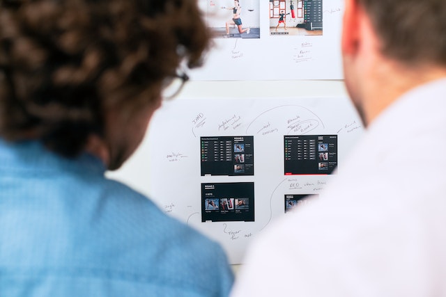
The Visual Strategy Revolution

Why Text-Dense Charters Fail in Fast-Moving Markets

The Visual Strategy Revolution

GUEST POST from Art Inteligencia


The Slow Death of the 50-Page Charter

There is a profound irony at the heart of modern corporate transformation: we are attempting to navigate 21st-century exponential change using 20th-century static, linear documents. We assemble brilliant, cross-functional teams, promise them agility, and then immediately weigh them down with a 50-page, text-dense project charter. It is the exact moment where great, disruptive ideas go to die a slow, administrative death.

These traditional charters act as intellectual silos. Typically written by a single project manager or a small committee operating in a vacuum, they are emailed out as a static PDF and promptly filed away in a digital graveyard. They offer the illusion of progress while creating immense friction, effectively divorcing the strategic intent of leadership from the day-to-day reality of the teams tasked with executing it.

The Ultimate Competitive Advantage: Speed-to-Alignment

In hyper-competitive, fast-moving markets, the ultimate competitive advantage is no longer just your technology or your capital — it is your speed-to-alignment. If it takes your organization six weeks of writing, reading, and debating a text-heavy document just to get everyone on the same page, your competitors have already launched, learned, and pivoted.

“When strategy remains buried in paragraphs of corporate prose, it is invisible. And what is invisible cannot be agilely executed.”

To survive and thrive, we must shift our paradigm from static documentation to dynamic, visual collaboration. By democratizing understanding through visual strategy frameworks, we don’t just speed up decision-making — we unlock the collective intelligence and empathy required to design truly exceptional human experiences.

Why Text-Dense Charters Fail in Modern Ecosystems

To understand why traditional documents paralyze modern teams, we have to look at how the human brain actually processes information. We are visual creatures, yet we persist in forcing our teams to translate strategy through dense, linear walls of text. In a fast-moving market, this approach fails for several critical reasons:

1. Cognitive Overload and Friction

When a team member is handed a massive text document, their brain must work overtime to construct a mental model of the project. This cognitive friction slows down comprehension. Conversely, a visual layout allows the brain to map relationships, dependencies, and priorities almost instantly. If people have to read 10 pages to understand how their work connects to the customer’s pain point, you have already lost their momentum.

2. The Illusion of Alignment

Text is notoriously ambiguous. Two stakeholders can read the exact same sentence in a charter — for example, “We will optimize the end-user onboarding experience” — and walk away with completely different interpretations. One visualizes a redesigned UI, while the other envisions a new automated email sequence. Visualizing the strategy forces these conflicting assumptions into the open, replacing passive agreement with explicit, shared clarity.

3. The Rigidity of Static Documentation

In a volatile market, strategy must be dynamic. Yet, updating a traditional text charter feels like amending a legal contract. It requires redlines, version control, and endless review meetings. Because the process is so painful, teams resist changing the plan, even when market data screams that they should. Visual frameworks, built on canvases or digital whiteboards, make pivoting as simple as moving a digital sticky note.

4. Losing the Human Element

Traditional charters are written in cold, sterile, corporate-speak. They focus heavily on governance, checklists, and compliance, completely ignoring the human beings who will build the solution and the customers who will use it. When we strip the human experience out of the strategic plan, we lose the empathy required to drive true innovation.

The Anatomy of the Visual Strategy Revolution

The visual strategy revolution isn’t about making things look pretty or adding superficial graphics to a slide deck. It is about restructuring how information is organized, synthesized, and socialized across an organization. To move from static documentation to dynamic, visual alignment, we must leverage three core design pillars:

1. The Power of Spatial Organization

When you dump information into a continuous text document, the physical relationship between ideas is lost. Spatial organization fixes this by mapping strategy, goals, target audiences, and technical constraints into dedicated, visible zones on a single plane. Using a structured layout — like Braden Kelley’s Change Planning Canvas™ — allows the eye to travel across the strategic landscape, instantly recognizing how a resource constraint in one corner impacts a delivery milestone in another.

2. Building Shared Mental Models

Every department in a modern enterprise speaks its own dialect. Engineers talk in sprint velocities and APIs, marketers speak of customer acquisition costs and funnel conversion, and finance leads focus strictly on budget variance. Visual frameworks act as a universal translator. By distilling complex concepts into clean, visual boundaries and structured modules, we bridge the gap between diverse disciplines. Everyone, regardless of their background, can look at the same visual artifact and walk away with an identical mental model of the mission.

3. Co-Creation Over Consumption

Traditional charters are consumption-based: one author writes, and the rest of the team is expected to passively consume (and somehow retain) the information. Visual strategy is fundamentally participatory. By using visual workspaces — whether physical whiteboards with sticky notes or digital collaborative canvases — the team shifts from readers to active co-designers. When people physically shape the strategy alongside leadership, they build immediate emotional ownership. They aren’t just executing a plan handed down to them; they are executing a plan they helped build.

“When you change the way a team visualizes their challenges, you fundamentally change the way they collaborate to solve them.”

Core Frameworks Driving the Visual Shift

To transition from theory to practice, organizations must adopt proven visual frameworks that replace traditional documentation. These tools are designed to make strategy actionable, collaborative, and human-centered from day one. Here are the three primary engines of the visual strategy revolution:

1. Visual Change Planning Canvases

Instead of burying project scope, stakeholder impact, and risk mitigation in separate document sub-sections, visual change planning canvases bring these elements together onto a single page. By utilizing structured frameworks like my Change Planning Canvas™, teams can collaboratively map out the ‘why,’ the ‘who,’ and the ‘how’ in real-time. Dependencies, potential roadblocks, and resource constraints are instantly exposed as color-coded sticky notes, allowing the team to address conflicts before a single line of code is written or a process is changed.

2. Customer Journey Maps and Service Blueprints

Traditional project charters often lose sight of the ultimate goal: the human experience. Visual journey maps and service blueprints ground every strategic initiative in the actual reality of the customer and the frontline employee. These tools visually align the front-stage experience (what the customer sees and feels) with the back-stage operations (the technology, processes, and people required to support it). This ensures that every milestone in your project plan directly moves the needle on user-centered value.

3. Dynamic Roadmapping

Static Gantt charts are incredibly fragile; a single delayed task can cascade and render an entire 12-month timeline obsolete. The visual strategy alternative is dynamic roadmapping. By swapping rigid chronological lines for flexible visual horizons (such as Now, Next, and Later buckets), teams can align on outcomes rather than arbitrary output dates. This shift allows leadership to maintain strategic direction while giving delivery teams the autonomy to navigate fast-changing market realities dynamically.

Strategic Benefits of Going Visual

Transitioning from text-dense charters to visual strategy frameworks isn’t just a process change — it is a performance multiplier. When organizations embrace visual alignment, they unlock measurable improvements in delivery speed, team engagement, and operational governance. The strategic payoff is realized across three critical dimensions:

1. Accelerated Velocity and Speed-to-Market

The traditional chartering process is notorious for drag. Weeks are wasted routing drafts, collecting written feedback, and scheduling follow-up meetings to clarify misunderstandings. Visual collaboration compresses this entire cycle. By gathering key stakeholders around a shared canvas, weeks of asynchronous debates are consolidated into a few hours of high-energy, real-time alignment. Because the team alignment is immediate and explicit, execution begins sooner and with far fewer false starts.

2. Increased Engagement and True Emotional Ownership

It is a fundamental truth of human-centered change: people support what they help create. A text-dense charter handed down from above feels like a mandate, fostering compliance rather than commitment. Conversely, a visual canvas invites contribution. When cross-functional team members physically place their insights, risks, and ideas onto a shared board, they see themselves in the strategy. This active participation builds deep emotional ownership, turning passive executors into passionate problem solvers.

3. Real-Time, Lightweight Governance

Governance shouldn’t require administrative overhead. Visual frameworks double as live management tools. Instead of creating separate status slide decks and progress reports, teams use their active strategy canvases as the single source of truth during daily standups, sprint reviews, and executive retrospectives. Because the strategy is visual, leadership can walk into a room, glance at the board, and instantly assess progress, identify bottlenecks, and make rapid decisions without reading a single status report.

“True agility is achieved when the distance between a strategic decision and the team’s understanding of that decision is reduced to zero. Visuals are the only medium fast enough to close that gap.”

Conclusion: Tear Up the Templates and Design the Future

The fast-moving markets of today do not tolerate slow-moving processes. Continuing to rely on text-dense, multi-page charters to guide your most critical transformation initiatives is no longer just an administrative burden — it is a strategic risk. When strategy is hidden in paragraphs of corporate prose, it remains invisible, inflexible, and uninspiring.

The Challenge: Audit Your Current Alignment

Before your next project kickoff, I challenge you to look closely at your existing initiation process. Ask yourself and your leadership team these critical questions:

  • How many people on the delivery team have actually read our 50-page project charter?
  • How much of our strategic intent lives dynamically in our minds, and how much is buried on page 14 of a static PDF?
  • If our market shifts tomorrow, how quickly and painlessly can we update this document to reflect our new reality?

Make the Shift to Visual Leadership

It is time to unleash your team’s collective intelligence. By tearing up the outdated templates and replacing them with shared, visual strategy canvases, you do more than accelerate your speed-to-market. You foster an organization of continuous agility, empathy, and deep emotional ownership.

Stop writing about what you want to build. Start visualizing it together, mapping the human experience, and designing the future in real-time.

“The future belongs to the organizations that can align, pivot, and execute at the speed of sight. Make your strategy visual, make it human, and watch your innovation flourish.”

Frequently Asked Questions

1. Why do traditional, text-dense charters fail so often in today’s market?

Traditional charters fail because they are static, linear, and slow. They create cognitive overload, making it difficult for teams to quickly synthesize information. Because they are rarely read or updated, they become intellectual silos that foster a false sense of alignment while slowing down an organization’s speed-to-market.

2. How does visual strategy improve cross-functional team alignment?

Visual strategy uses spatial organization (like canvases and journey maps) to translate complex ideas into a single, shared mental model. It acts as a universal language that bridges the gap between different departments—such as engineering, marketing, and finance—allowing everyone to instantly see dependencies, risks, and customer value on a single plane.

3. Does moving to visual frameworks mean abandoning all documentation?

Not at all. It means replacing administrative overhead with lightweight, dynamic, and high-impact documentation. A visual canvas serves as a living “single source of truth” that teams actually use during standups and reviews, keeping governance active and real-time rather than buried in a static archive.


Bottom line: Futurists are not fortune tellers. They use a formal approach to achieve their outcomes, but a methodology and tools like those in FutureHacking™ can empower anyone to be their own futurist.

Image credit: Gemini

Subscribe to Human-Centered Change & Innovation WeeklySign up here to get Human-Centered Change & Innovation Weekly delivered to your inbox every week.