Some Insights from Cracker Barrel
GUEST POST from Pete Foley
The Cracker Barrel rebrand has certainly created a lot of media and social media attention. Everything happened so fast that I have had to rewrite this introduction twice in as many days. Originally written when the new logo was in place, it has subsequently been withdrawn and replaced with the original one.
It’s probably been a expensive, somewhat embarrassing and sleepless week for the Cracker Barrel management team. But also one that generated a great deal of ‘free’ publicity for them. You could argue that despite the cost of a major rebranding and de-branding, this episode was priceless from a marketing penetration perspective. There is no way they could have spent enough to generate the level of media and social media they have achieved, if not necessarily enjoyed.
But of course, it raises the perennial question ‘is all publicity good publicity?’ With brands, I’d argue not always. For certain, both good and bad publicity adds to ‘brand fluency’ and mental availability. But whether that is positively or negatively valanced, or triggers implicit or explicit approach or avoid responses is less straightforward. A case in point is of course Budweiser, who generated a lot of free media, but are still trying to drag themselves out of the Bud Light controversy.
Listening to the Customer: But when the dust settles, I suspect that Cracker Barrel will come out of this quite well. They enjoyed massive media and social media exposure, elevating the ‘mindshare’ of their brand. And to their credit, they’ve also, albeit a little reluctantly, listened to their customers. The quick change back to their legacy branding must ave been painful, but from a customer perspective, it screams ‘I hear you, and I value you’.
The Political Minefield. But there is some lingering complexity. Somehow the logo change became associated with politics. That is not exactly unusual these days, and when it happens, it inevitably triggers passion, polarization and outrage. I find it a quite depressing commentary on the current state of society that a restaurant logo can trigger ‘outrage. But like it or not, as change agents, these emotions, polarization and dubious political framing are a reality we all have to deal with. In this case, I personally suspect that any politically driven market effects will be short-lived. To my eye, any political position was unintentional, generated by social media rather than the company, and the connection between logo design and political affiliation is at best tenuous, and lacks the depth of meaning typically required for persistent outrage. The mobs should move on.
The Man on the Moon: But it does illustrate a broader problem for innovation derived from our current polarized society. If a logo simplification can somehow take on political overtones, pretty much any change or innovation can. Change nearly always comes with supporters and detractors, reflecting the somewhat contradictory nature of human behavior and cognition – we are change agents who also operate largely from habits. Our response to innovation is therefore inherently polarized, both as individuals and as a society, with elements of both behavioral inertia and change affinity. But with society deeply polarized and divided, it is perhaps inevitable that we will see connections between two different polarizations, whether they are logical or causal or not. We humans are pattern creators, evolved to see connections where they may or may not exist. This ability to see patterns using partial data protected us, and helped us see predators, food or even potential mates using limited information. Spotting a predator from a few glimpses through the trees obviously has huge advantages over waiting until it ambushes us. So we see animals in clouds, patterns in the stars, faces on the moon, and on some occasions, political intent where none probably exists.
My original intent with this article was to look at the design change for the logo from a fundamental visual science perspective. From that perspective, I thought it was quite flawed. But as the story quickly evolved, I couldn’t ignore the societal, social media and political element. Context really does matter. But if we step back from that, there are stillo some really interesting technical design insights we can glean.
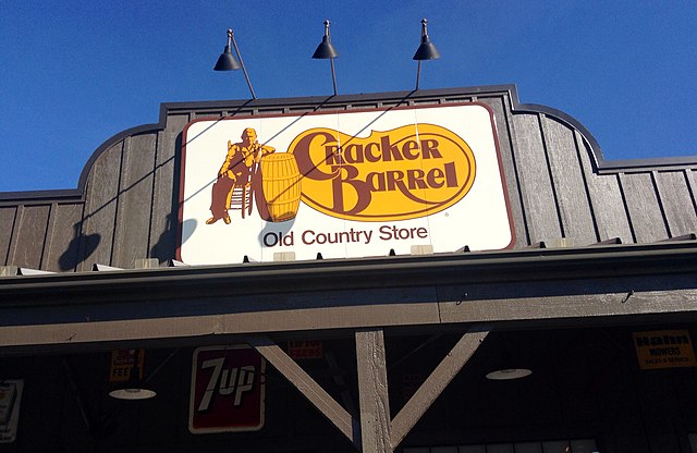
1. Simplicity is deceptively complex. The current trend towards reducing complexity and even color in a brands visual language superficially makes sense. After all, the reduced amount of information and complexity should be easier for our brains to visually process. And low cognitive processing costs come with all sorts of benefits. But unfortunately it’s not quite that simple. With familiar objects, our brain doesn’t construct images from scratch, but instead takes the less intuitive, but more cognitively efficient route of unconsciously matching what we see to our existing memory. This allows us to recognize familiar objects with a minimum of cognitive effort, and without needing to process all of the visual details they contain. Our memory, as opposed to our vision, fills in much of the details. But this process means that dramatic simplification of a well established visual language or brand, if not done very carefully, can inhibit that matching process. So counterintuitively, if we remove the wrong visual cues, it can make a simplified visual language or brand more difficult to process than it’s original, and thus harder to find, at least for established customers. Put another way, the way our visual system operates, it automatically and very quickly (faster than we can consciously think) reduces images down to their visual essence. If we try to do that ourselves, we need to very clearly understand what the key visual elements are, and make sure we keep the right ones. Cracker Barrel has lost some basic shapes, and removed several visual elements completely, meaning it has likely not done a great job in that respect.
2. Managing the Distinctive-Simple Trade Off. Our brains have evolved to be very efficient, so as noted above, we only do the ‘heavy lifting’ of encoding complex designs into memory once. We then use a shortcut of matching what we see to what we already know, and so can recognize relatively complex but familiar objects with relatively little effort. This matching process means a familiar visual scene like the old Cracker Barrel logo is quickly processed as a ‘whole’, as opposed to a complex, detailed image. But unfortunately, this means the devil is in the details, and a dramatic simplification like Cracker Barrels can unintentionally remove many of the cues or signals that allowed us to unconsciously recognize it with minimal cognitive effort.
And the process of minimizing visual complexity can also remove much of what made the brand both familiar and distinctive in parallel. And it’s the relatively low resolution elements of the design that make it distinctive. To get a feel for this, try squinting at the old and new brand. With the old design, squinting loses the details of the barrel, or the old man, But the rough shape of them, and of the logo, and their relative positions remain. That gives a rough approximation of what our visual system feeds into our brain when looking for a match with our memory. Do the same with the new logo, and it has little or no consistency or distinctivity. This means the new logo is unintentionally making it harder for customers to either find it (in memory or elsewhere) or recognize it.
As a side effect, oversimplification also risks looking ‘generic’, and falling into the noise created by a growing sea of increasingly simplified logos. Now, to be fair, historical context matters. If information is not encoded into memory, the matching process fails, and a visual memory needs to be built from scratch. So if we were a new brand, Cracker Barrels new brand visual language might lack distinctivity, but it would certainly carry ease of processing benefits for new customers, whereas the legacy label would likely be too complex, and would quite likely be broadly deselected. But because the old design already owns ‘mindspace’ with existing customers, the dramatic change risks and removal of basic visual cues asks repeat customers to ’think’ at a more conscious level, and so potentially challenges long established habits. A major risk for any established brand
3. Distinctivity Matters. All visual branding represents a trade off. We need signal to noise characteristics that stand out from the crowd, or we are unlikely to be noticed. But we also need to look like we belong to a category, or we risk being deselected. It’s a balancing act. Look too much like category archetypes, and lack distinctivity, and we fade into the background noise, and appear generic. But look too different, and we stand out, but in a potentially bad way, by asking potential customers to put in too much work to understand us. This will often lead a customer to quickly de-select us. It’s a trade off where controlled complexity can curate distinctive cues to stand out, while also incorporating enough category prototype cues to make it feel right. Combine this with sufficient simplicity to ease processing fluency, and we likely have a winning design, especially for new customers. But it’s a delicate balancing act between competing variables
4. People don’t like change. As mentioned earlier, we have a complex relationship with change. We like some, but not too much. Change asks their brains to work harder, so it needs to provide value. I’m skeptical the in this case, it added commensurate value to the customer. And change also breaks habits. So any major rebrand comes with risk for a well established brand. But it’s a balancing act, and we should remain locked into aging designs forever. As the context we operate in changes, we need to ‘move with the times’, and remain consistent in our relationship with our context, at least as much as we remain consistent with our history.
And of course, there is also a trade off between a visual language that resonates with existing customers and one designed to attract new ones, as ultimately, virtually every brand needs both trial and repeat. But for established brands evolutionary change is usually the way to achieve reach and trial without alienating existing customers. Coke are the masters of this. Look at how their brand has evolved over time, staying contemporary, but without creating the kind of ‘cognitive jolts’ the Cracker Barrel rebrand has created. If you look at an old Coke advertisement, you intuitively know both that it’s old, but also that it is Coke.
Brands and Politics. I generally advise brands to stay out of politics. With a few exceptions, entering this minefield risks alienating 50% of our customers. And any subsequent ‘course corrections’ risk alienating those that are left. For a vast majorities of companies, the cost-benefit equation simply doesn’t work!
But in this case, we are seeing consumers interpreting change through a political lens, even when that was not the intent. But just because it’s not there doesn’t mean it doesn’t matter, as Cracker barrel is discovered. So I’m changing my advice from ‘don’t be political’ to ‘try and anticipate if you’re initiative could be misunderstood as political’. It’s a subtle, but important difference.
And as a build, marketers often try to incorporate secondary messages into their communication. But in todays charged political climate, I think we need to be careful about being too ‘clever’ in this respect. Consumer’s sensitivity to socio-political cues is very high at present, as the Cracker Barrel example shows. So if they can see political content where none was intended, they are quite likely to spot any secondary or ‘implicit’ messaging. So for example, an advertisement that features a lot of flags and patriotic displays, or one that predominately features members of the LBGTQ community both run a risk of being perceived as ‘making a political statement’, whether it is intended to or not. There is absolutely nothing wrong with either patriotism or the LBGT community, and to be fair, as society becomes increasingly polarized, it’s increasingly hard to create content that doesn’t somehow offend someone. At least without becoming so ‘vanilla’ that the content is largely pointless, and doesn’t cut through the noise. But from a business perspective, in today’s socially and politically fractured world, any perceived political bias or message in either direction comes with business risks. Proceed with caution.
And keep in mind we’ve evolved to respond more intensely to negatives than positives – Caution kept our ancestors alive. If we half see a coiled object in the grass that could be a garden hose or a snake, our instinct is to back off. If we mistake a garden hose for a snake to cost is small. But if we mistake a venomous snake for a garden hose, the cost could be high.
As I implied earlier, when consumers look at our content though specific and increasingly intense partisan lens, it’s really difficult for us to not be perceived as being either ‘for’ or ‘against’ them. And keep in mind, the cost of undoing even an unintended political statement is inevitably higher than the cost of making it. So it’s at very least worth trying to avoid being dragged into a political space whenever possible, especially as a negative. So be careful out there, and embrace some devils advocate thinking. Even if we are not trying to make a point, implicitly or explicitly, we need to step back and look at how those who see the world from deeply polarized position could interpret us. The ‘no such thing as bad publicity’ concept sits on very thin ice at this moment in time, where social media often seeks to punish more than communicate
Image credits: Wikimedia Commons
![]() Sign up here to join 17,000+ leaders getting Human-Centered Change & Innovation Weekly delivered to their inbox every week.
Sign up here to join 17,000+ leaders getting Human-Centered Change & Innovation Weekly delivered to their inbox every week.