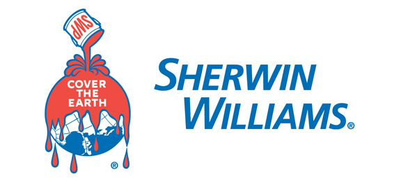
Every time I see this logo I cringe.
If there is one logo in the world that is definitely in desperate need of updating, it is the logo of Sherwin Williams.
My stomach turns at the site of the earth dripping with paint and the slogan “Cover the Earth” only makes it worse.
Is there anyone out there that would actually like to see the earth covered in paint?
Especially paint that looks like blood?
Sherwin Williams, I implore you, please update your logo as soon as possible to reflect the changing world we live in, where people are concerned about toxicity and where sustainability and being green are increasingly important.
If you could do it before Earth Day on April 22, 2012 that would be even better.
You may not realize the negative logo your logo is having on your business because your stock price is moving up and to the right, but imagine how much better it might be doing if you updated your image to reflect your surroundings?
Come on Sherwin Williams, you can do it!
![]() Sign up here to get Human-Centered Change & Innovation Weekly delivered to your inbox every week.
Sign up here to get Human-Centered Change & Innovation Weekly delivered to your inbox every week.

Really? You are going after an iconic sign? Your reasons are so typical of today. There are real issues and we dwell on the silly by conjuring a message that is not there.
Leave the logo alone!
Thank you for the comment Georgina. I love the passion! 🙂