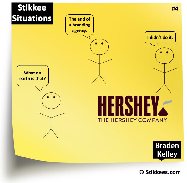
Recently The Hershey Company decided to update their logo and since it’s launch they’ve been getting a lot of negative buzz surrounding the new logo because some people think that part of the logo looks like a steaming pile of *#&@.
The new branding was created in-house by Hershey Global Design, with assistance from goDutch and Alexander Design Associates, and on the one hand for Hershey I imagine all of the pile of excrement comments might be quite concerning, but on the other hand you have the age old mantra ‘all publicity is good publicity’.
Where do you stand on the controversy?
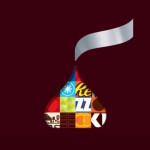 Personally I would have used the colorful kiss they developed instead in order to reinforce their global confection and snack company positioning and dropped the redundant “The Hershey Company”. In addition, I don’t think the pile of excrement comments will harm their sales or their brand because most people won’t even notice or care.
And after all, when it comes to marketing and advertising, you should really be doing WGAS Marketing anyways.
Not sure what that is?
Check out the article here and follow along! 🙂
Please note the following licensing terms for Stikkee Situations cartoons:
| 1. BLOGS – Link back to https://bradenkelley.com/category/stikkees/ and you can embed them for free | |
| 2. PRESENTATIONS, please send $25 to me on PayPal by clicking the button | 3. NEWSLETTERS & WEB SITES, please send me $50 on PayPal by clicking the button |
![]() Sign up here to get Human-Centered Change & Innovation Weekly delivered to your inbox every week.
Sign up here to get Human-Centered Change & Innovation Weekly delivered to your inbox every week.