by Braden Kelley and Art Inteligencia
We are living through a crisis of civic experience. People can feel that they’re being ripped off by their elected and administrative officials, but yet they lack a fair way to prove it. The future will not be built by louder arguments alone. It will be built by better comparisons: value delivered per dollar, relative to peers who look like us. That is the spark for a human-centered citizen movement. First, let’s look at the scale of the problem already documented in the public record.
The bill without a receipt
Most of us do not experience government as a spreadsheet. We experience it as a journey: the permit that takes months, the school board meeting that buries tradeoffs in jargon, the water bill that climbs while the story never quite lands. That journey is the real product. And if experience design has taught us anything, it is this: when the interface of truth is broken, people do not get smarter by trying harder, they get cynical.
Cynicism is not a character flaw. It is a rational response to incomplete design.
We are asked to fund systems whose performance is rarely presented in the only language that makes human comparison fair: what does a place like mine get for money like mine?
Imagine, just for a moment, learning that a school district with a nearly identical enrollment mix educates children with far less administrative drag and better learning growth per instructional dollar. Or that a peer city issues permits, paves roads, or clears cases at a cost structure that cannot be waved away with “we’re special.” That is not a conspiracy theory. That is a design question. Design questions can be answered, if we stop accepting fog as a management strategy.
Before we build the instruments of peer comparison, we have to stop understating what already leaks, bloats, and under-delivers in plain sight. Innovation begins with facing reality, not romanticizing it.
The scale hiding in plain sight
If this were only a few bad actors and a few delayed audits, a nice annual report and a press release would be enough. The public record says otherwise. What we are looking at is a systems problem: structural error and theft measured in hundreds of billions; spending that sprints past simple population-and-inflation baselines; and institutions whose staffing mix drifts toward administration while the work citizens think they are buying becomes relatively thinner.
Let’s start at the federal level, not because your city council or school board is less important, but because the national numbers are large enough that denial starts looking like a lifestyle choice.
The U.S. Government Accountability Office (GAO) estimated that direct annual financial losses to the federal government from fraud fall between roughly $233 billion and $521 billion a year, based on fiscal years 2018–2022 risk environments (GAO-24-105833 highlights; full report: PDF). That is not a rounding error. That is a second economy of loss living inside the first.
Then there are improper payments – the broader leak that includes overpayments, underpayments, documentation failures, and more. Agencies reported about $236 billion in improper payments in fiscal year 2023 (GAO FY2023 overview) and still about $162 billion in fiscal year 2024 after some pandemic programs wound down (GAO FY2024 press release; GAO-25-107753 PDF). Cumulative improper-payment estimates since fiscal year 2003 approach about $2.8 trillion (see GAO-25-107753). Earlier in the same stretch: roughly $281 billion in FY2021 (GAO) and $247 billion in FY2022 (GAO).
Let’s be clear, as any honest change leader must be: improper payments are not all intentional fraud. But they are the proof that our control experience is broken. If you cannot reliably send the right money to the right place, you do not have a “communications” problem. You have a design problem.
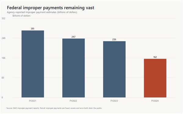 Federal agency-reported improper payment estimates remain measured in hundreds of billions even after the pandemic peak. Sources:
GAO FY2021 (~$281B);
GAO FY2022 (~$247B);
GAO FY2023 (~$236B);
GAO FY2024 (~$162B).Scale of loss is one window. Scale of spend is another. Total federal net outlays rose from roughly $3.5 trillion in fiscal year 2014 to roughly $6.7 trillion in fiscal year 2024 – nearly a doubling in a decade in nominal dollars, with the pandemic rewriting the shape of the curve. Those figures come from the U.S. Office of Management and Budget historical outlay series published via the Federal Reserve Bank of St. Louis as FRED series FYONET, with the broader tables at OMB Historical Tables.
More spending can mean more service, more obligations, an older population, emergencies. Futurology without humility is just sci-fi cosplay. But here is the innovation insight most public debates miss: absolute “we spent more” tells citizens almost nothing about unit cost, quality, or leakage. When the size of the system grows, the need for peer-relative instruments grows with it. Otherwise we are asking people to navigate a denser fog with the same broken map.
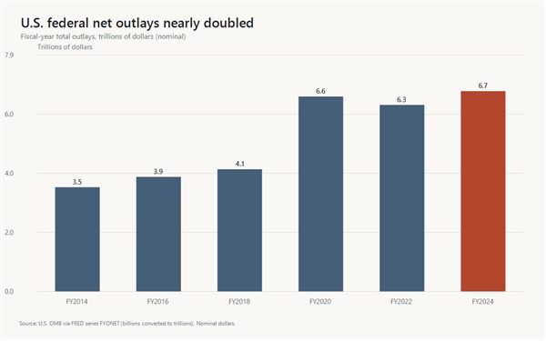 U.S. federal net outlays, selected fiscal years (nominal dollars). Source:
OMB Federal Net Outlays (FYONET) via FRED.
See also OMB Historical Tables.Now bring it closer to home – for many of us, literally. Washington State’s Near General Fund–Outlook (NGF-O) operating budget grew from about $31.2 billion in the 2011–13 biennium to about $80.2 billion for 2025–27, roughly a 157% increase in nominal dollars, as laid out by the Washington Policy Center using the state’s NGF-O series. The 2023–25 NGF-O package, after the 2024 supplemental, was about $71.9 billion (Legislative Budget Notes PDF). The same analysis notes that if spending since the mid-2010s had tracked only population and inflation, today’s scale would be tens of billions lower. Growth is real. “We only kept up with costs” is a different claim. Official statewide spending trails also live at fiscal.wa.gov.
This is not a Washington-only story. It is a pattern story: when the bar chart climbs and the experience of value does not climb with it, citizens notice – even if they cannot yet prove the gap against peers.
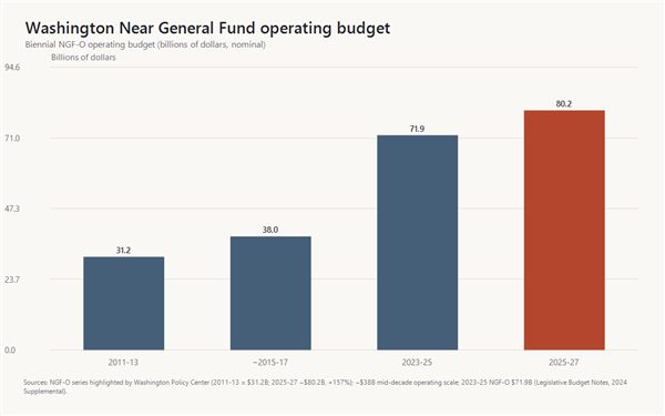 Washington NGF-O biennial operating budget scale (nominal). Sources:
Washington Policy Center NGF-O growth summary
(2011–13 ≈ $31.2B; 2025–27 ≈ $80.2B; ~157%);
2023–25 NGF-O ≈ $71.9B (Legislative Budget Notes PDF);
mid-decade ~$38B scale as described in the same WPC overview of the decade-long climb.Then there is administrative gravity, especially in higher education, where parents still believe they are buying teaching first. The Delta Cost Project at the American Institutes for Research documented something experience designers would call a quiet interface change: as managerial and professional administrative ranks grew, the average number of faculty and staff per administrator fell by roughly 40 percent at many four-year institutions between 1990 and 2012, landing near 2.5 or fewer faculty and staff per administrator (Desrochers & Kirshstein, Labor Intensive or Labor Expensive?, 2014 (PDF); AIR press summary). Professional non-faculty roles often grew faster than full-time instructional capacity, even as campuses leaned harder on part-time instructors. The underlying institutional data ecosystem lives in IPEDS and the Delta Cost Project database.
Is every new position waste? Of course not. Human organizations need coordination. The revolutionary question is not “abolish administration.” It is: do we have a transparent, peer-relative view of what administration costs relative to learning and outcomes — or are we just hoping for the best?
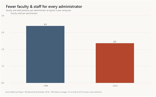 Illustrative faculty-and-staff-per-administrator levels reflecting Delta Cost Project / AIR findings of roughly a 40% decline from 1990 to 2012 at many four-year campuses, averaging about 2.5 or fewer faculty and staff per administrator.
Source: Desrochers & Kirshstein (2014) PDF.And then there is the softer, stickier problem: corruption perceptions and nonprofit “grift” that thrives in long outcome chains. In occupational-fraud cases studied by the Association of Certified Fraud Examiners (ACFE), government organizations and for-profit firms land around a median loss of about $150,000 per case, while nonprofits still show up in about one in ten cases, with smaller median losses (about $76,000) that can still wreck a thin-margin mission (Occupational Fraud 2024: A Report to the Nations (PDF)).
Here is the human-centered insight: when public dollars pass through contractors and tax-exempt intermediaries, the distance between the taxpayer’s intention and the citizen’s experience often grows. High overhead, related parties, vague deliverables, and glossy stories without unit costs are not always illegal – but they can be a failure of value design. Law can punish fraud. Only better metrics can expose underperformance that still has good branding.
Trust tracks this story. Transparency International’s Corruption Perceptions Index has scored the United States in the mid-60s out of 100 in recent years, with multi-year deterioration flagged by Transparency International U.S. (see their CPI 2025 statement (PDF)). When perceptions fall, governance gets more expensive — because every negotiation becomes theater, and every reform takes more energy to land.
So stack it up without theatrics: hundreds of billions a year in federal fraud-loss risk and improper-payment leakage; state operating budgets that can more than double across a decade and a half; staffing mixes that load coordination relative to the work many people believe they are buying; pass-through chains that hide unit economics. That is enough reason to innovate how citizens see value. It is not a license to smear every public employee. Revolutionary change worth having is precise, not performative.
Sources for the scale claims above
Why shouting about “too much spending” never ends the argument
American public argument too often collapses into two dead ends. One side treats every dollar as proof of compassion. The other treats every dollar as proof of waste. Both can be partially right, and still leave neighbors holding a slogan instead of a shared fact.
Absolute spend is a weak instrument for learning. Larger places spend more. Harder case mixes cost more. Expensive labor markets pay more without automatically proving mismanagement. When numbers ignore context, people fight about identity instead of performance. That is not governance. That is sportswashing for budgets.
Experience design offers a simpler truth: people cannot improve what they cannot sense. If the “interface” of civic truth is either opaque PDFs or cable-news moral theater, the lived journey of taxpayers becomes cynicism – then disengagement – then the quiet permission structure where bloat, under-delivery, and yes, fraud, get more time than they deserve.
The future of healthier institutions will not be won by volume alone. It will be won by better comparisons ordinary people can use without a PhD in public finance. That is human-centered change in one sentence: redesign the sense-making layer, and better action becomes possible.
A better unit of civic truth: value relative to peers
Futurology has a bad habit: it over-promises technology and under-specifies culture. Here is the cultural upgrade that matters first.
Score places the way adults already rank experiences in the rest of life, relative to alternatives that should be similar.
Peer-relative value asks a sharper question than “how much did we spend?” It asks: among entities of roughly the same size and constraints, who delivers more real outcomes per dollar – and who is the best performer we should be learning from?
That shift changes the emotional temperature of accountability. It is harder to dismiss a neighbor when the comparison is another city that looks like yours, another county with a similar mandate set, another school district with a similar student population, another water district with similar infrastructure age. The conversation stops being “are you for or against government?” and starts being “why are we so different from our best peers?”
Relative performance does not erase values. It clarifies delivery. Compassion with weak unit economics is still compassion, and also an unfinished design problem. Efficiency without outcomes is just thrift cosplay. Citizens deserve both: what was intended, and what was delivered, at a cost that survives peer daylight.
This is innovation in the classic sense: not novelty for its own sake, but a better way of creating and measuring value — at the civic layer, where most of life is still lived.
Where fraud, grift, and bloat actually hide
Serious fraud is not always cinematic. More often it is procedural: sole-source patterns that never face real competition; nonprofit pass-throughs that struggle to show outcomes while still collecting public purpose; administrative layers that expand faster than service quality; capital projects whose unit costs and schedule slips never get benchmarked against places that built something comparable; delay as a shield because documents arrive too late to matter.
This is where passion becomes useful, and where discipline becomes non-negotiable. Performance gaps and integrity red flags are not the same thing. Treating every underperforming budget line as a crime story destroys trust the first time a good-faith agency is smeared. Treating every audit as “politics” is how poor design gets tenure.
A mature citizen practice separates the tracks, think of them as three instrument panels on the same dashboard:
- Performance: outcomes and service quality relative to cost among peers.
- Structure: administration share, contracting concentration, salary density versus output.
- Integrity: delayed reporting, audit findings, related-party patterns, outcome-light grantee chains—presented with sources, confidence, and room to reply.
That separation is not gentleness toward corruption. It is how legitimate pressure remains standing when the pushback arrives. Revolutions that last are the ones that can still tell the truth under scrutiny.
The future of accountability is local (and buildable)
National drama can make local work feel small. It is not. Your life is administered by boards, districts, counties, cities, and agencies that set real prices for real services within a few miles of your door. Those are also the levels where a committed group of citizens can still change the information environment in a single budget cycle.
What is newly possible, and this is the innovation hinge, is not “AI as magic.” Magic is for marketing decks. Real innovation is AI as scale applied to the boring, necessary labor of extraction, classification, plain-language briefing, and pattern spotting — always subordinated to transparent methods and primary records. The opportunity is a suite of do-it-yourself tools that a passionate local team can download, stand up, and own: gather public data, process it with clear human oversight, and publish peer benchmarks for the jurisdiction they care about.
Think of it as open experience architecture for citizenship: not a single national score imposed from above, but many local instruments speaking the same comparative language. Cities. Counties. States. School districts. Water boards and special districts. Same idea. Local ownership. Peer daylight.
Movements fail when they ask everyone to wait for a capital-city hero. They gain power when they give capable people a way to begin where they already have skin in the game—and when the path from “I care” to “I can host a public scoreboard” is designed, documented, and downloadable. That is human-centered change: remove friction between intention and action.
From spark to local firepower: what you can actually do
Enthusiasm without a next step is just another scroll. So here is the honest promise of this movement: we are building the instruments — and you choose the jurisdiction, the intensity, and the role that fits your life.
Start with a target you can describe in one sentence. Your school district. Your city budget. Your county contracting. Your state’s administrative stack. Your water or sewer or flood-control district, the special-purpose governments that spend real money while almost nobody is watching. Passion plus a defined entity beats vague anger about “the system” every time.
Then choose a depth of start that matches your week, not your fantasy of free time:
- Weekend scout: Pull the latest budget, CAFR, or checkbook export. List the top five cost centers. Note what is missing — outcomes, headcount by function, sole-source awards. That alone is civic reconnaissance.
- Meeting witness: Show up once a month with three peer-comparison questions written in advance. Serious questions change how staff prepare—and how journalists listen.
- Budget-season cadence: Build a small team and a calendar tied to when appropriations still can move. That is when numbers still have opponents who can feel them.
- Local scoreboard: When the toolkit ships, stand up a public site — data intake, AI-assisted processing under human guardrails, and peer-relative benchmarks neighbors can share without translating bureaucracy dialect.
You do not need to do everything. You need a first mile. The guidebooks we will publish will walk those miles: how to FOIA without burning out, how to structure a peer cohort fairly, how to avoid turning a performance gap into a defamation trap, how to brief a board in three minutes, how to partner with a local reporter as an ally rather than an ambush.
Lighting a fire does not mean burning institutions down. It means raising the temperature of truth until fog can no longer survive as a management strategy—and giving thousands of local teams the same matchbook.
Pick a role that fits how you show up
From the outside, movements look monolithic. From the inside, they are division of labor — just like every innovation team that ever shipped anything that mattered. You do not have to become a full-stack auditor, web host, and public speaker on the same Tuesday night. Find the work that matches your temperament. Then find one person whose temperament complements yours.
Data gatherers and custodians. You enjoy documents more than microphones. You pull budgets, salary schedules, bid awards, board packets, 990s tied to public grants. You file public-records requests, keep the source folder honest, and leave a trail so nothing depends on a single hero’s laptop. Without clean intake, every downstream score is theater.
Benchmarking intelligence creators. You want the “so what.” You define peer sets carefully, normalize costs, choose outcome metrics that survive scrutiny, and write method notes so a critic can challenge the math without inventing motives. You turn spreadsheets into stories: unit cost of pavement, administrative share of a district, permit latency per FTE, learning growth per instructional dollar — always versus true peers. When the AI processing stack is ready, this role runs it with human judgment still on the wheel.
Website hosts and local product owners. You are willing to stand something up for your community: a place where neighbors can see the score, the sources, the trends, and an invitation to correct errors. You care about reliability and clarity – not turning a civic tool into a partisan meme machine. The downloadable suite is for you: templates, deployment path, content structure—so passion is not blocked by “I don’t know how to ship a site.”
Promoters, translators, and evangelists. You are the bridge. You do not have to invent the model. You make sure it reaches PTAs, rotary clubs, neighborhood groups, faith communities, taxpayer groups, student journalists, and people who will never open a CAFR unprompted. You translate peer-relative value into plain language, share uncomfortable comparisons without contempt, and keep the movement multipartisan enough that the score—not the team jersey—remains the headline.
Meeting advocates and budget-season operators. You take the brief to the microphone. Three questions. One peer chart. A written record. You show up when the appropriation can still move. The action packs we will release are for this role: scripts, FOIA companions, and “why the gap” one-pagers for boards and councils.
Local media partners and explanation designers. You help facts travel. A retired editor, a podcast host, a newsletter writer, a visual explainer—anyone who can turn a transparent ranking into public attention that demands reply rather than rumor. Credible pressure almost always needs a second institution’s megaphone.
Tutors of the top decile. When a peer is crushing your entity on value, someone should study them without ego—procurement habits, staffing ratios, open-data practices, facility utilization, grantee outcomes. Celebrating excellence is not a side quest. It is how reform becomes copyable instead of merely shaming. That is continuous improvement in civic form.
If you have ever left a public meeting thinking, “Someone should document this properly,” there is a role with your name on it. If you can explain a hard idea at a kitchen table, there is a role. If you can keep a folder organized, there is a role. The only non-role is permanent spectator—assuming someone else will finish the counting.
From newsletter spark to the bonfire of tools
The first act of a movement is not a software download. It is a shared refusal: we will no longer treat uncompared spending as a finished explanation of life. We will learn to ask for peer-relative value. We will demand receipts ordinary people can follow. We will treat the best performers as teachers, not enemies.
The second act is capability. That is the work now underway: do-it-yourself tooling for data gathering, careful AI-assisted processing, and public benchmarking intelligence — plus a series of role-based guidebooks so data gatherers, intelligence creators, website hosts, promoters, and budget-season operators are not inventing discipline from scratch in the dark.
Between spark and bonfire, there is a simple way to stay in formation: join the people who want the heads-up when the kits go live, when the next methods article drops, and when the first local teams start publishing peer scores others can fork and improve.
If this article lit something in you, subscribe to Human-Centered Change & Innovation Weekly. Use that signup as your seat on the bus for this movement. When the downloadable tools and guidebooks are ready — beyond the idea, into usable firepower — that is how you will know first, with practical next steps you can take in the jurisdiction you choose.
Prefer the full signup page? Open the newsletter signup page.
Tell a friend who sits through the same meetings and mutters the same unfinished sentence. Forward this to the person who always says, “If someone would just pull the numbers…” Forward it to the person who already pulls numbers but has nowhere trusted to publish them. Movements scale by invitation more than by manifesto.
For now, sit with the question every zip code deserves:
What if your community pays more and gets less than its true peers — and the only reason it continues is that nobody has finished the counting?
If that question lands, you are already part of the movement. Choose a jurisdiction. Choose a role. Get on the list. We will build the matchbooks — toolkits, methods, and guidebooks — so when you are ready to strike, the fire has somewhere local, human, and bright to go.
Frequently Asked Questions
What is “peer-relative value,” and why is it better than arguing about total spending?
Peer-relative value compares what similar governments achieve per dollar — schools with similar student needs, cities of similar size and density, utilities with similar infrastructure ages — rather than treating raw budget size as proof of success or failure. It makes accountability fairer because it adjusts for context, and sharper because it points to real best performers citizens can learn from. In experience-design terms: it gives people a better interface for understanding value.
Does this approach accuse every high-spending community of fraud?
No. Serious, human-centered accountability separates performance gaps (weaker outcomes or higher unit costs than peers) from integrity red flags (audit issues, opaque grantee chains, noncompetitive contracting patterns) that require stronger evidence. Relative benchmarking creates pressure for better results; it is not a substitute for investigation, law, or due process—and it should never be used as a license to smear people who serve in good faith.
How can I get involved before the tools are fully available?
Choose one jurisdiction you care about, start basic public-record reconnaissance, and pick a role that fits how you show up — data gathering, benchmarking intelligence, website hosting, promotion, meeting advocacy, or media partnership. Subscribe to Human-Centered Change & Innovation Weekly at bradenkelley.com/contact-me/newsletter-signup/ so you are first in line when downloadable toolkits and role-based guidebooks are ready to help stand up local peer-benchmarking sites.
Image Credits: Gemini
Content Authenticity Statement: The topic area, key elements to focus on, etc. were decisions made by Braden Kelley, with a little help from Cursor to clean up the article.
 Sign up here to get Human-Centered Change & Innovation Weekly delivered to your inbox every week.


 Some business models and products have been around so long that we just take them for granted, while others concepts that are becoming new business models are so new that we’re not quite sure what to expect. It is probably easiest to explain what I mean and why this juxtaposition is important by looking at a few examples. Most of these examples involve challenging our orthodoxies.
 Chicken processors used to throw the feet away after processing a truckload of chickens, but after they discovered that chicken feet are a delicacy in several Asian countries, they stopped throwing them away and instead started exporting them. In fact, chicken feet sell for more per pound than chicken breasts in China.
 Britain has always been a hotbed of innovation, and the country that brought us Pret a Manger and Innocent smoothies brings us this tasty treat. Mr. Sherick’s Shakes brings people a little bit of luxury to their day in the form of their high quality milkshakes.
  People always love something new and different, even if it is something old that has disappeared from the market. This is why fashion runs in cycles, and in a mature category like soft drinks there is no reason why we shouldn’t keep these principles in mind and see if now is the time to bring something back, or to see if there is an orthodoxy that we shouldn’t now look at challenging to see if an opportunity might not be created.

 Now you might be asking yourself…
 Innovation comes in all different forms, and there is more than one way to boost profits in organizations.