LAST UPDATED: March 12, 2026 at 6:45 PM
GUEST POST from Art Inteligencia
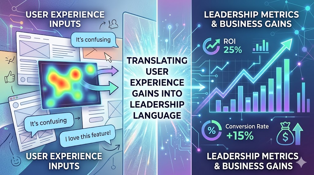
The Lost in Translation Problem: Bridging the UX-Exec Divide
In the world of human-centered innovation, we often speak a language of empathy, usability, and “delight.” While these concepts are the lifeblood of a great product, they often hit a glass ceiling when they reach the C-suite. To a Chief Financial Officer or a Head of Operations, “delight” is a soft metric—it’s difficult to quantify, harder to forecast, and nearly impossible to fit into a quarterly earnings report.
This creates a Translation Gap. On one side, design teams are advocating for the user; on the other, leadership is advocating for the business. When these two groups cannot communicate, innovation stalls, budgets are slashed, and the most critical user experience gains are dismissed as “nice-to-haves” rather than “must-haves.”
The Thesis: Communication as a Catalyst
Real innovation isn’t just about the capacity to create value—it is about the ability to articulate that value in the cold, hard terms of risk, revenue, and resilience. As leaders, we must reclaim the balance between logic and wonder. We use wonder to envision a better world for our users, but we must use logic to prove why that vision is a mechanical necessity for the organization’s survival.
Moving Beyond the “Cost Center” Stigma
For too long, User Experience has been viewed through the lens of a cost center—an expensive department that makes things “look pretty” at the end of a development cycle. To drive systemic change, we must pivot the conversation. We need to frame UX as a growth engine.
- From Aesthetic to Asset: Shifting the view of design from a final coat of paint to a structural foundation.
- From Friction to Financials: Demonstrating how every millisecond of user frustration correlates to a dip in the bottom line.
- From Intuition to Insight: Replacing “I think this looks better” with “This change reduces support overhead by 15%.”
The goal of this translation is not to abandon our human-centered roots, but to protect them. By learning to speak the language of leadership, we ensure that the “wonder” of our innovations has the “logic” required to be funded, scaled, and sustained in the most complex business environments of our time.
The Currency of Leadership: Identifying Strategic Drivers
To successfully translate User Experience (UX) gains, you must first understand what the board is actually buying. Leaders rarely buy “features”; they invest in outcomes. When we align human-centered design with the fundamental drivers of a business—velocity, risk, and differentiation—we move the conversation from subjective preference to strategic necessity.
1. Velocity and Efficiency: The Speed of Value
In an era of rapid digital transformation, the most precious resource is time. UX is often the primary lever for increasing organizational velocity. By streamlining workflows and reducing cognitive load, we aren’t just making a tool “easier” to use; we are accelerating the Time to Value (TTV).
- Reduced Onboarding Friction: Every hour a customer or employee spends learning a system is an hour of lost productivity. Effective UX minimizes this “learning tax.”
- Operational Throughput: Strategic design removes the “micro-bottlenecks” that, when multiplied across thousands of users, result in significant hidden costs.
2. Risk Mitigation: Building Organizational Resilience
Leadership is a constant exercise in risk management. A poor user experience is not just a design failure; it is a business risk. Framing UX as a defensive strategy helps leadership see it as a form of insurance against market volatility.
- Churn Prevention: Every friction point in a customer journey is an invitation for a competitor. UX serves as the “glue” that increases switching costs through emotional and functional loyalty.
- Reducing Technical and Design Debt: Launching a flawed experience creates a deficit that must be paid back with interest in the form of support tickets, bug fixes, and brand damage.
- Compliance and Accessibility: Proper UX ensures that products meet global standards, protecting the organization from legal exposure and reputational harm.
3. Market Differentiation: Finding the “Blue Ocean”
In a saturated market, technical features are quickly commoditized. Innovation leaders know that the experience is often the only sustainable differentiator left. By utilizing human-centered insights, we can identify unmet needs that competitors—who are often focused solely on the “Logic” of features—have completely overlooked.
This is where we reclaim the balance of Wonder. We look beyond the existing data to find the “Experience Gap” where we can provide a unique value proposition that justifies a premium price point or captures new market share.
Summary: The Executive Alignment Checklist
Before presenting a UX initiative, ask yourself:
| UX Improvement | Executive Translation |
|---|---|
| Simplified Navigation | Increased Employee/User Efficiency |
| Accessible Design | Total Addressable Market (TAM) Expansion |
| Consistent UI Patterns | Reduced Development and Support Costs |
Mapping UX Metrics to Executive Outcomes
The most common pitfall in executive reporting is presenting “shallow” metrics. While a 20% increase in “user satisfaction” sounds positive, it lacks the fiscal weight required for strategic decision-making. To bridge this gap, we must map our behavioral data to the Key Performance Indicators (KPIs) that leadership uses to measure the health of the enterprise.
1. From Task Success Rate to Operational Excellence
Designers measure Task Success Rate to see if a user can complete a goal. Leadership measures Operational Excellence—the cost required to produce a specific outcome.
When a user fails a task, they don’t just disappear; they become a “cost event.” They call support, they submit tickets, or they require intensive training. By improving success rates, we are directly reducing the Cost to Serve.
- The Calculation: (Reduction in Support Volume) × (Average Cost per Ticket) = Direct Operational Savings.
2. From Net Promoter Score (NPS) to Customer Lifetime Value (CLV)
NPS and other sentiment scores are often dismissed as “vanity metrics” because they measure what people say rather than what they do. To make these relevant, we must correlate sentiment with retention and expansion.
A “delighted” user is a user with a higher probability of renewal and a lower cost of acquisition for future products. We translate “delight” into Revenue Predictability. By tracking how high-sentiment cohorts behave over 12–24 months, we can prove that human-centered design is a lead indicator for long-term financial stability.
3. From Reduced Friction to Conversion Velocity
In the boardroom, “friction” is synonymous with “revenue leakage.” Every unnecessary step in a digital journey is a point where potential revenue evaporates.
We must frame the removal of friction as an increase in Conversion Velocity. This isn’t just about getting more people through the door; it’s about getting them through the door faster and with less marketing spend.
Executive Metric Translation Matrix
| What UX Tracks | What Leadership Hears | Strategic Impact |
|---|---|---|
| Time on Task | Labor Productivity | Lowering OpEx (Operating Expenses) |
| Error Rate | Risk and Compliance | Avoiding Brand Erosion/Legal Costs |
| Retention Rate | Market Share Stability | Increasing Shareholder Value |
| System Usability Scale (SUS) | Asset Depreciation Rate | Extending the Life of Tech Investments |
By presenting our data in this manner, we stop asking for “permission to design” and start offering “solutions to business problems.” We move from being a tactical resource to a strategic partner.
The Human-Centered Innovation Framework: Logic meets Wonder
To drive systemic change, we must move beyond the “design vs. business” dichotomy. My core philosophy rests on a fundamental truth: We are all born with the capacity for both logic and wonder. In a corporate context, “Logic” is the data that proves the past, while “Wonder” is the vision that sells the future. Section IV outlines how to blend these two forces to make UX improvements irresistible to leadership.
1. The Logic & Wonder Balance
Leadership often retreats into Logic—spreadsheets, historical data, and risk assessments—because it feels safe. However, pure logic only leads to incrementalism. Conversely, pure Wonder—creative blue-sky thinking—feels risky to those responsible for the bottom line.
The most successful innovators act as translators between these two states. We use wonder to identify the “human-centered” breakthroughs that solve complex challenges, then we wrap that wonder in the logic of business cases, ROI projections, and strategic alignment.
2. Visualizing the Ripple Effect: Impact Mapping
Don’t just show a wireframe; show an Impact Map. Leadership needs to see how a singular human-centered design choice creates a ripple effect across the entire organizational ecosystem.
- Micro-Level: User completes a task 30% faster.
- Meso-Level: Departmental productivity increases, reducing the need for seasonal hiring.
- Macro-Level: The organization achieves a higher “Operating Margin” due to reduced labor costs per unit of value delivered.
3. The “So What?” Test for Every Presentation
Every piece of UX research or design iteration must pass the “So What?” test before it reaches a stakeholder. This is the discipline of concluding every technical observation with a business implication.
“We discovered that 40% of users drop off at the payment screen (Observation). This represents a $2.4M annual revenue leakage (The ‘So What?’). By reclaiming the balance of the interface, we can recover this lost value (The Solution).”
Framework Tool: The Strategic Narrative Arc
When presenting to leadership, structure your narrative using this framework to ensure both sides of the executive brain are engaged:
| Stage | Element | Executive Focus |
|---|---|---|
| 1. The Reality (Logic) | Current friction points and cost metrics. | “What is this costing us today?” |
| 2. The Insight (Wonder) | The unmet human need or “Experience Gap.” | “What is the opportunity we’re missing?” |
| 3. The Bridge (Logic) | The roadmap, ROI forecast, and pilot results. | “How do we execute this with low risk?” |
By mastering this balance, we ensure that our innovations aren’t just “good ideas,” but are recognized as essential tools for solving the most complex challenges of our time.
Case Studies: The Translation in Action
Theory only carries weight in the boardroom when backed by practical application. The following cases demonstrate how shifting the narrative from “user experience” to “business outcomes” secured executive buy-in and drove measurable organizational transformation.
Case Study 1: The Cost of Complexity (The Efficiency Gain)
The Problem: A global logistics firm utilized a legacy internal portal for inventory management. The design team identified significant usability issues, but leadership viewed a redesign as a “cosmetic expense” that would distract from backend upgrades.
The Translation: Instead of presenting “cluttered UI” and “bad navigation,” the team calculated Task Completion Time. They demonstrated that the average warehouse manager spent 12 minutes on a task that should take three.
- The Logic: Across 5,000 employees, those nine wasted minutes represented 45,000 minutes of lost productivity per day.
- The Result: At an average labor rate, the redesign was projected to save $4.2M annually in reclaimed labor. The project was greenlit within 48 hours.
Case Study 2: The Experience Premium (The Growth Gain)
The Problem: A Fintech startup was seeing high drop-off rates during their digital onboarding process. Marketing wanted more spend to fill the funnel; Product wanted to redesign the flow.
The Translation: The UX team stopped talking about “user frustration” and started talking about Customer Acquisition Cost (CAC). They mapped the drop-off points directly to marketing dollars being set on fire.
- The Wonder: They envisioned a “Zero-Friction” onboarding that felt like a conversation rather than an interrogation.
- The Logic: By reducing the steps from 12 to 5 and utilizing progressive disclosure, they projected a 20% increase in conversion velocity.
- The Result: The redesign increased successful sign-ups by 28%, effectively reducing the CAC by nearly a third and allowing the company to scale without increasing their marketing budget.
The “Case Study” Template for Your Next Meeting
When presenting your own successes to leadership, use this high-impact structure to ensure your results are framed through the lens of innovation and change:
| Element | Human-Centered Action | Leadership Outcome |
|---|---|---|
| The Insight | Identified cognitive load issues in the checkout process. | Reduced revenue leakage at the final point of sale. |
| The Intervention | Implemented a simplified, one-click payment flow. | Increased operational velocity and transaction volume. |
| The Impact | Users reported 40% higher satisfaction. | Predicted 15% increase in Customer Lifetime Value (CLV). |
Conclusion: Becoming a Bilingual Innovator
The final step in translating user experience gains into leadership language is a personal one: becoming bilingual. To be a truly effective human-centered change leader, you must be as comfortable discussing the nuances of a journey map as you are discussing the nuances of a quarterly earnings report.
1. The Call to Action: Learn the Second Language
Designers and innovation practitioners often wait for a “seat at the table.” However, that seat isn’t granted based on the quality of our pixels; it’s granted based on our ability to solve the problems that keep CEOs awake at night. This requires an intentional effort to study the mechanics of your business.
- Read the Annual Report: Understand the “Risk Factors” your organization has publicly disclosed. These are the “Complex Challenges” your UX work should be solving.
- Shadow the Sales Team: Hear the objections customers raise. Use these as the “Logic” for your next “Wonder-based” innovation.
- Adopt Executive Vocabulary: Replace “usability” with “friction,” “delight” with “loyalty,” and “users” with “market participants.”
2. Reclaiming the Essential Balance
We must never forget that reclaiming the balance between logic and wonder isn’t just a career hack—it’s a prerequisite for solving the most complex challenges of our time. Logic gives us the stability to build, but wonder gives us the vision to build something worth having.
When we speak the language of leadership, we aren’t “selling out.” We are ensuring that the human-centered values we care about—empathy, accessibility, and dignity—are woven into the very fabric of the organization’s strategy.
3. Final Thought: Build a Better Table
When you successfully translate UX gains into leadership language, you do more than just get a project funded. You shift the culture. You prove that being human-centered is not a distraction from business success, but the ultimate driver of it. You don’t just get a seat at the table—you help build a better table for everyone.
“We are all born with the capacity for both logic and wonder. Reclaiming that balance isn’t just good for business — it’s essential for solving the most complex challenges of our time.”
— Braden Kelley
Frequently Asked Questions: UX and Leadership Alignment
To ensure this strategic framework is discoverable by both human leaders and modern answer engines, the following FAQs are structured with JSON-LD schema. This ensures that AI-driven search tools can accurately parse and prioritize these insights.
How do you define the ‘Translation Gap’ in innovation?
The Translation Gap is the communicative disconnect between design teams, who often speak in terms of user empathy and qualitative delight, and executive leadership, who prioritize quantitative metrics like risk, revenue, and operational resilience. Closing this gap requires reframing human-centered gains as business outcomes.
Why is the balance of ‘Logic and Wonder’ essential for business?
Logic provides the data-driven foundation to prove past performance and manage risk, while Wonder provides the creative vision necessary to identify future opportunities. Businesses that rely solely on logic become stagnant through incrementalism, while those that rely solely on wonder face high execution risk. Reclaiming the balance allows for sustainable, high-impact innovation.
What is the most effective way to present UX metrics to the C-suite?
The most effective method is to map behavioral UX metrics to financial KPIs. Instead of reporting on “usability,” report on “operational efficiency” and “cost to serve.” Instead of “user satisfaction,” report on “Customer Lifetime Value (CLV)” and “retention-driven revenue predictability.”
Image credit: Google Gemini
![]() Sign up here to get Human-Centered Change & Innovation Weekly delivered to your inbox every week.
Sign up here to get Human-Centered Change & Innovation Weekly delivered to your inbox every week.